Takahiro Miyashita’s Architectural Artistry in Hi-End Speaker Design
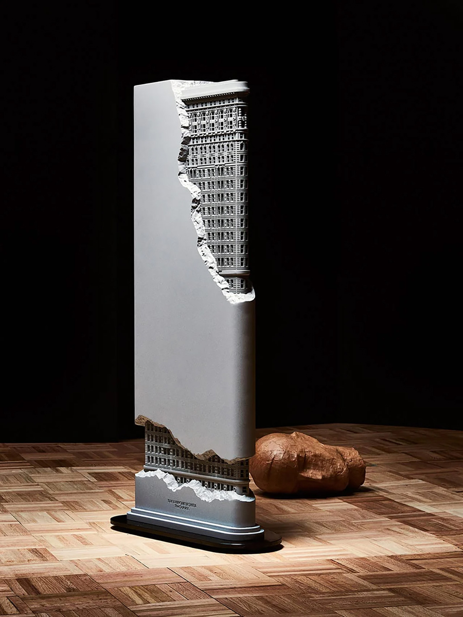
When fashion intersects with technology, it can lead to remarkable innovations. Celebrated fashion designer Takahiro Miyashita has branched into audio design, introducing a speaker that masterfully combines visual artistry with acoustic innovation. Continue reading »
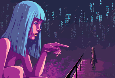
AI Artist Combines Star Wars Imagery with the Creative Spirit of Burning Man

Peio Duhalde’s art project employs AI to blend iconic “Star Wars” characters with the Burning Man ethos, creating a realm of imaginative possibilities. Continue reading »
German Factory Introducing the ‘“Double-Lambretta”, 1953
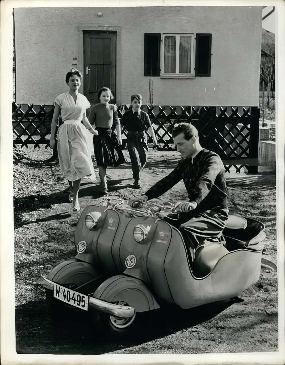
In 1953, the NSU factory in Dusseldorf, Germany, introduced the “Double-Lambretta.” Initially designed for young couples, this small motorcycle could be expanded by joining it with another Lambretta to accommodate a growing family, effectively transforming into a small car that could carry two adults and two children, achieving speeds of up to 78 km/h and a fuel efficiency of 3.4 liters per 100 km. Continue reading »
Spectacular Street Photography Winners From The Sony World Photography Awards 2024
Winner: Callie Eh, Malaysia
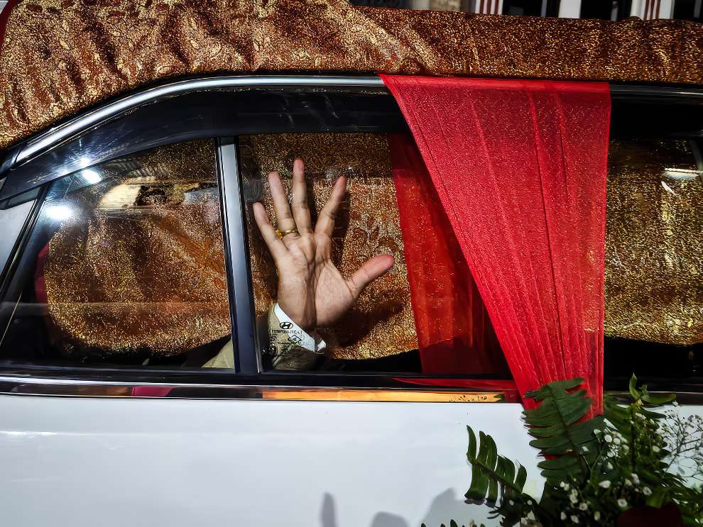
The 2024 Sony World Photography Awards have once again highlighted the extraordinary skill and imagination of street photographers worldwide. This year’s awardees have masterfully depicted the vibrancy of city living through their powerful and moving images, providing a window into the varied and energetic realm of street photography. Continue reading »
The Photographer Discovers the Most Stunningly Gorgeous Tree in Japan

While fruit trees are known for their delicious bounty, the tree itself usually isn’t considered appetizing. Continue reading »
At the Moment that The Sun Is Shining, a Fountain in Italy Appears to Be Gushing out Lava
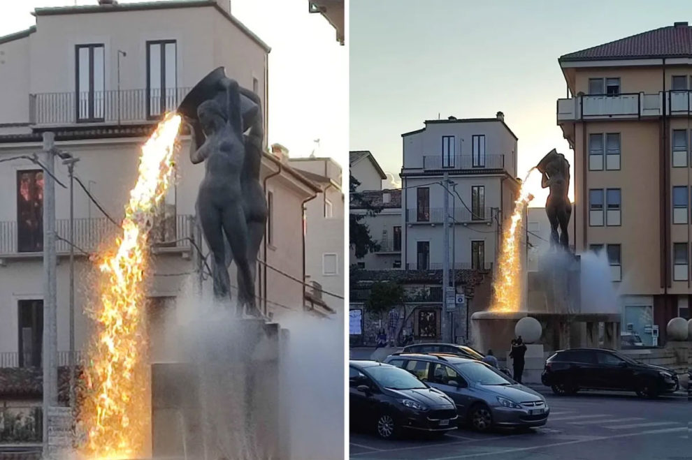
In 2009, L’Aquila, a city in central Italy, was devastated by an earthquake, resulting in extensive damage. Despite the destruction, the city embarked on a path of recovery and restoration. Continue reading »
Innovative Accessory Spotlight: The Hair Clip That’s Turning Heads With Realistic Eyes
Ever wished for eyes on the back of your head? Now, with the ingenious and slightly eerie hair clip by Humans Since 1982, you can have just that. Continue reading »
Artist Crafts Imaginative Illustrations Transforming Common Items into Novel Creations
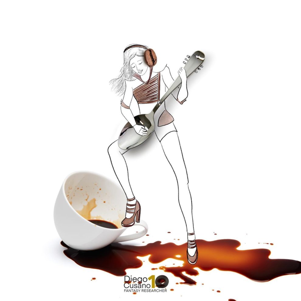
With age, many of us start to ignore the simple pleasures in life, but individuals like Diego Cusano (previously featured), the “Fantasy Researcher” from Italy, keep their sense of childlike wonder alive. Continue reading »
Horrible Photographs of Damaged Cars From the 1994 Northridge Earthquake

The 1994 Northridge earthquake struck the San Fernando Valley in southern California on January 17, becoming the most destructive quake in the state since the 1906 San Francisco earthquake and the costliest in U.S. history. Continue reading »
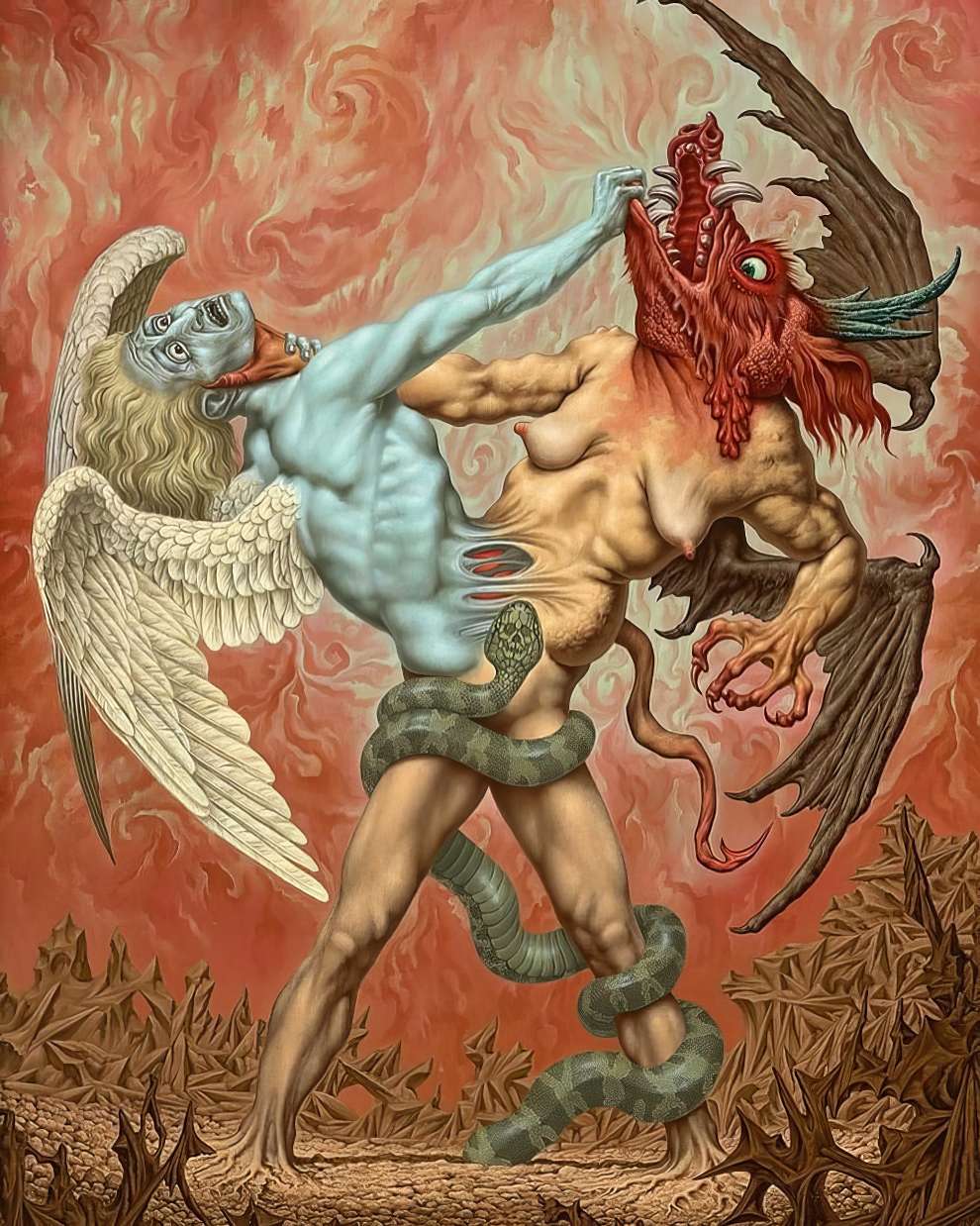
The Superb Dark and Occult Art of Dylan Garrett Smith
Dylan Garrett Smith’s illustrations blend occult themes with natural elements, using materials like ashes, chalk-lead, and black cotton rag paper. Continue reading »
Spectacular Macro-Winning Photos From The British Photography Awards
Winner: “The Next Generation” by Lee Frost
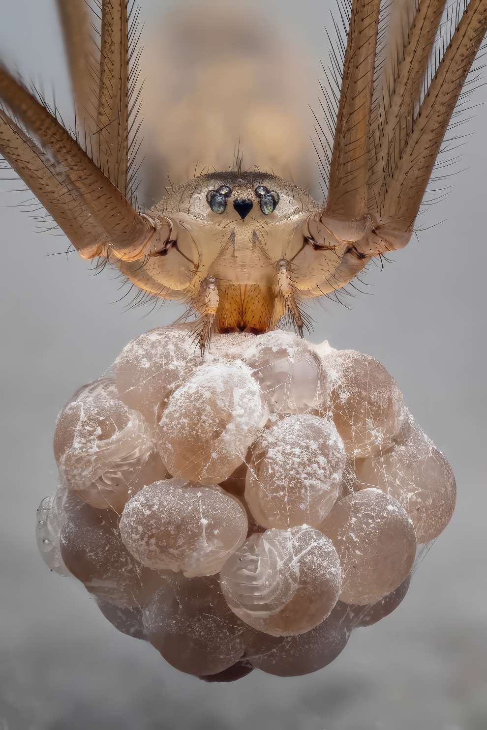
The British Photography Awards 2023 recently highlighted a captivating collection of macro photography winners, revealing the stunning details hidden in the small wonders of our world. From dew-covered petals to the intricate structure of leaves, these images showcase a rarely seen universe of vibrant colors and textures. Continue reading »
Typical Friday Night at KFC, According To AI

Ever wondered what goes through an AI’s circuits on a typical Friday night at KFC? Dive into the artificial mind as we explore its quirky take on the antics of KFC patrons and staff. Continue reading »
The Art of Nicole Duennebier, Including Her Works of Ruffs, Pearls, and Rotten First-Fruits
Nicole Duennebier’s vibrant works meld 17th- and 18th-century aristocratic portraits with vanitas still lifes and biological illustrations of deep-sea or microscopic life. Continue reading »
This Artist Creates Altered Photographs of Landscapes that Are Sure to Make You Scratch Your Head
The Turkish artist who creates one-of-a-kind and mind-blowing images is going to take us on a journey into surrealism via his eyes. Continue reading »
The Lotus Esprit S1, Known as “Wet Nellie,” Was Featured in The James Bond Film “The Spy Who Loved Me,” and These Photographs Are Really Breathtaking
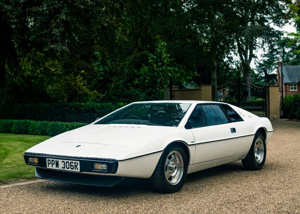
The Lotus Esprit S1 was used in the 1977 James Bond film The Spy Who Loved Me, where it was affectionately dubbed “Wet Nellie.” This “car-submarine” became an iconic Bond vehicle, with its ability to transform from a car into a working submarine capturing the public’s imagination. Continue reading »
Illustrations from “Potjeh” by Ivana Brlić-Mažuranić, 1975
”The story is about a grandfather and his three grandchildren. They have to choose between good and evil where good represents the god Svarozic who is the son of the god Svarog. The evil represents the master of anger. His name was Bjesomar. The purpose of these stories is to find the meaning of what one’s heart desires.” Continue reading »
Graphic Designer Captures Pantone Hues Across Landscapes and Cities

Today, I would like to offer you the opportunity to observe how graphic designer Andrea Antoni (previously featured) interprets the world through the use of Pantone colors. Everyone has a different point of view on the world. Continue reading »
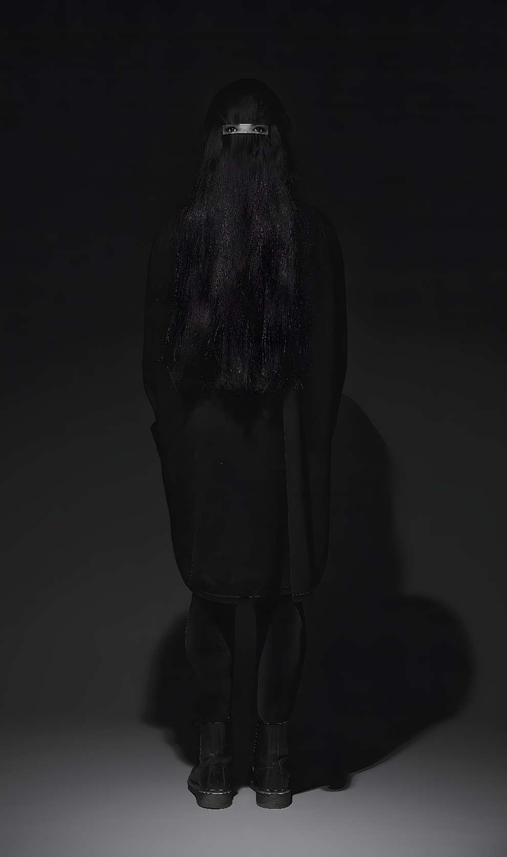
The Emotional and Poetic Portraits of Sena Adjovi
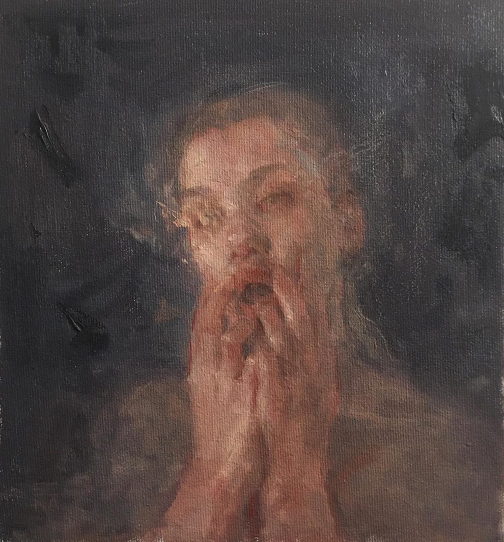
The ethereal portraits by Montreal artist Sena Adjovi evoke the cadence and resonance of poetry. Continue reading »
Spectral Transformations: The Macabre Masterpieces of Roberto Diaz’s Artworks
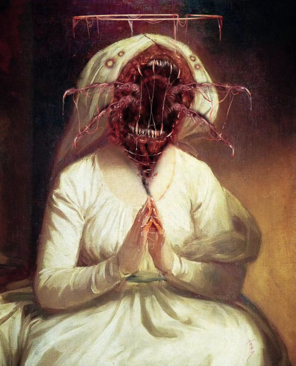
Roberto Diaz’s mixed-media art is both unsettling and captivating. Using a blend of traditional drawing and digital painting techniques, Diaz creates surreal portraits of historical figures marred by monstrous alterations. Continue reading »
The Unique Style of Jose Gallego Gallego’s Fallas Art
Jose Gallego Gallego, born on February 21, 1980, in Gandia, is a renowned Fallas artist. He began his career at the age of eighteen, apprenticing under notable artists like José Sanchis, Palacio, Serra, and Pere Baenas. Continue reading »
Artist Creates Adorable Tattoos Featuring Cute Animals And Creatures
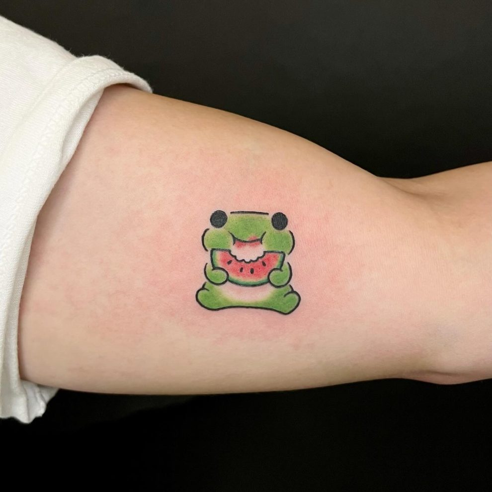
Prepare to be enchanted by Buoy’s delightful tattoo designs! Hailing from Seoul, Korea, Buoy’s creations showcase adorable animals, characters, and creatures that are sure to brighten your day. Continue reading »
Vibrant Color Photos Capture Young Women in Swimsuits in the 1960s

As the modest swimsuits of the 1950s faded into the past, the 1960s ushered in a new era of swimwear fashion. The once-demure two-piece bikini and the flashy one-piece bathing suit took center stage, captivating beachgoers and pool-party attendees alike. Continue reading »
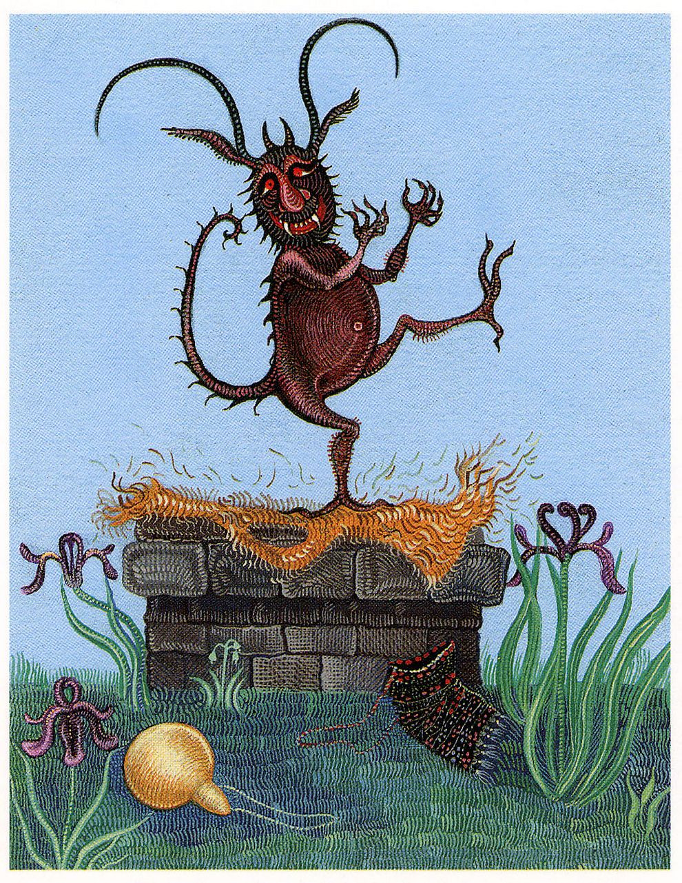
Organic Landscapes, Emblematic Narratives and The Surreal and Fantastic Visions of Johfra Bosschart
Johfra Bosschart, born Franciscus Johannes Gijsbertus van den Berg, was a Dutch pioneer of surrealism and fantastic realism. Continue reading »
Beautiful Clay Characters and Still Lifes by Irma Grunholz
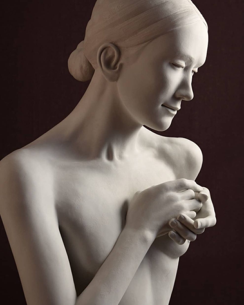
Irma Gruenholz, a three-dimensional illustrator and sculptor based in Madrid, Spain, engages in a creative process centered on hand-sculpted illustrations using clay and various materials to achieve three-dimensional effects. Continue reading »
Daniel Mróz, An Illustrator Behind The Stanisław Lem’s Sci-Fi Stories
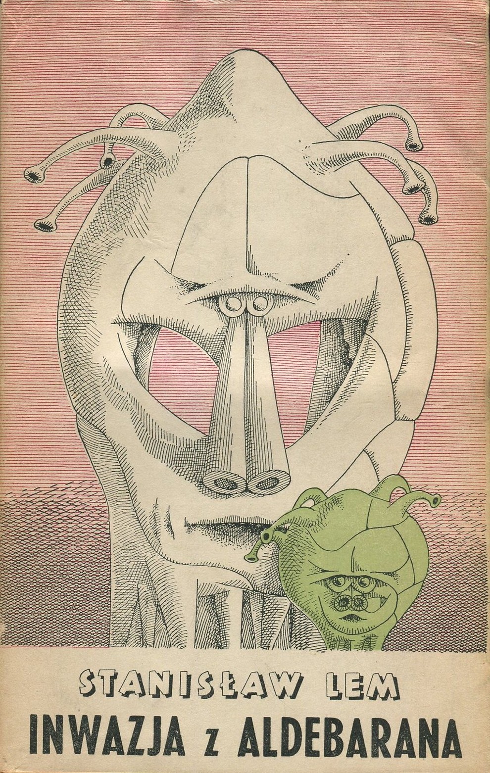
Daniel Mróz (born 3 February 1917 in Kraków; died 21 January 1993 in Kraków) – Polish stage designer and artist, illustrator of the science fiction books of Stanislaw Lem and of the unique, absurd writings of Sławomir Mrożek. Continue reading »