The Superb Hyper-Realistic Lifelike Paintings By Marco Grassi
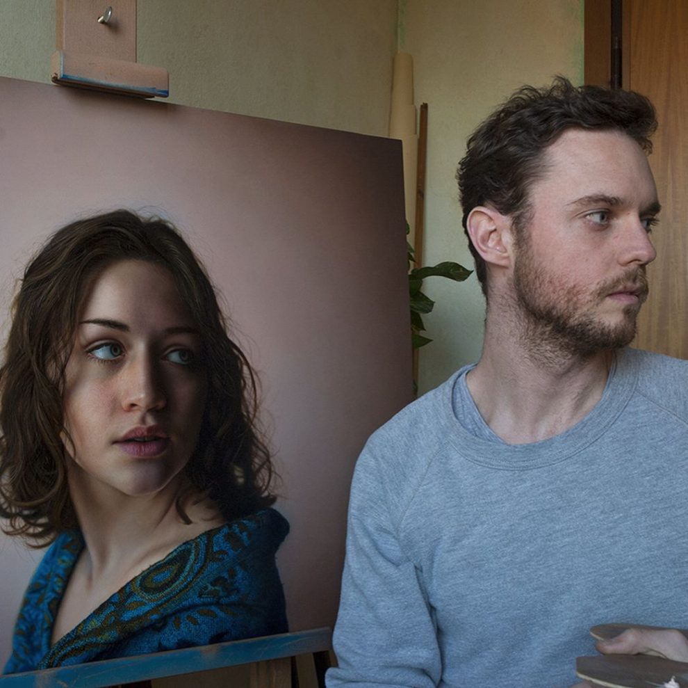
Marco Grassi, a talented artist from Italy, creates paintings so realistic they could easily be mistaken for photographs. However, what distinguishes Grassi is his distinctive approach: he infuses his portraits with surprising elements that blur the boundaries between reality and fantasy. Continue reading »
Artist Creates Abstract Environments Through Magical Realism-Inspired Conceptual Experiments
Artist Elnaz Mansouri, originally from Tehran, Iran, and now based in Canada, delves deeply into the interplay between reality and fantasy through her innovative use of 3D, AI and VR. Continue reading »
Meet KAZZILLA, a Feisty Fat Cat of Great Destruction! Ready to Invade and Destroy Hearts of Cat Slaves!
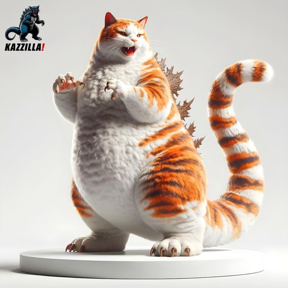
Meet Kazzilla 😹 It’s a Cattzilla figurine prototype created by a designer from Thailand “A feisty FAT CAT of great destruction! Ready to invade and destroy hearts of cat slaves!” says their tagline. Waiting for real figures! Continue reading »
The Ethereal Artistry and Haunting Hyperrealism in Photographs by Alexander Berdin-Lazursky
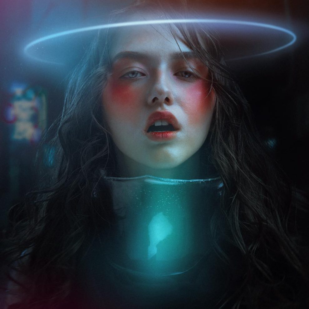
Alexander Berdin-Lazursky’s photography exudes a crisp elegance that is both striking and flawlessly beautiful. Continue reading »
Industry Logos as Vtuber Logos: There’s a Hilarious Challenge on Twitter

Some might think that vtubers logos are not created to be remembered as company logos and therefore it is a bit unfair to compare these two genres of logos, but there is no limit to creativity. That’s why Twitter has started another challenge where everyone can submit a famous logo in this silly style. Continue reading »
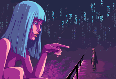
Never Drink Alone: A Visual Melancholic Journey Into Loneliness
In a world bustling with relentless activity, where solitude and introspection often find little sanctuary, the creative expression of a Twitter user known as @asocialdrinking stands out as a poignant counterflow. Through the lens of ai-generated art, @asocialdrinking brings to life melancholic scenes where lone individuals share moments of quietude with various characters. Continue reading »
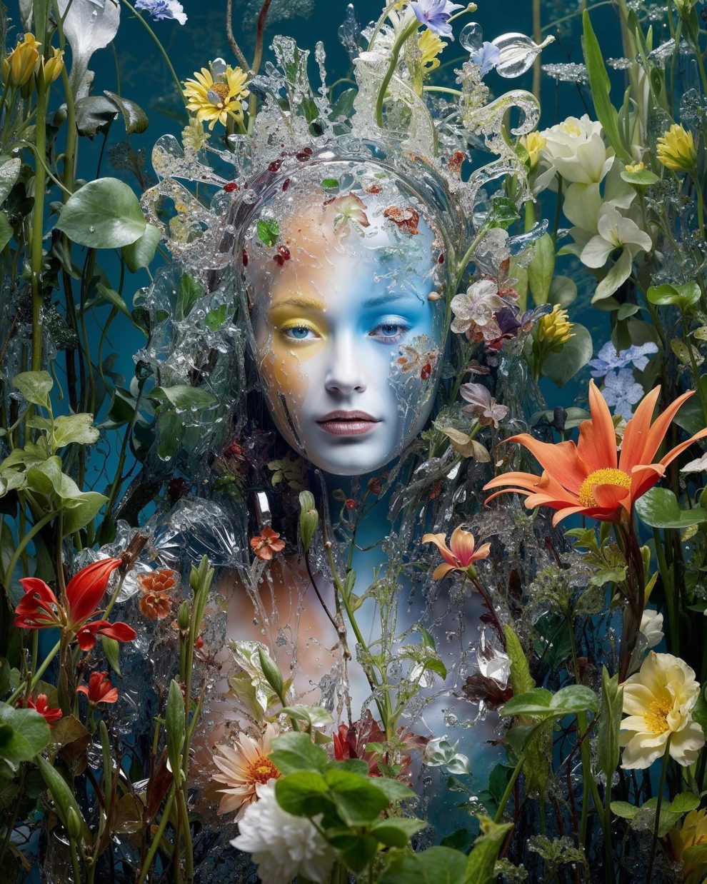
Phantasmal and Ethereal Works by Januz Miralles
Philippines-based artist Januz Miralles blends photo manipulation with traditional painting methods to produce ghostly and ethereal art. Continue reading »
Spectacular Wildlife Winning Photos From The British Photography Awards
Winner: Thirst by Tom Way
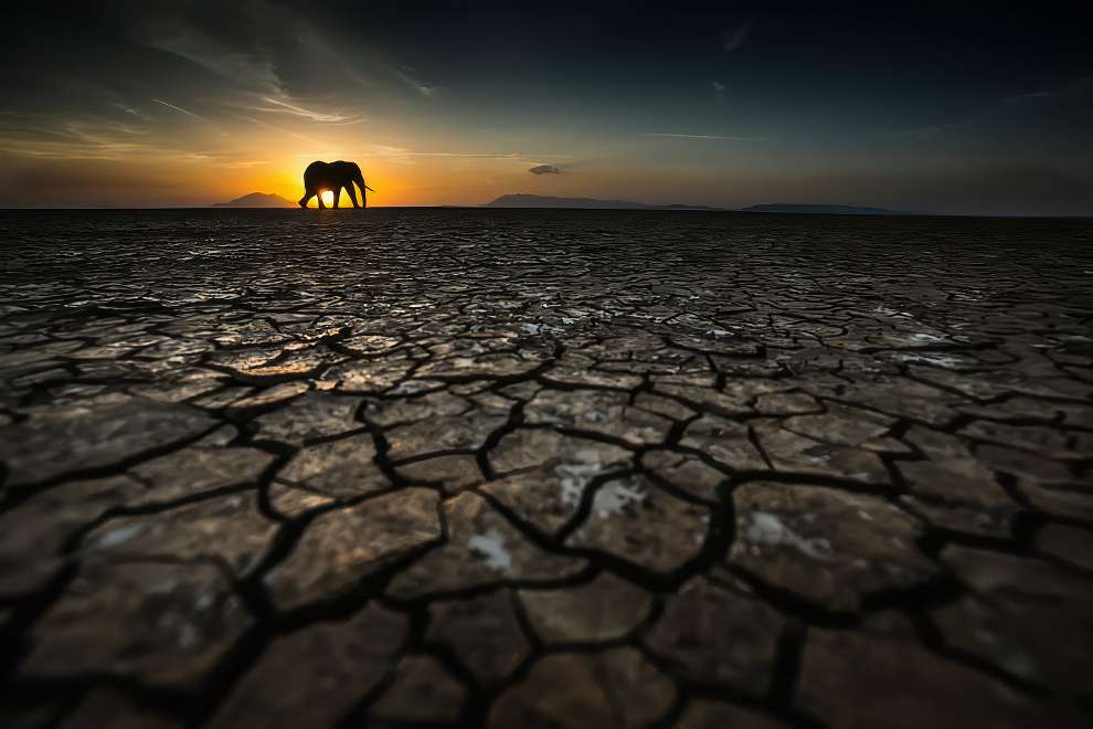
The British Photography Awards (BPA) 2023 showcases exceptional wildlife photography from the UK and beyond, highlighting the beauty of nature and promoting conservation. These awards celebrate photographers’ talent and encourage actions to protect wildlife for future generations. Continue reading »
Stunning Facade Design of The One River North Residence in Denver

In Denver’s vibrant River North (RiNo) district, a new architectural marvel, One River North Residences, has broken ground. Continue reading »
The Superb 1980s Hyper-Realistic Illustrations by Japanese Artist Masao Saito
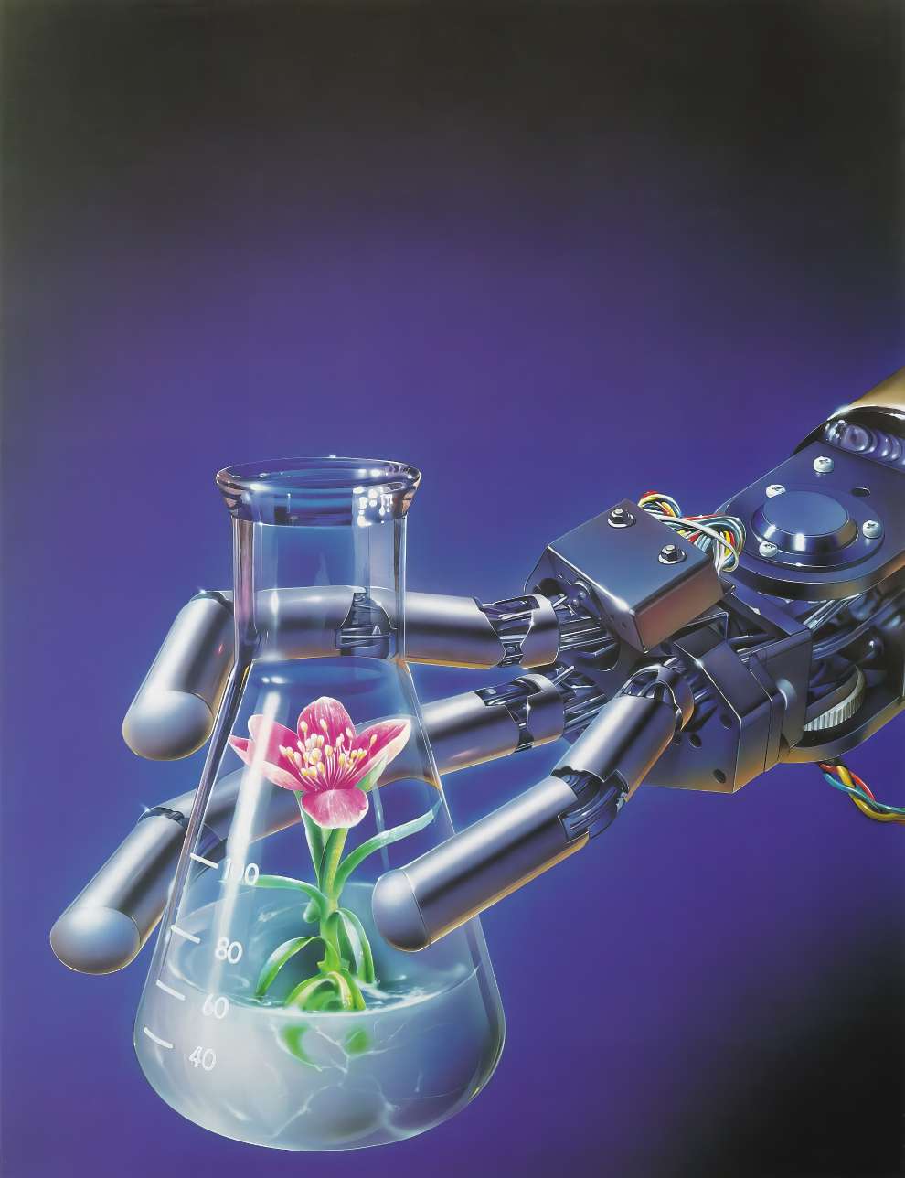
Masao Saito, the illustrator, is celebrated for his proficiency with the airbrush, a tool he has utilized to create images that are strikingly realistic, yet carry a dreamlike quality. Continue reading »
Photographer Captures Beautiful Photo Shoot of A Girl-Model and 1978 Lancia Sibilo
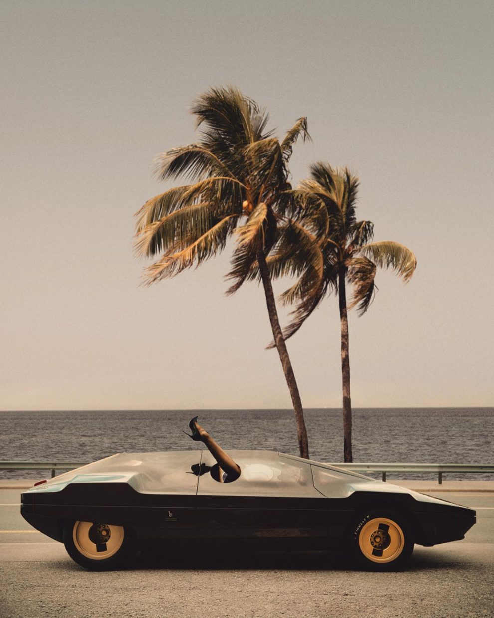
Photographer Camilo Rios White aka “RIOCAM” has shot a stunningly beautiful retro series, the main characters of which are a girl model and an incredible, fantastic Lancia Sibilo. Continue reading »
Baroque Baths and Rococo Ripples: The Art of Historical Pools Reimagined With AI
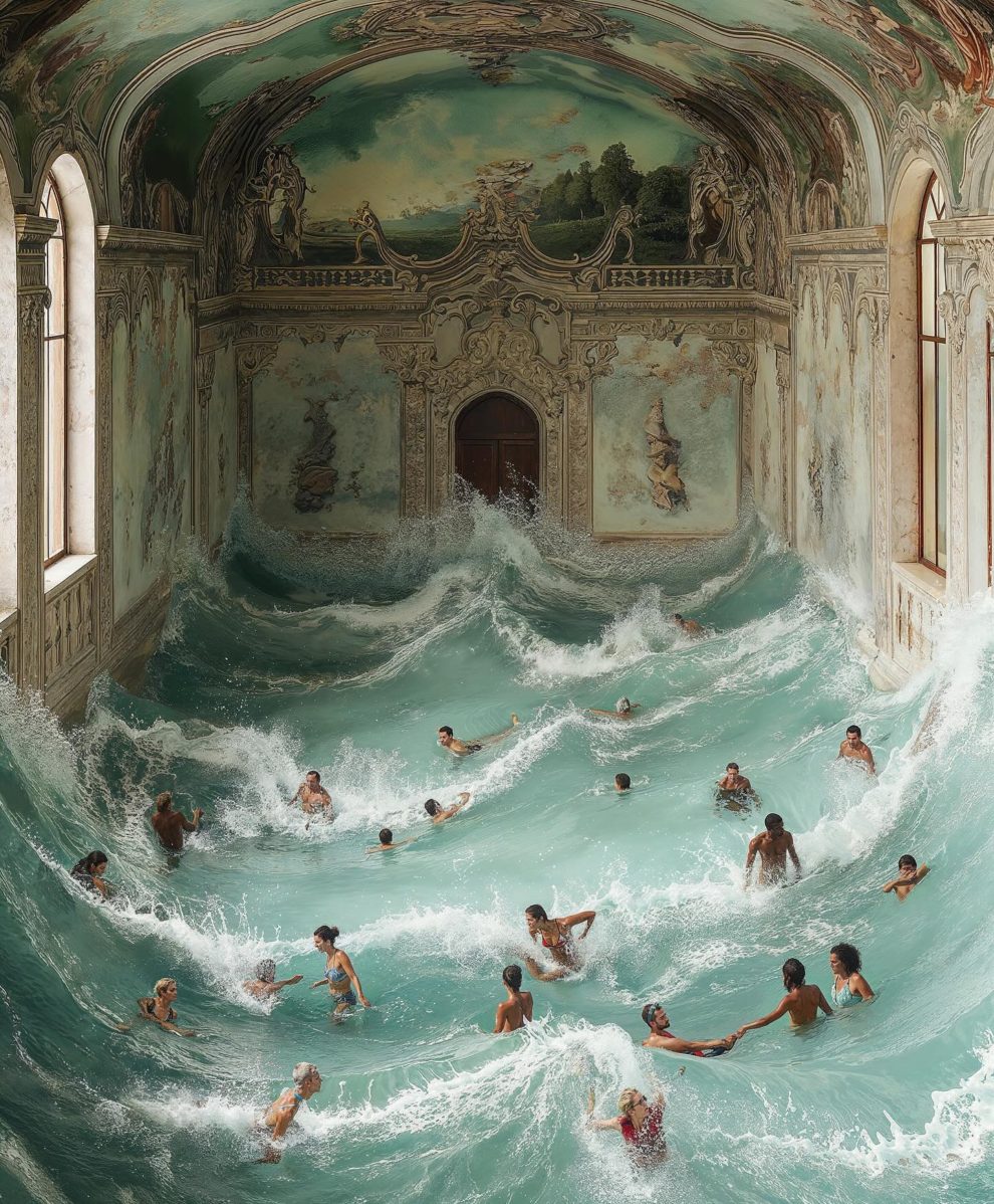
In a fascinating intersection of history and modern leisure, photographer Tomislav Marcijuš, utilizing the power of Midjourney, envisions what public swimming pools might have looked like had they been designed during the Baroque and Rococo periods. Continue reading »
Takahiro Miyashita’s Architectural Artistry in Hi-End Speaker Design
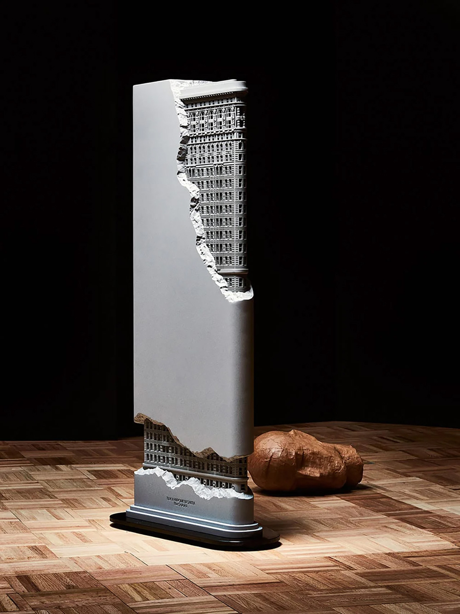
When fashion intersects with technology, it can lead to remarkable innovations. Celebrated fashion designer Takahiro Miyashita has branched into audio design, introducing a speaker that masterfully combines visual artistry with acoustic innovation. Continue reading »
AI Artist Combines Star Wars Imagery with the Creative Spirit of Burning Man
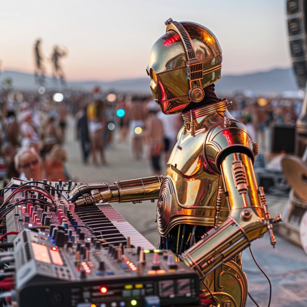
Peio Duhalde’s art project employs AI to blend iconic “Star Wars” characters with the Burning Man ethos, creating a realm of imaginative possibilities. Continue reading »
German Factory Introducing the ‘“Double-Lambretta”, 1953
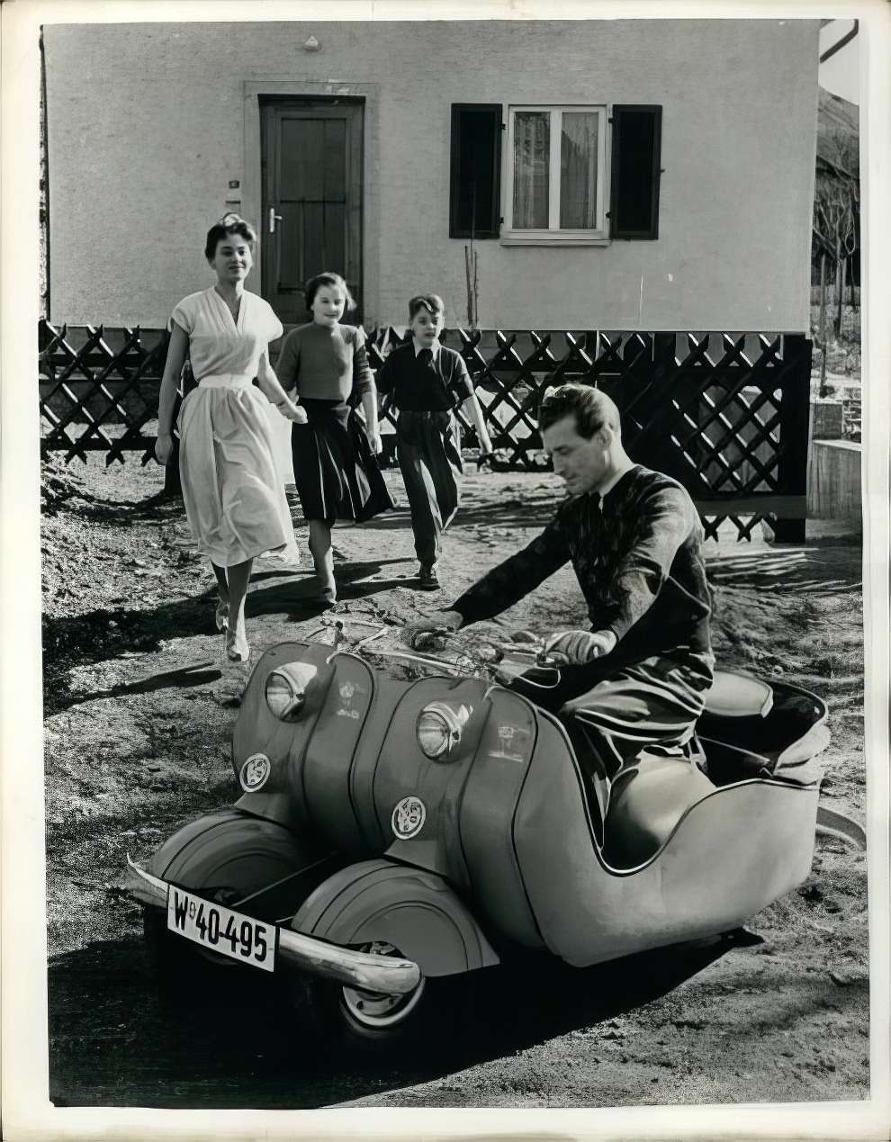
In 1953, the NSU factory in Dusseldorf, Germany, introduced the “Double-Lambretta.” Initially designed for young couples, this small motorcycle could be expanded by joining it with another Lambretta to accommodate a growing family, effectively transforming into a small car that could carry two adults and two children, achieving speeds of up to 78 km/h and a fuel efficiency of 3.4 liters per 100 km. Continue reading »
Spectacular Street Photography Winners From The Sony World Photography Awards 2024
Winner: Callie Eh, Malaysia
The 2024 Sony World Photography Awards have once again highlighted the extraordinary skill and imagination of street photographers worldwide. This year’s awardees have masterfully depicted the vibrancy of city living through their powerful and moving images, providing a window into the varied and energetic realm of street photography. Continue reading »
The Photographer Discovers the Most Stunningly Gorgeous Tree in Japan
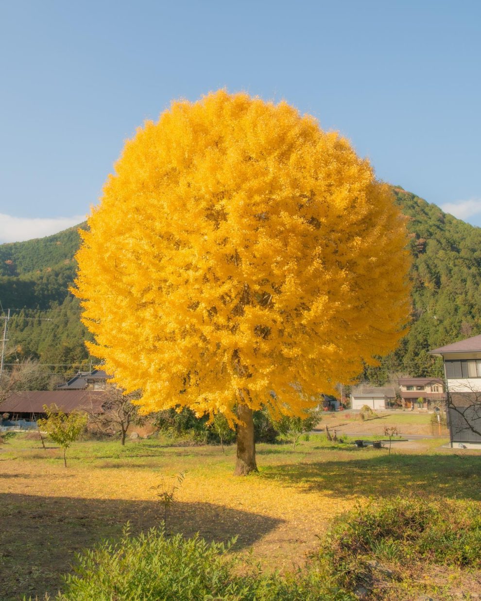
While fruit trees are known for their delicious bounty, the tree itself usually isn’t considered appetizing. Continue reading »
At the Moment that The Sun Is Shining, a Fountain in Italy Appears to Be Gushing out Lava
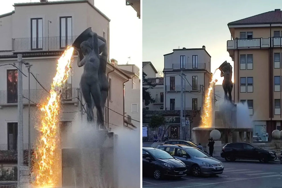
In 2009, L’Aquila, a city in central Italy, was devastated by an earthquake, resulting in extensive damage. Despite the destruction, the city embarked on a path of recovery and restoration. Continue reading »
Innovative Accessory Spotlight: The Hair Clip That’s Turning Heads With Realistic Eyes
Ever wished for eyes on the back of your head? Now, with the ingenious and slightly eerie hair clip by Humans Since 1982, you can have just that. Continue reading »
Artist Crafts Imaginative Illustrations Transforming Common Items into Novel Creations
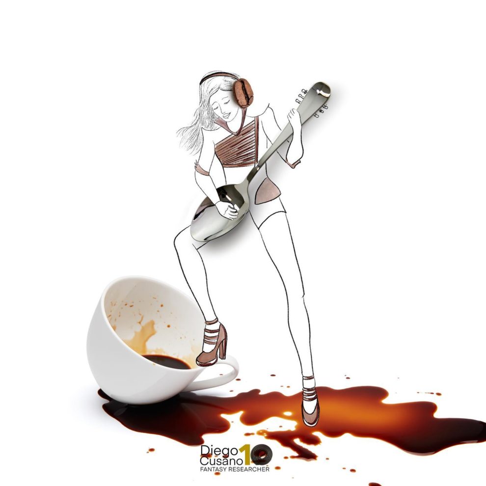
With age, many of us start to ignore the simple pleasures in life, but individuals like Diego Cusano (previously featured), the “Fantasy Researcher” from Italy, keep their sense of childlike wonder alive. Continue reading »
Horrible Photographs of Damaged Cars From the 1994 Northridge Earthquake
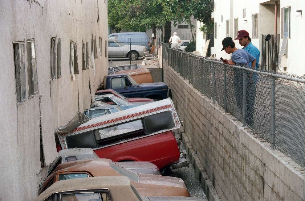
The 1994 Northridge earthquake struck the San Fernando Valley in southern California on January 17, becoming the most destructive quake in the state since the 1906 San Francisco earthquake and the costliest in U.S. history. Continue reading »
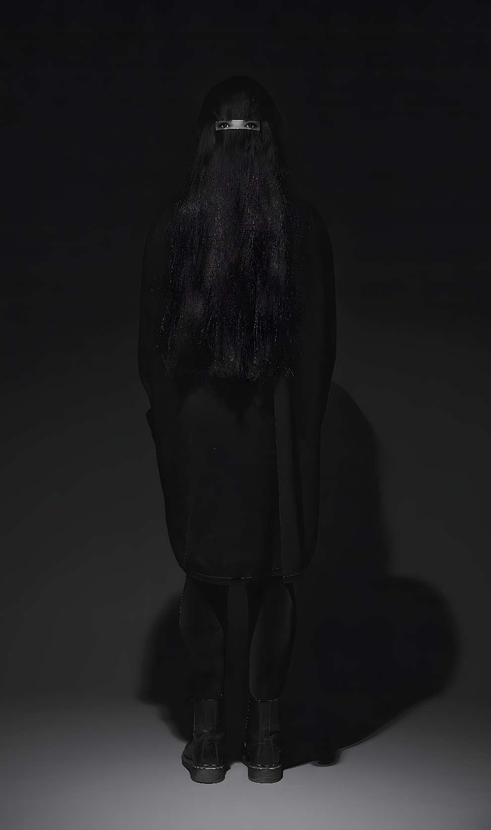
The Superb Dark and Occult Art of Dylan Garrett Smith
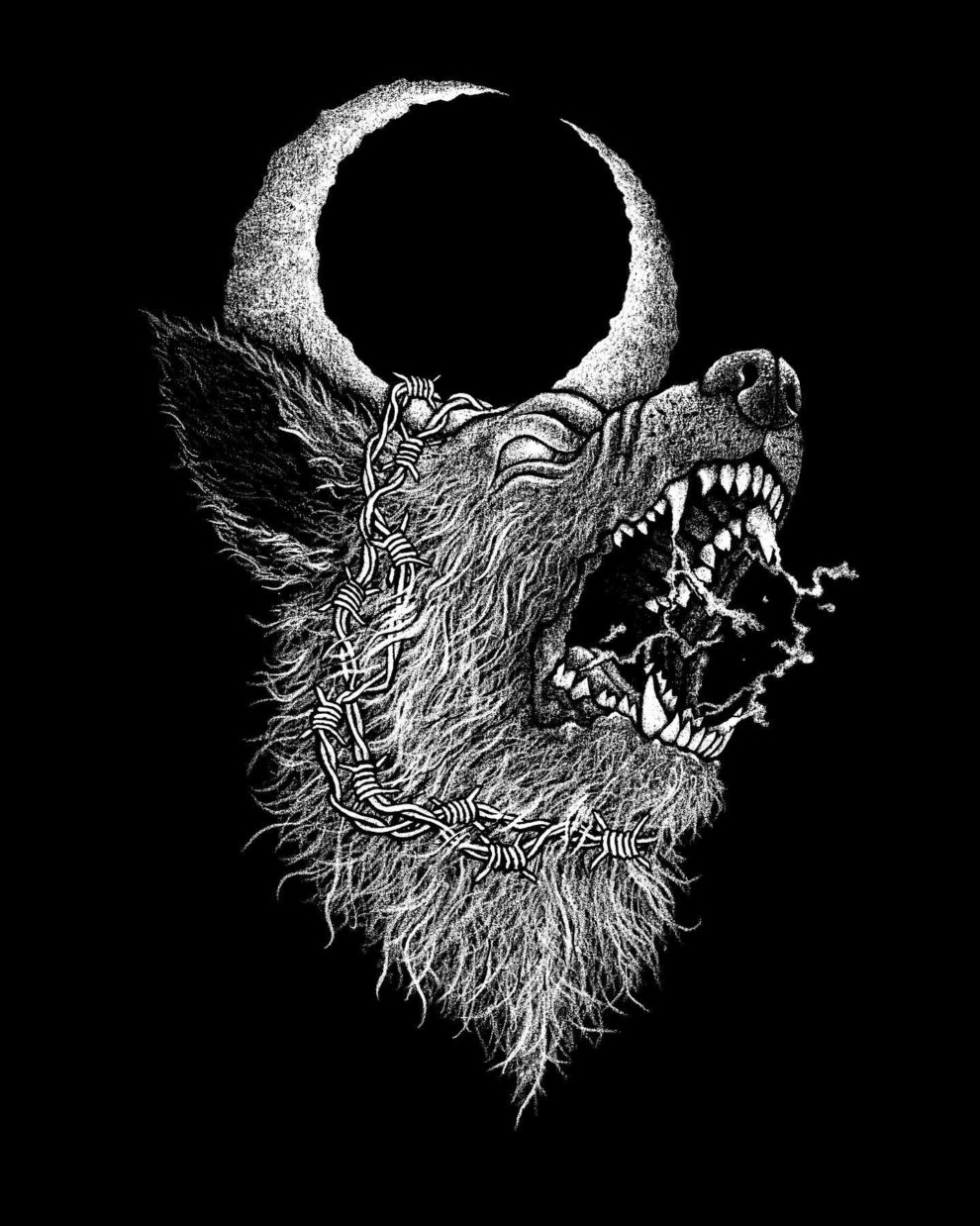
Dylan Garrett Smith’s illustrations blend occult themes with natural elements, using materials like ashes, chalk-lead, and black cotton rag paper. Continue reading »
Spectacular Macro-Winning Photos From The British Photography Awards
Winner: “The Next Generation” by Lee Frost
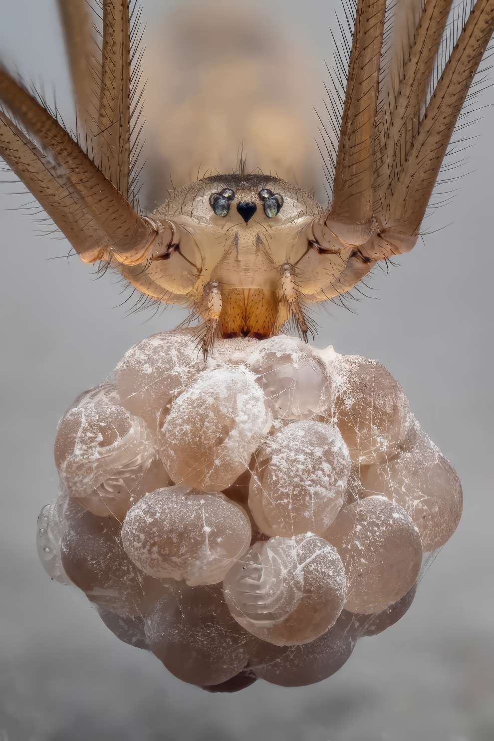
The British Photography Awards 2023 recently highlighted a captivating collection of macro photography winners, revealing the stunning details hidden in the small wonders of our world. From dew-covered petals to the intricate structure of leaves, these images showcase a rarely seen universe of vibrant colors and textures. Continue reading »
Typical Friday Night at KFC, According To AI
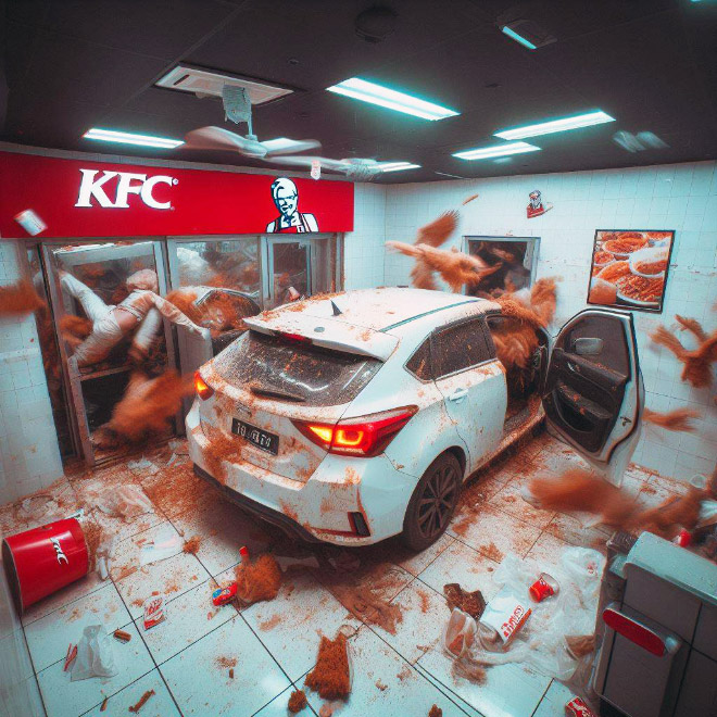
Ever wondered what goes through an AI’s circuits on a typical Friday night at KFC? Dive into the artificial mind as we explore its quirky take on the antics of KFC patrons and staff. Continue reading »
The Art of Nicole Duennebier, Including Her Works of Ruffs, Pearls, and Rotten First-Fruits
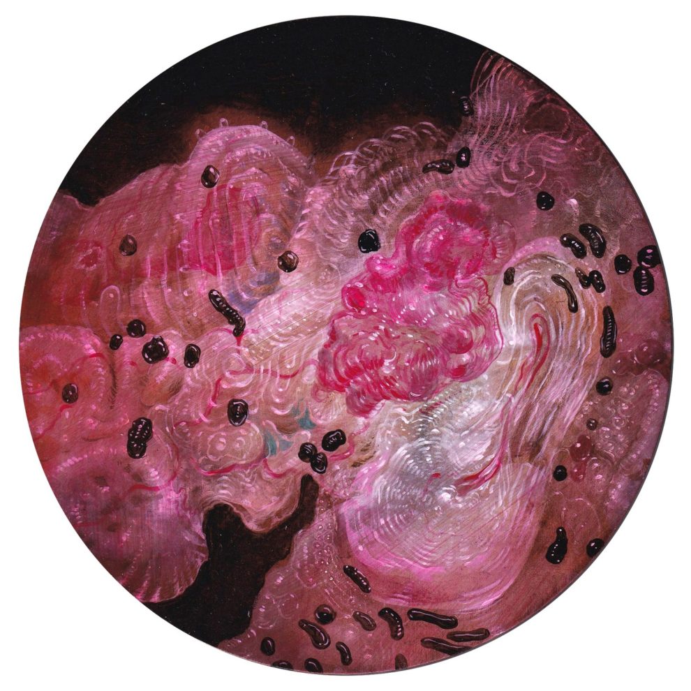
Nicole Duennebier’s vibrant works meld 17th- and 18th-century aristocratic portraits with vanitas still lifes and biological illustrations of deep-sea or microscopic life. Continue reading »