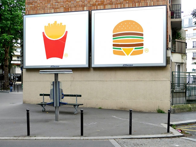
McDonald’s Unveils the Simplest Ads It’s Ever Made

Last summer, #TBWA Paris unveiled a bold campaign for #McDonald’s that consisted entirely of classic menu items photographed up close—with no branding at all. (Did somebody say McDonald’s? Not in those ads.)
Now, agency and client are back with a follow-up campaign that, in a way, is even more minimalist. Instead of the actual products, now we get clean, simple drawings of the products—turning them into actual icons. There is a bit more explicit branding on these, though, but it’s still very subtle—a tiny Golden Arches next to the illustrations.
Continue reading »

