Logo Artist Redesigns Iconic Brand Logos
According to Kwaku Amprako, an independent graphic designer, and logo design specialist: “I am a Graphic Designer based in London, my home for the past 20+ years. Since the start of my career, I have provided logo design and identity services. I have a deep passion for all things simple and modern. I pride myself in producing quality work for my clients. Continue reading »
The Designer Reveals His Suggestions for Redesigning Famous Brands
French designer Kévin Royer plays with different redesigns of famous (and not so famous) global brands. You can judge how good he is at it, see his works in his Instagram. Continue reading »
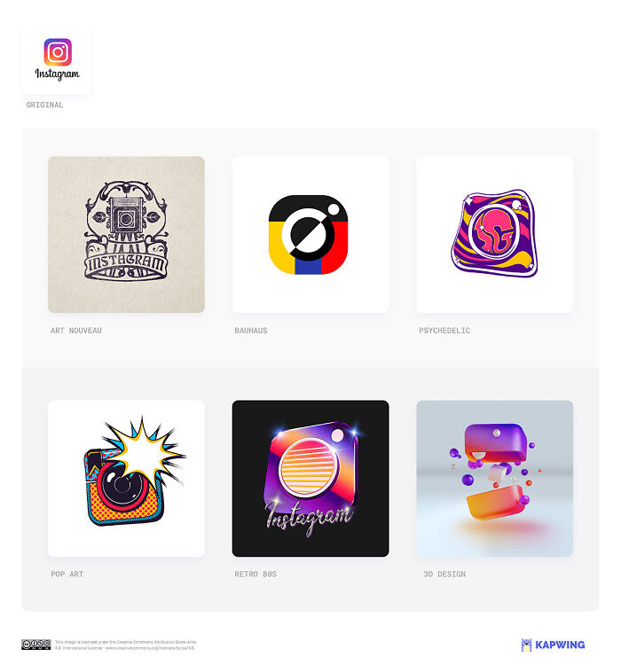
These Designers Remade Iconic Logos In Different Styles, And Here Are The Results
When talking logos, there are some that immediately pop into our heads as they’ve aged like fine wine and gained worldwide recognition. It’s difficult to imagine Apple, McDonald’s, or Google’s logos as anything other than what they are now, but it sure sounds entertaining. Continue reading »
25 Redesigns Of Famous Logos And Some Of Them Are Better Than The Original
Famous designers and artists sharing their redesign concepts of famous logos in Dribbble and Behance and they are really stunning and some of them are better than the original logo. my favorite redesigned logo is Google Maps, its really good how they blend “G” as a map symbol. Tell us your favorite logos in our comment section. Continue reading »
Italian Graphic Designer Emanuele Abrate Perfectly Fixes The ‘World’s Worst Logos’
A brand logo can make it or break it in the big game. Just look at the most iconic ones—from Apple to Nike, there’s something genius, yet so simple about them. But that’s an exception rather than a rule. Continue reading »
Artist Redesignes Celebrities, Cartoon And Comic Characters To Look More “Serious”
According to Kostis Pavlou: “Comic book and cartoon characters are an integral part of our lives. We grew up with them, loved them, made them friends, and in some cases still enjoy their company. We have learned to recognize them immediately by their voice, some of their special features (big ears, funny noses, etc.), and even by their dress. Continue reading »
Graphic Designers Remade Old Buildings Around The World By Using Trends Of The 21st Century
At the very beginning, people developed architecture according to their needs. Protection from the elements and other dangers was the main reason for building a shelter. Over time, other aspects became important too, like seeing from inside the house, being more comfortable, the house looking better. The city also became part of the home. Interior and exterior design became more and more important.
Due to lack of knowledge and materials, the houses were stumpy, the windows were small, walls thick and crooked. However, people learned. The windows became bigger, the walls – slicker, and the overall design – more elegant and beautiful.
SSo what would be the next step in home design? These designers asked the same question and created a series of CG renderings to renovate six old houses from the 21st century, using current and future house design trends.
Turf Houses Renovated (Iceland)
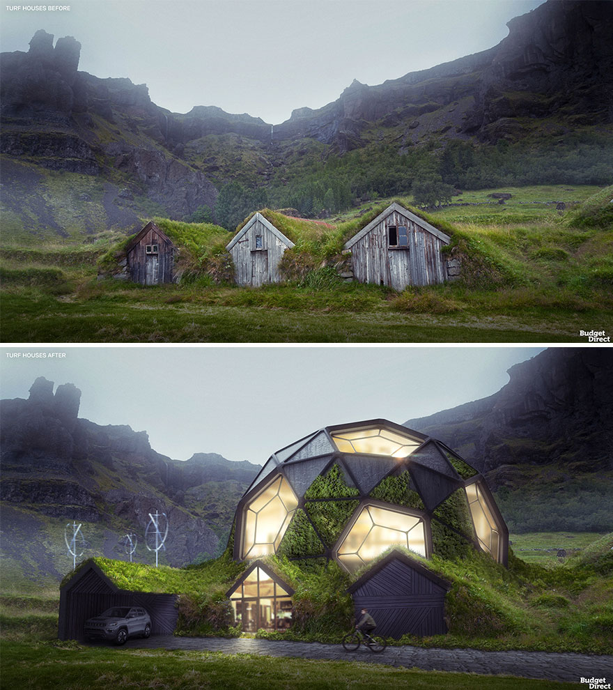
An Icelandic turf house consists of a wooden frame stuffed with blocks of turf (grass still embedded in the earth) on a stone foundation. Only the front around the doorway is bared. The entrance leads to a big hall (sometimes via an antechamber) with a firepit in the middle. Our renovated turf house complex plays with the ‘badly hidden’ appearance of traditional turf houses, which seem to sink back into the landscape. The steel-frame dome looks partly natural yet completely alien. Panels of turf and timber alternate with glass windows, using reflections to create an improbable, angular mound of grass, wood, and… clouds! In a subtler touch, the wooden planks that form the facades have been rearranged at decorative angles. Continue reading »
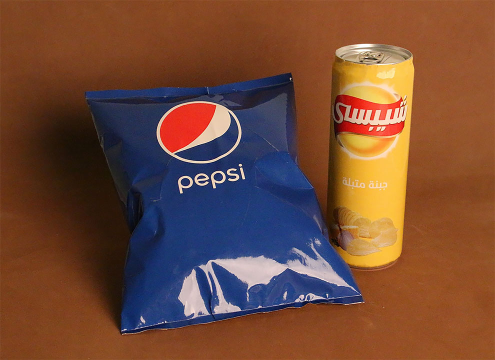
Artist Redesigned Famous Logos, Printed Them Out And Repackaged Them In A Way That Will Mess With Your Head … In A Good Way
Egyptian Ahmed Morshedi is an art director by profession and creates some very interesting art as well. Continue reading »
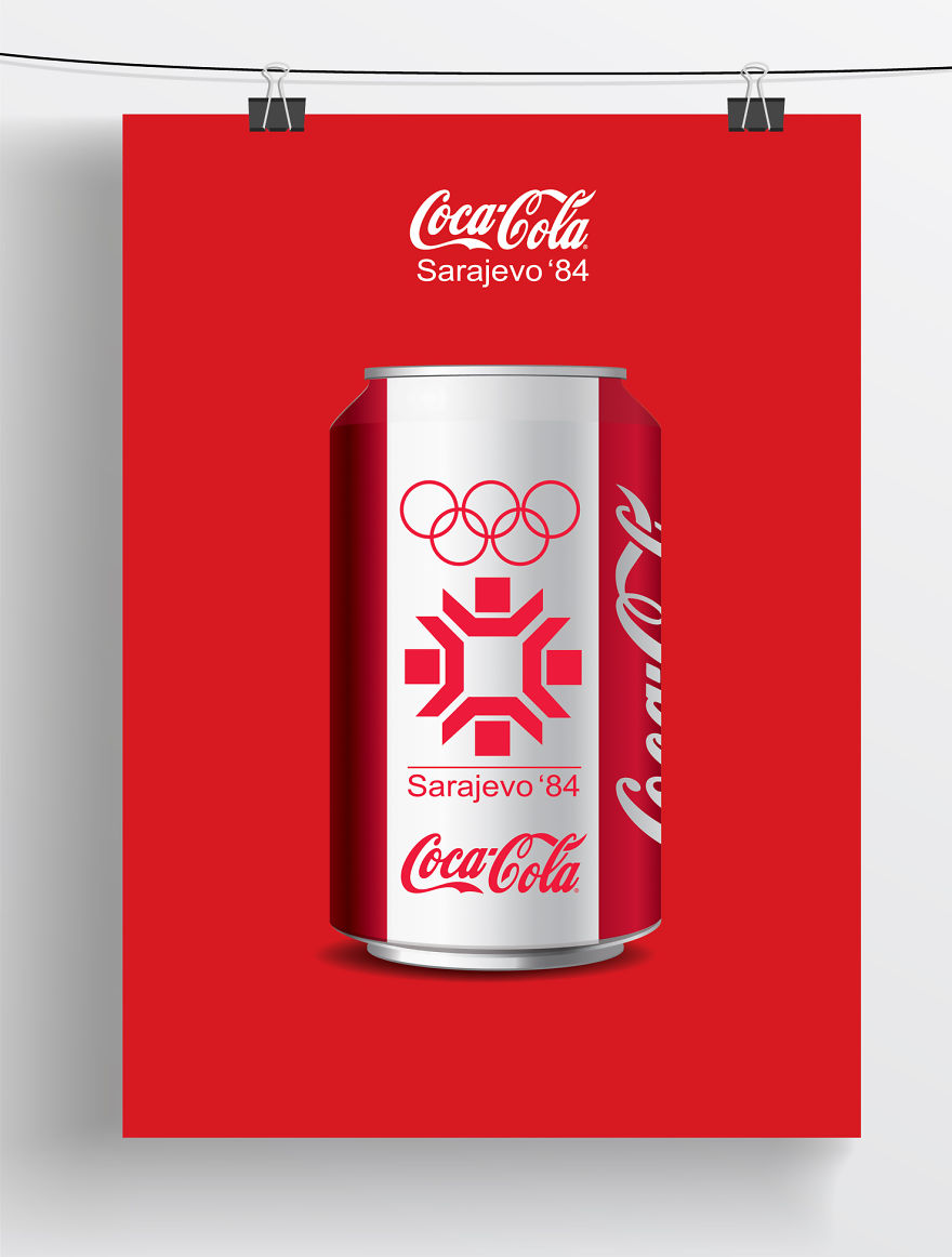
Artist Redesigned Famous Yugoslavian Posters To Bring Back Good Memories
Graphic designer Zoran Cardula from Macedonia, Skopje, in his own way paid tribute to the Yugoslav design, and some of the most popular brands and visuals from the time of the former state. Continue reading »
Clever Redesign Of McDonald’s Takeaway Bag Lets You Eat A Big Mac Without Mess Read
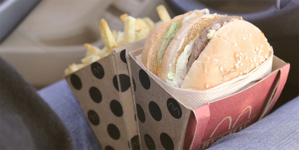
Design student Jessica Stoll, from Arizona State University, has created a packaging redesign concept for McDonald’s Big Mac, which not only looks like a delightful Happy Meal for adults, but also reduces mess when eating on-the-go. Continue reading »
Absolut Looks to Create an Icon for the Future with Bottle Redesign
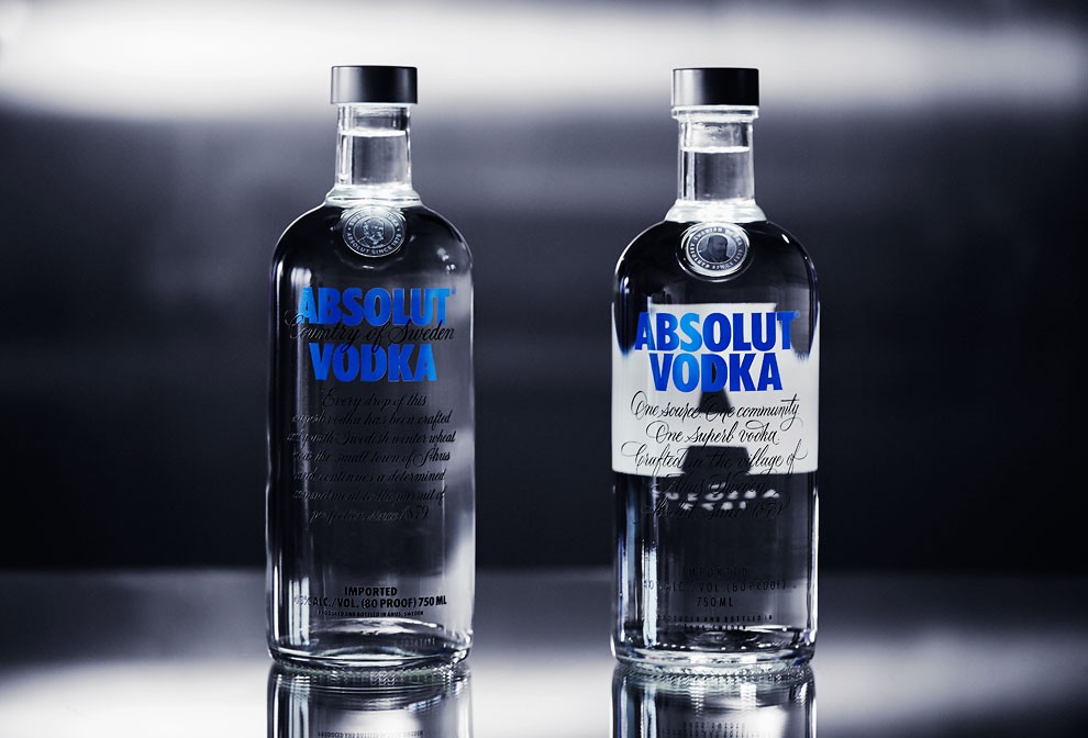
This year, Absolut looks to the future and makes a new mark by introducing a freshly redesigned bottle – an icon for the future made by a passionate group of creatives who push boundaries in their pursuit of perfection. Continue reading »
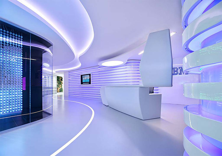
Stunning, Futuristic Redesign of IBM’s Office Buildings
Let’s have a look at IBM’s new high tech office buildings in Rome, Italy. They’ve been entirely renovated and largely expanded to give this amazing futuristic-like environment full of LEDs. Continue reading »
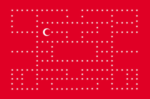
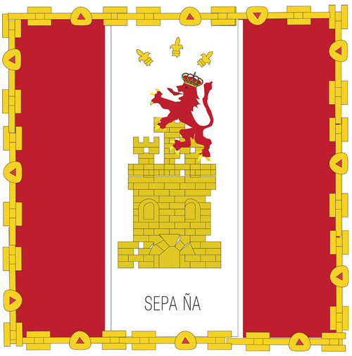
Don’t like your country’s flag? Redesign!
Cool mashup idea of Las Fg project and its creator Gabriel Medeiros – pick a flag and redesign it the way you want. Try, it’s fun.
