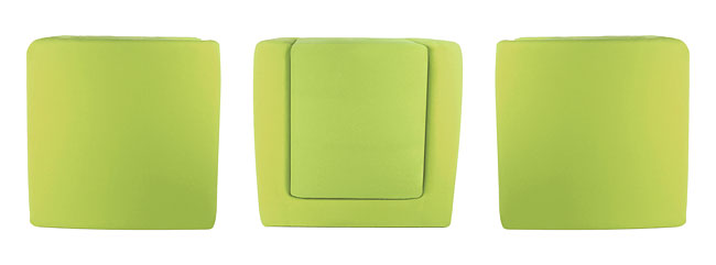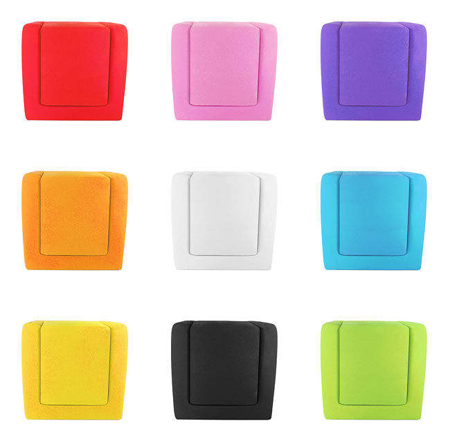
Less Armchair
This armchair pushes the boundaries of product design. It was born by lots of questions and philosophizing. What is the design or art? What is beautiful and what is ugly? How far we can go? What we call well-designed product? If something is simple , is it beautiful as well? Why? If less is more,a little is much? How does the simplest armchair look like?
When we sit in the Less armchair, the minimal cube design become more by us and by creases. So the less become more and the questions are answered. This is a proof that the less can be more. Designed by Attila Jónás.
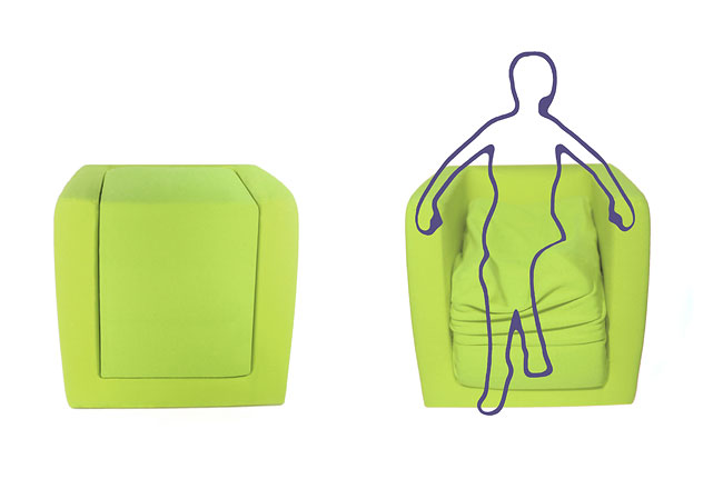
This project won a Bronze A’ Design Award at A’ Design Award and Competition 2012-2013.
More Inspiring Stories
Palais Namaskar: Luxury Hotel & Spa in Marrakech
City Never Sleeps by PIXERS
Eurostar 'Paris - London' Interior Design
Cat Ghost
Surface View: A Wallcovering with a Difference
Star Trek Theme Apartment
The Standing Broom
Manta 2.0 / Ray of Light
Wood Casting by Hilla Shamia
Weston Homes Create “Lego Children's Room” to Assist with Marketing Houses to Families
Underneath
Thompson Avenue in Alameda, California, becomes “Christmas Lane” with Holiday Lights
Invisible Hieroglyphics
Shelves
Giant Skull Armchair Designed By Gregory Besson
Designer Gregory Kloehn Turns a Dumpster into a Cozy Home in NYC
Inspiration is a Woman Collection by PIXERS
The Power of Imagination
Indoor Pool at the Hotel Catell dels Hams
Magnetic Wallpaper By Sian Zeng
Knelt Desk and Seat for Children by Ubiquity Design Studio
Mood Mug
Ocean’s Edge Table
Panajachel Ceiling Lamp