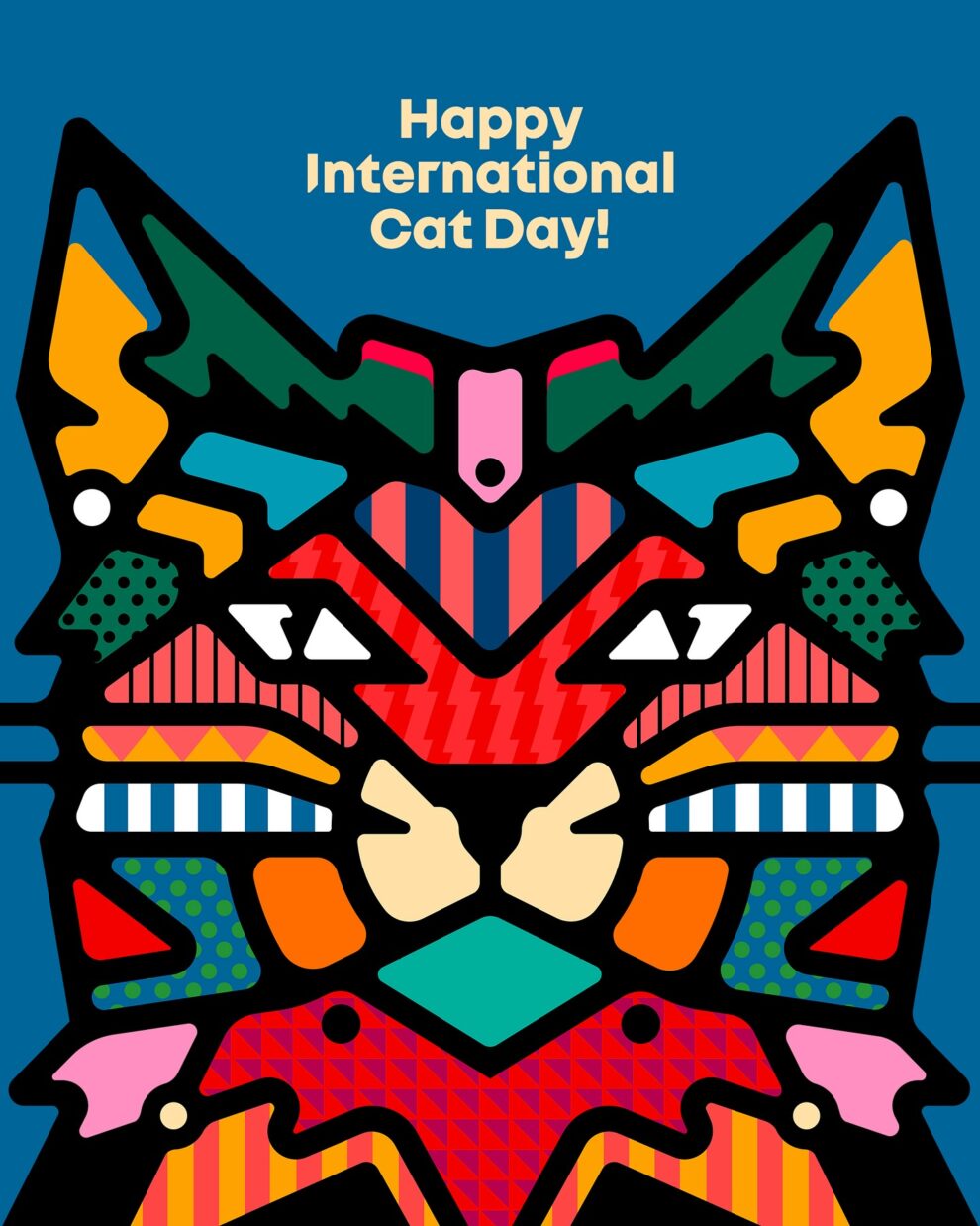
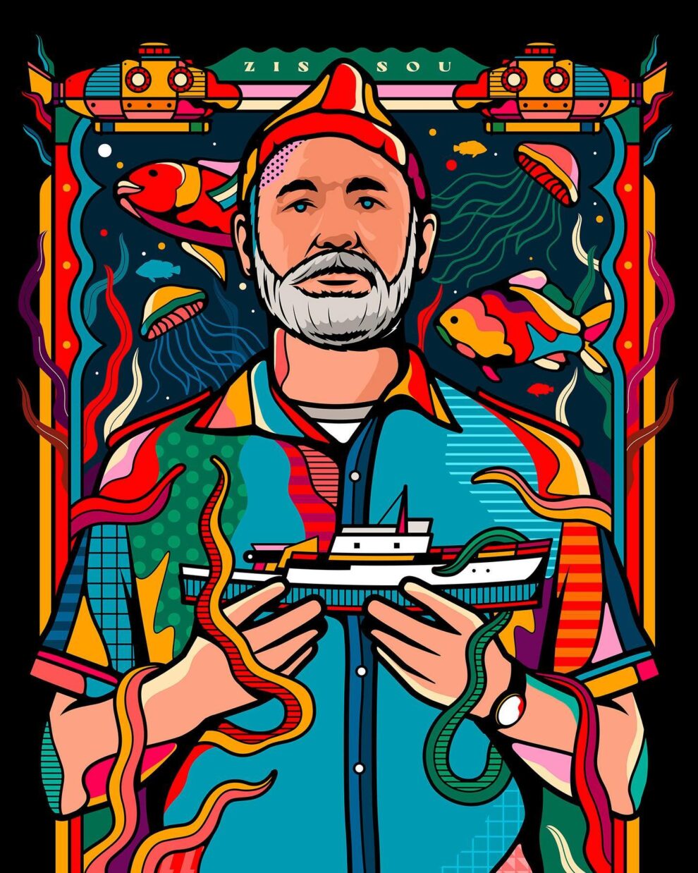
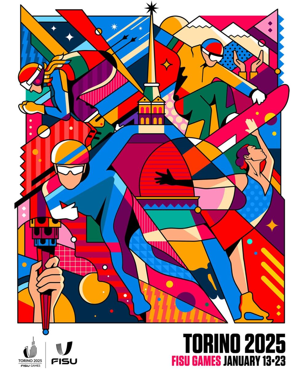
Italian Duo Creates Neon, Stained‑glass Pop Illustrations With Thick Black Lines And Explosive Colour Reimagining Cult Movies And Icons

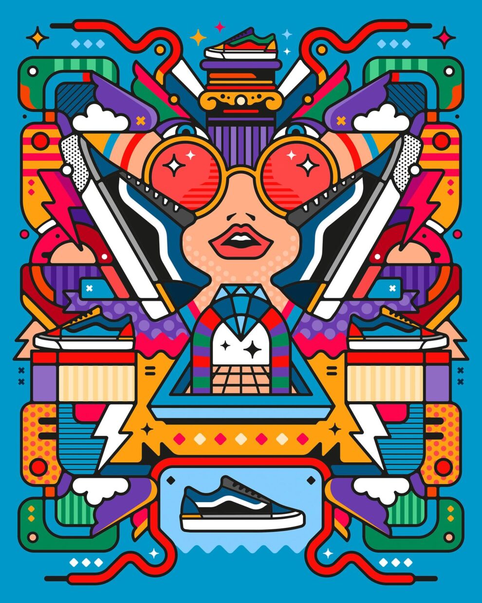
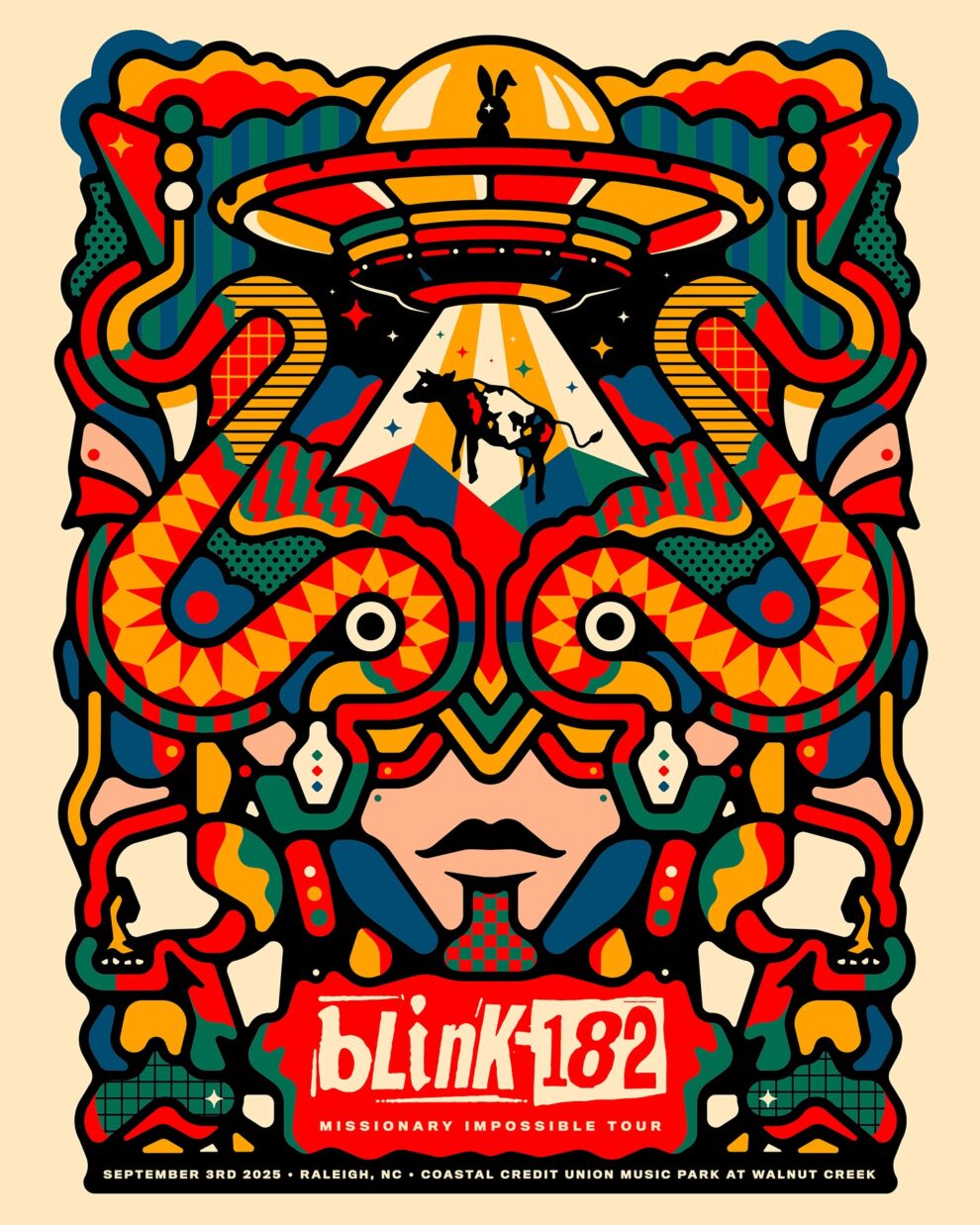
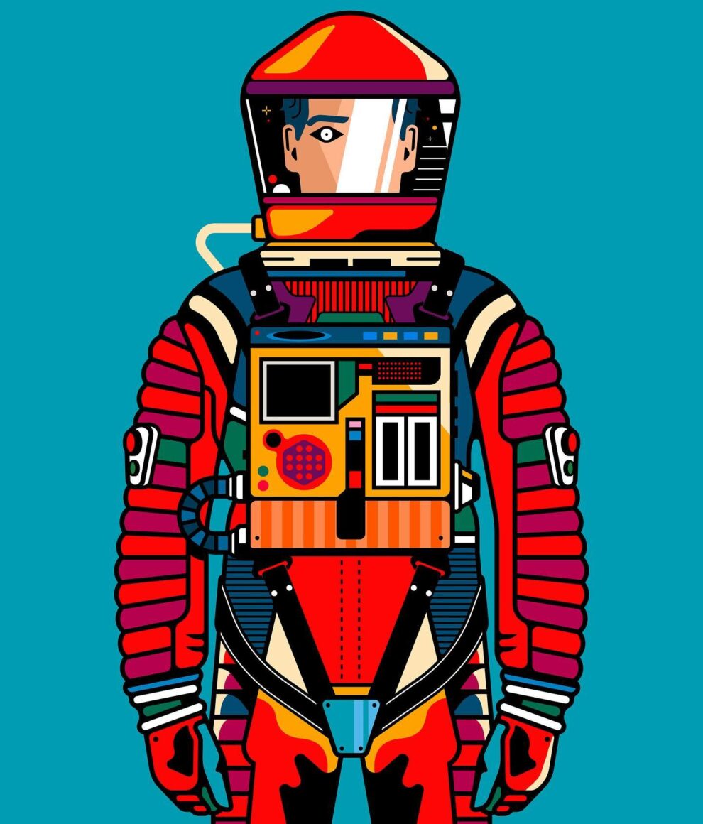
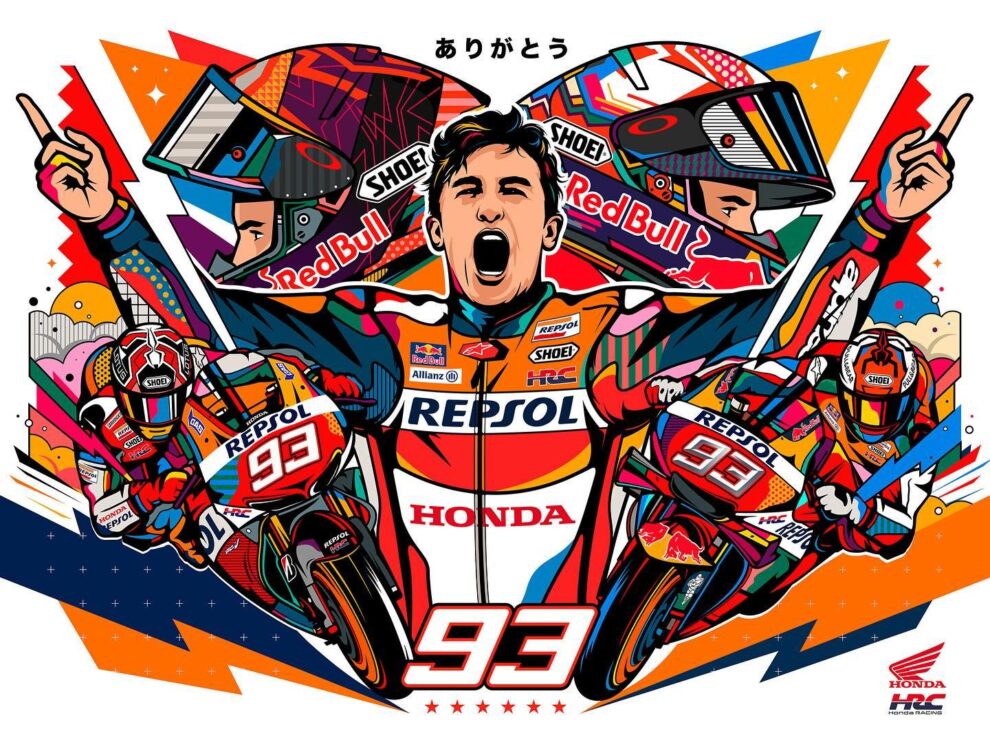
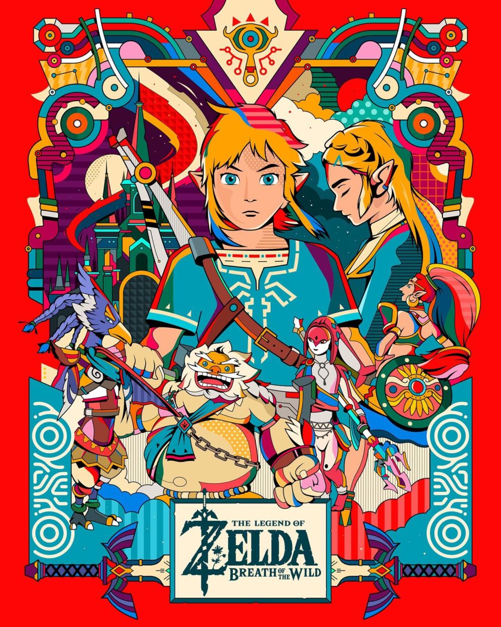
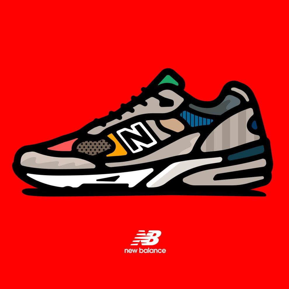
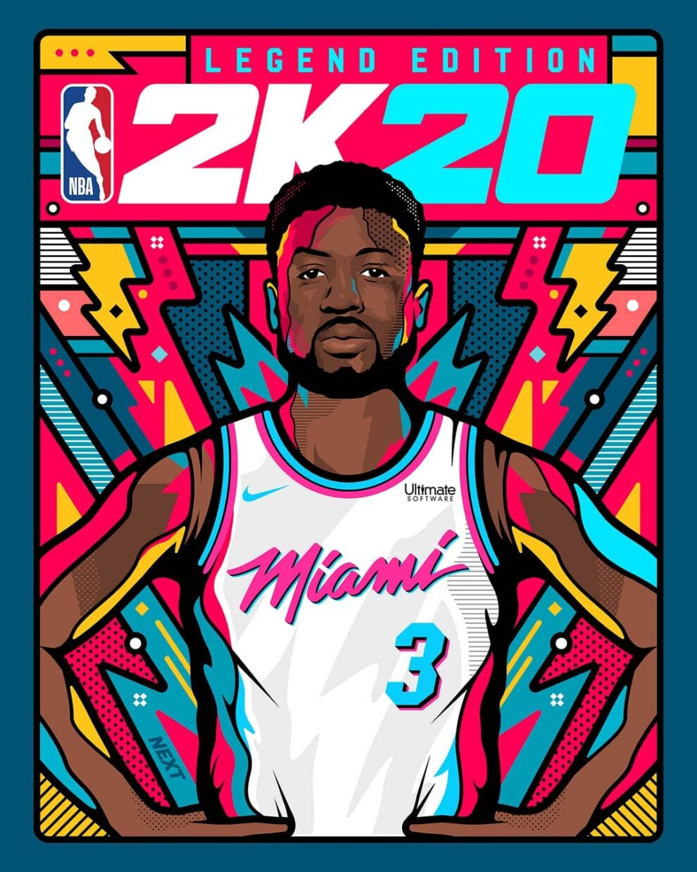
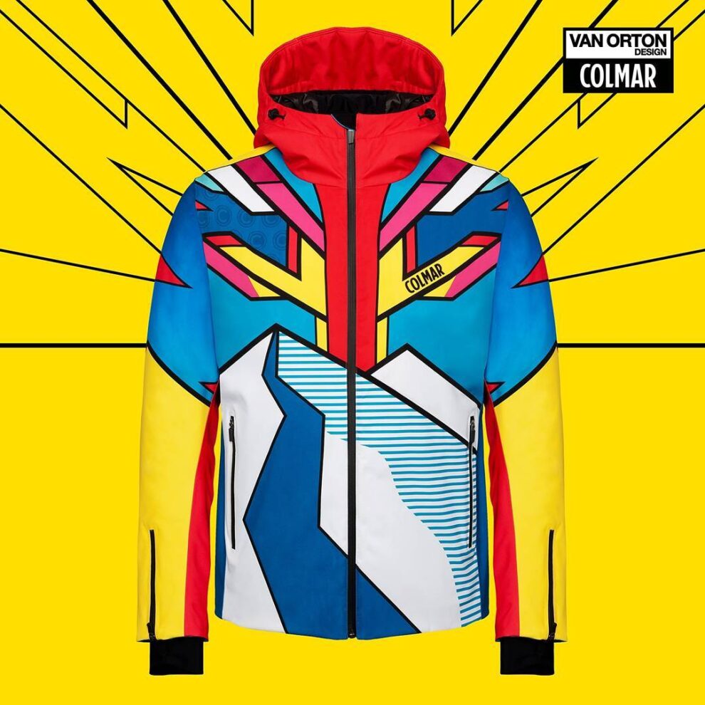
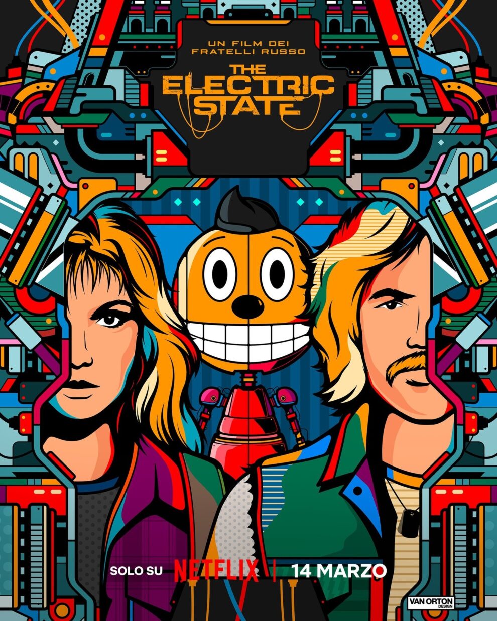
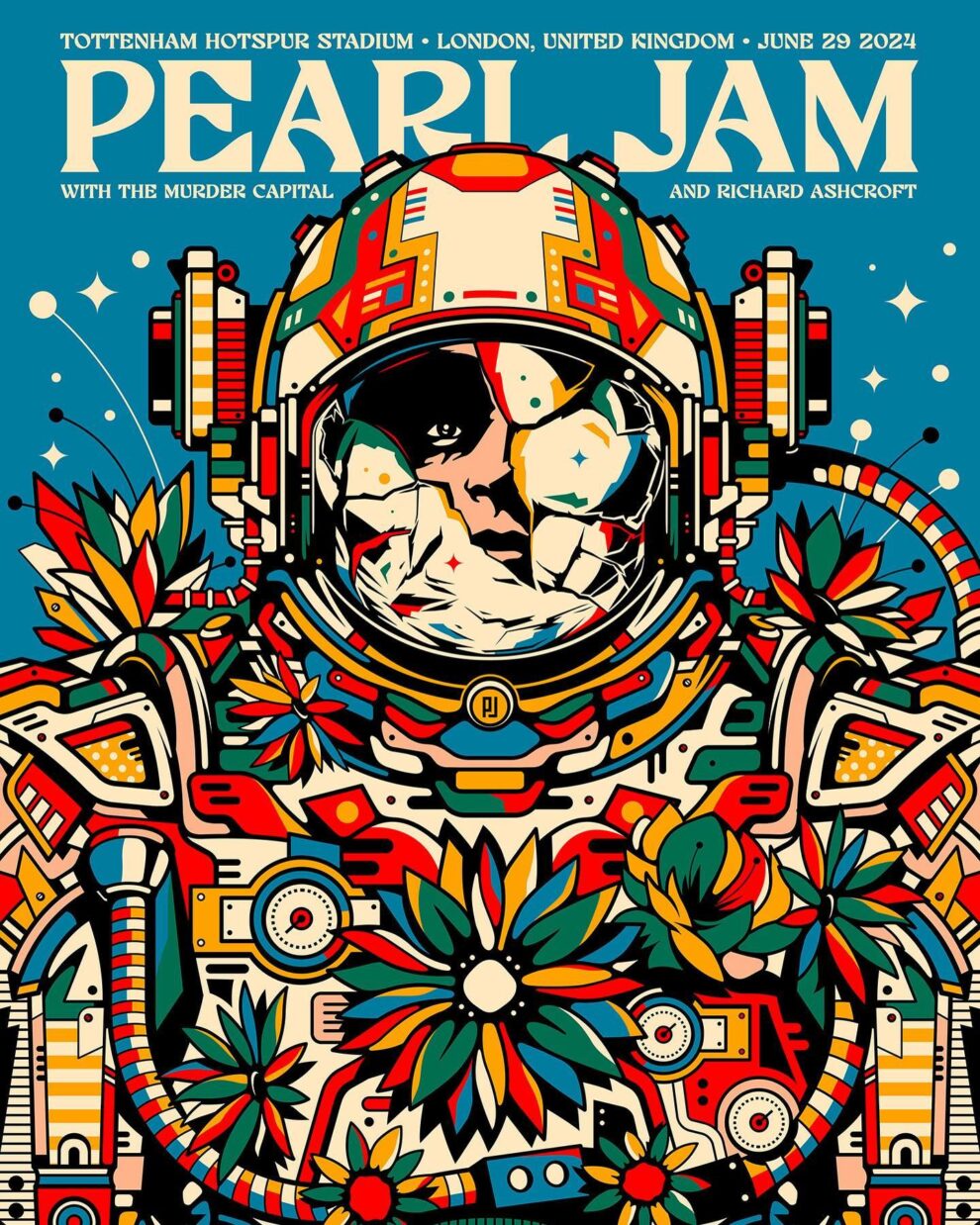
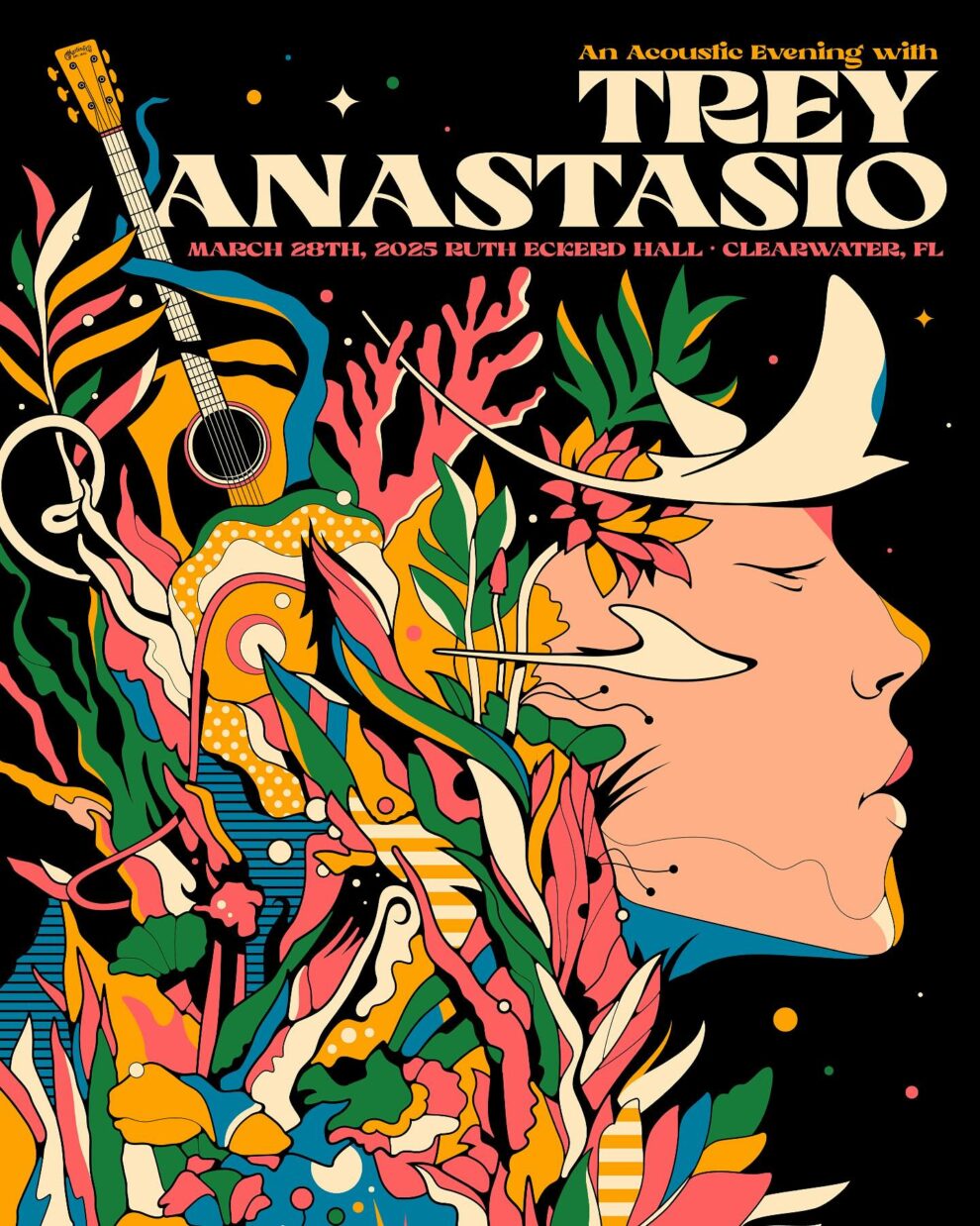
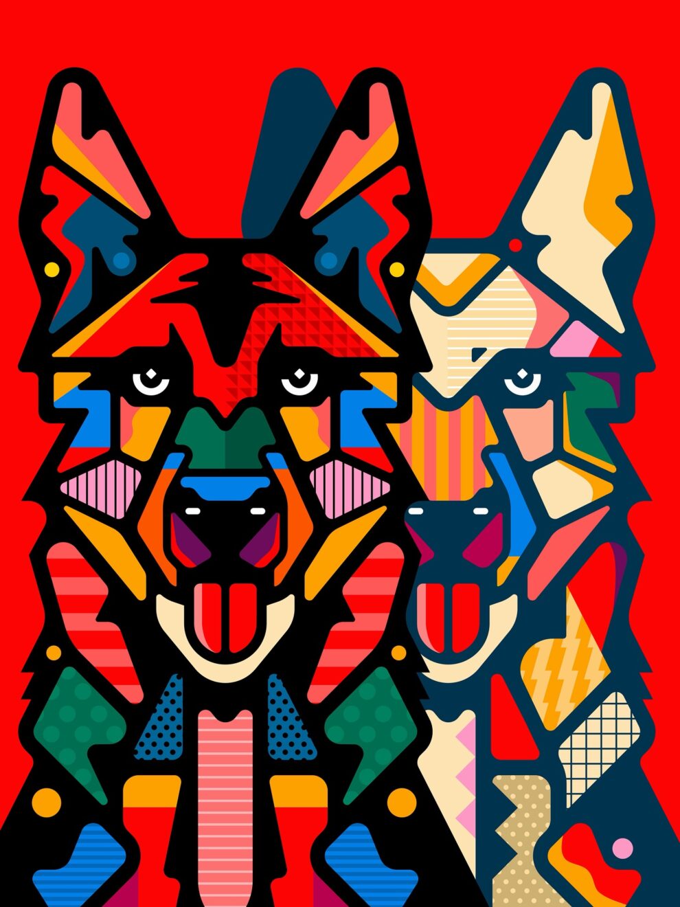
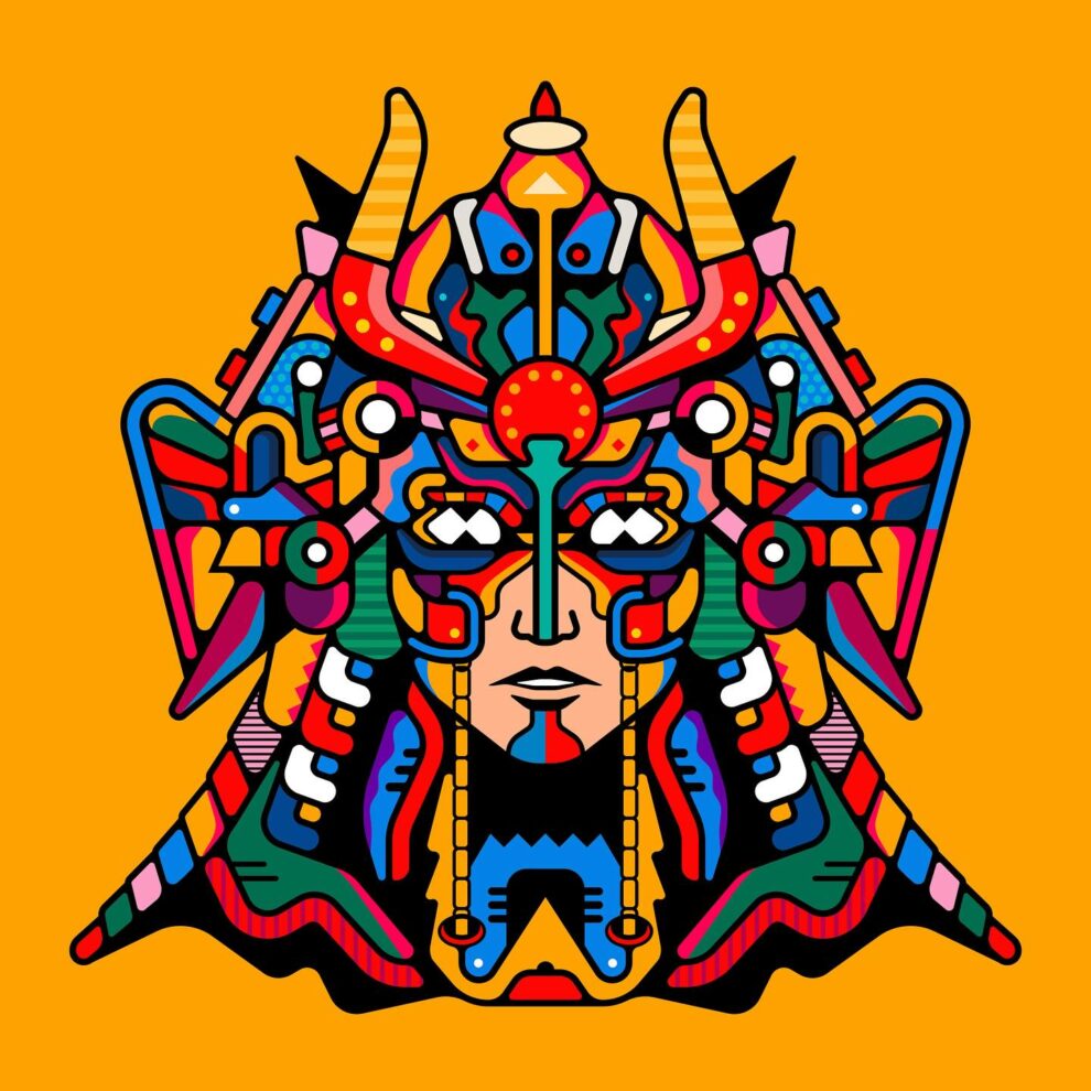
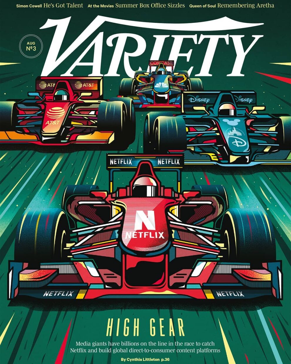
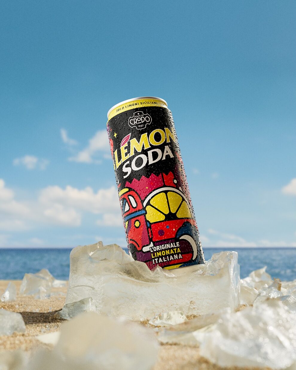
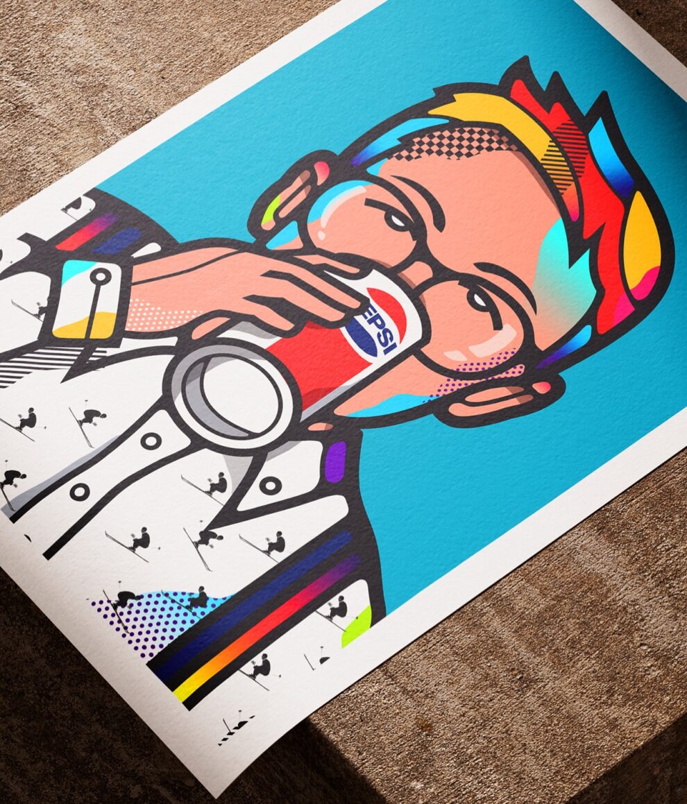
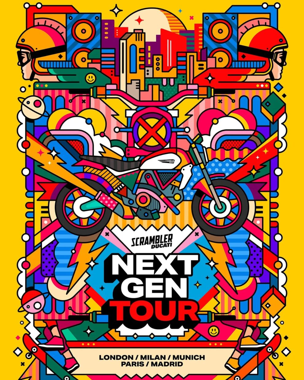
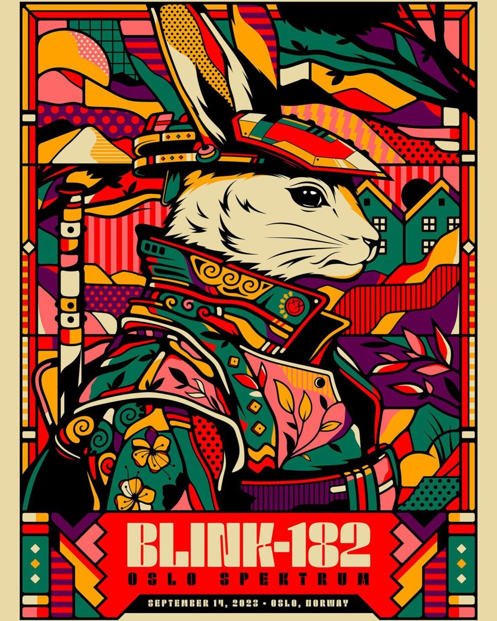
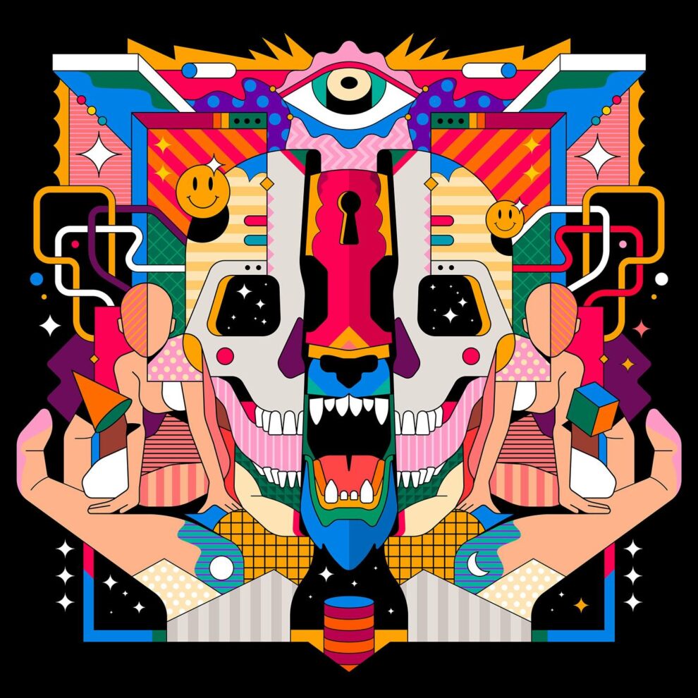
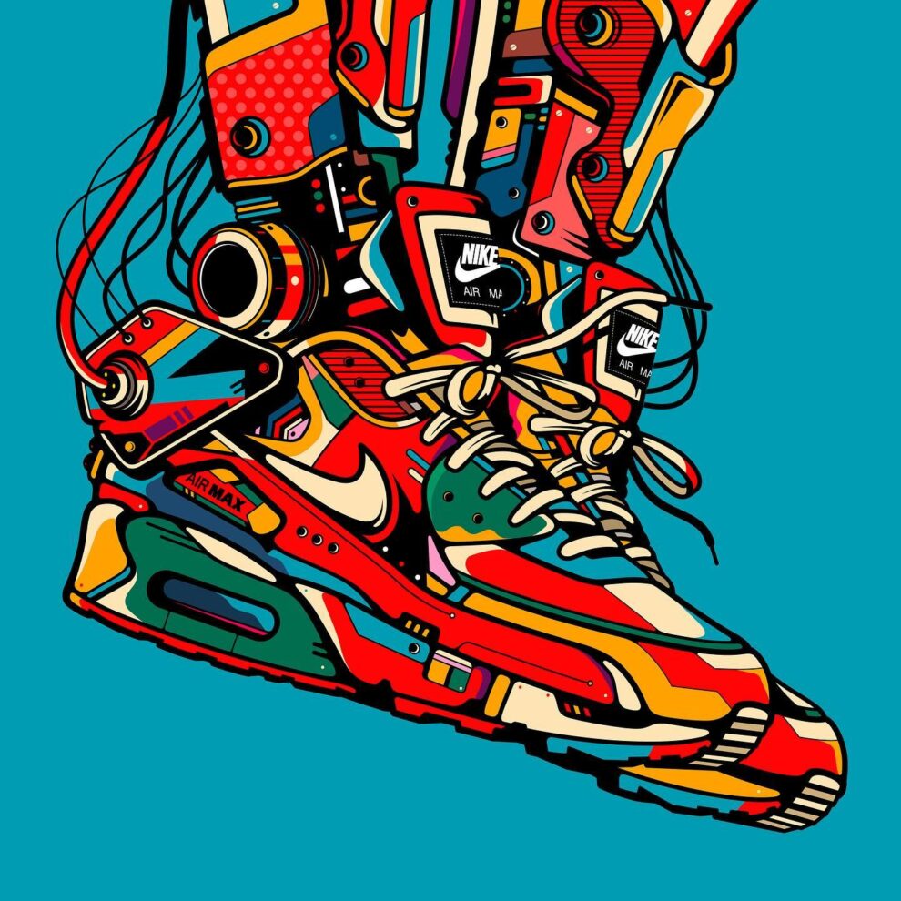
Van Orton Design is an Italian creative duo of twin brothers Marco and Stefano from Turin, known for ultra‑colourful pop‑culture illustrations that look like stained‑glass windows crossed with 1980s poster art.
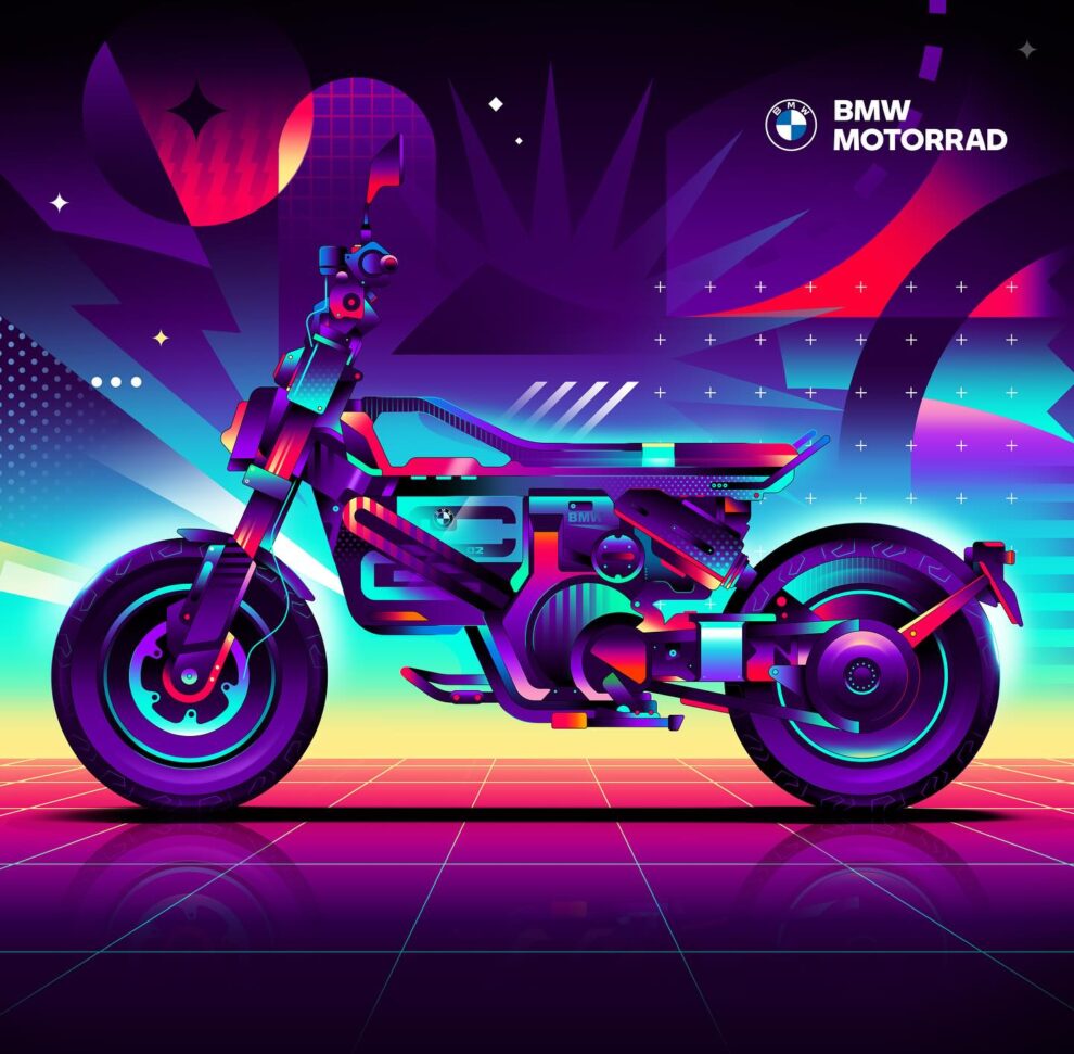
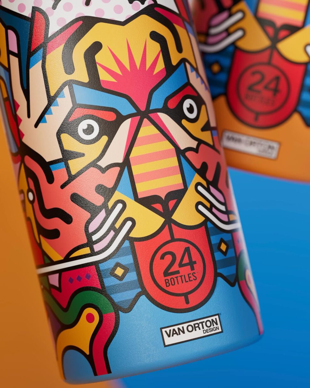
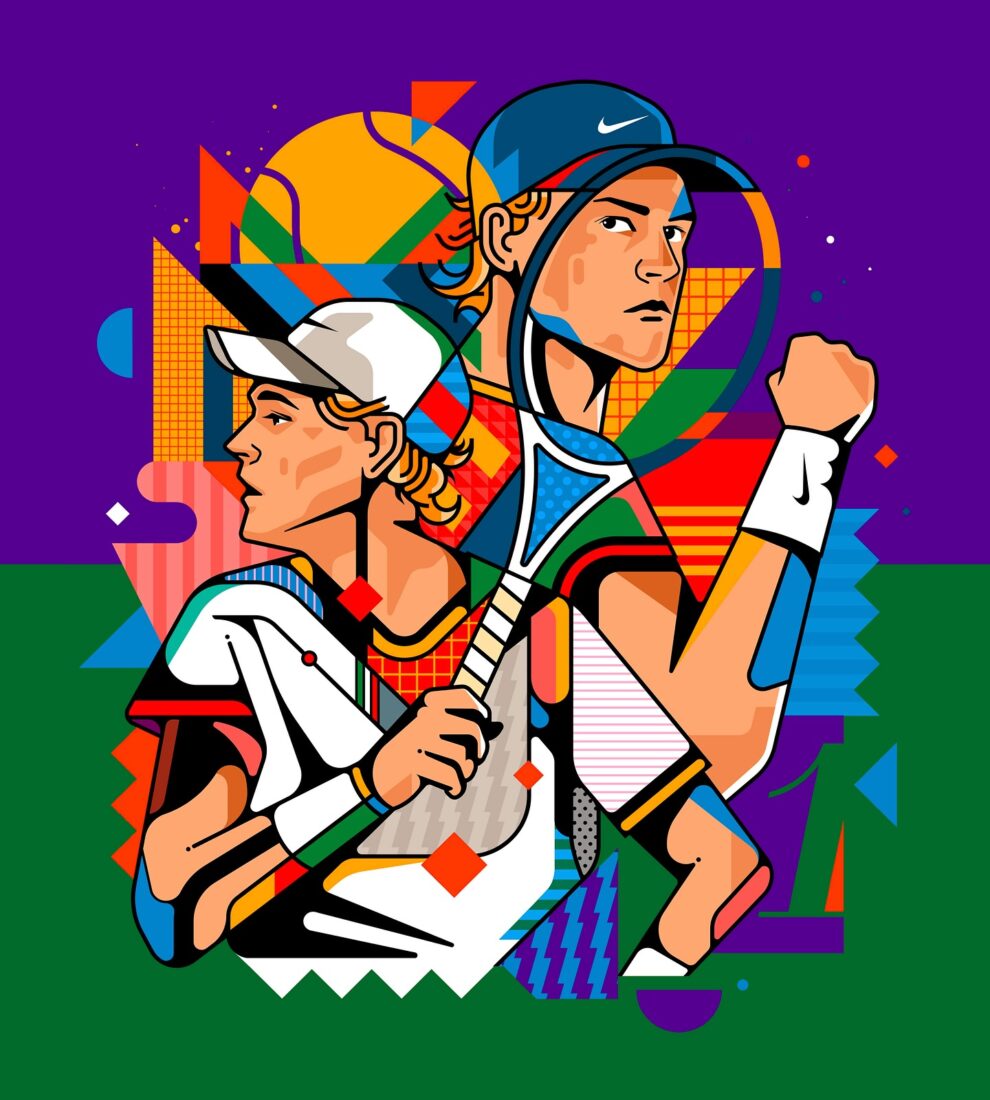
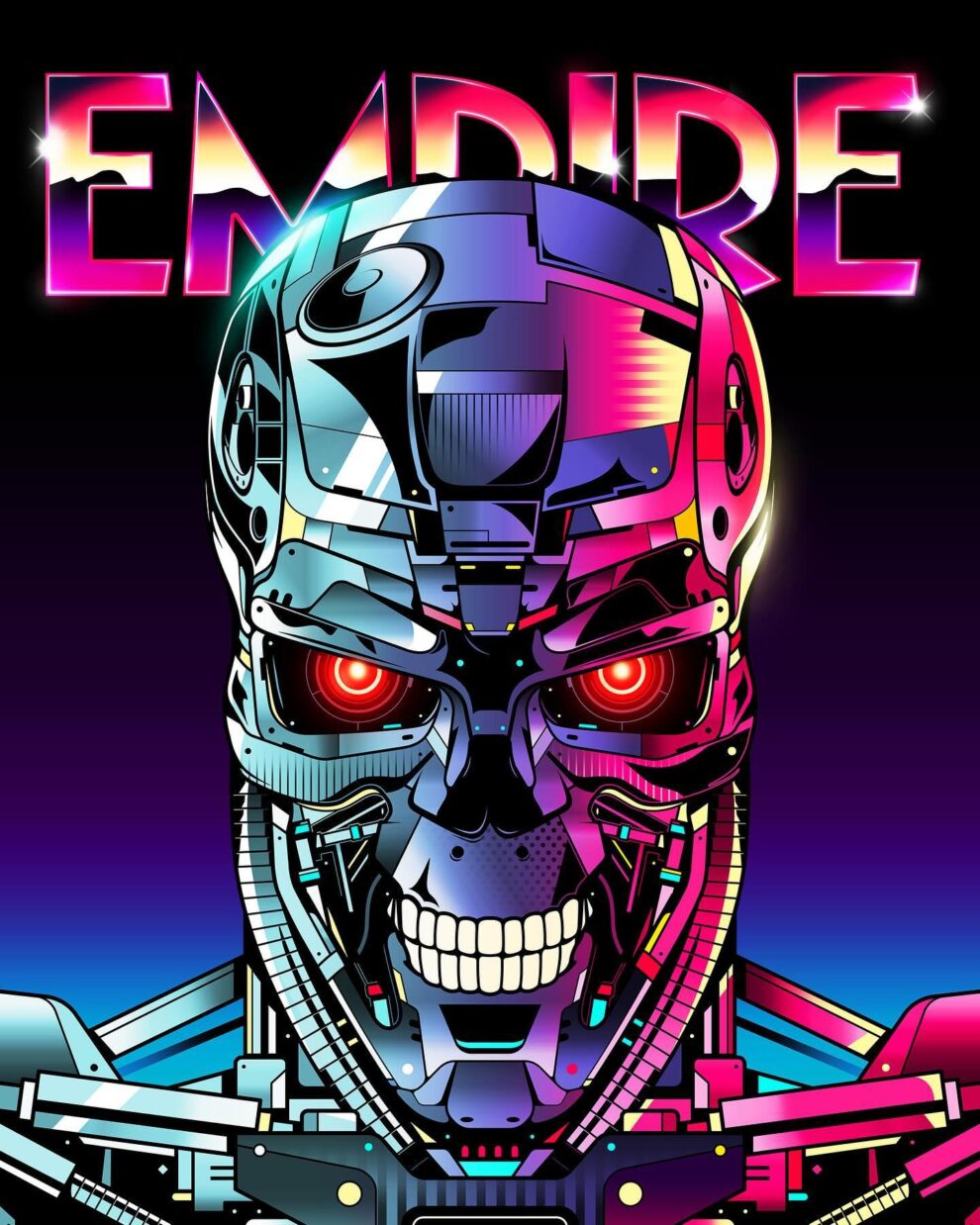
Their style uses thick black outlines, geometric shapes, neon palettes and dot/line textures influenced by church glass, Roy Lichtenstein and ’80s logos, which they apply to everything from tribute posters for films, bands and anime to official campaigns for brands like Disney, Marvel, BMW, Ducati, Ray‑Ban, ESPN, Empire Magazine and more. Starting as fan‑art illustrators while working at an agency, they went full‑time after major commissions, now running a studio that produces key art, packaging, murals, apparel capsules, NFT drops and Domestika classes, all built around their instantly recognizable “Van Orton” look.
More: Instagram