Designer Turns Mundane Life Into Graphic Stories on The Back of Coffee Recipes and Organizes Papers Into Massive Web Archive
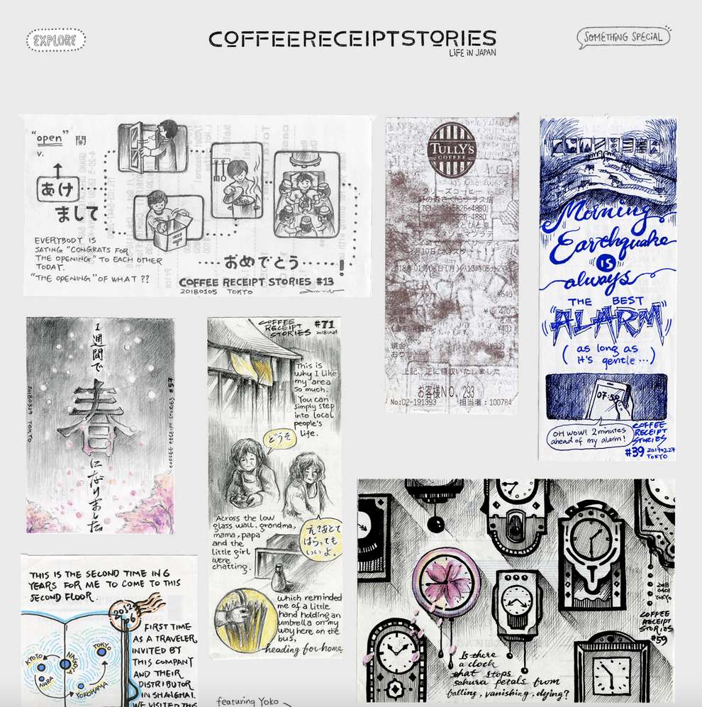
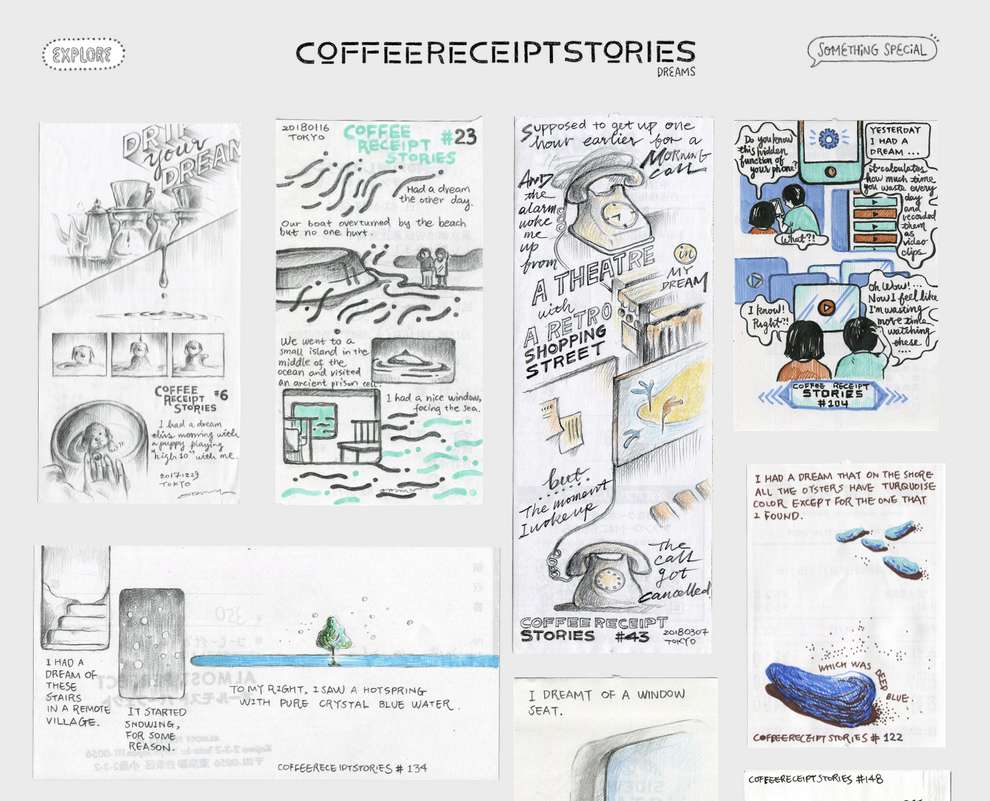
Hopes and fears, dreams and travel, happy and mundane life in Japan are the core sources of inspiration for the hand-drawn comics of Chinese-born artist Odding Wang.
More: Coffee Receipt Stories h/t: readymag
In 2017, her self-doubt and penchant for coffee culture led him to draw a short story on the back of a coffee recipe. Now, five years later, the number of comics has grown to over 700, most igitalized and organized into an easily-navigable website that combines the warmth of hand craft with cutting-edge web technologies.
Like many, Odding has been drawing and writing stories since she was very little. A designer with Ogilvy Japan, she always worked on personal projects — some even generated international recognition, opening opportunities to create both analogue and digital artworks for Moleskine, McDonald’s, Google and other high-profile brands.
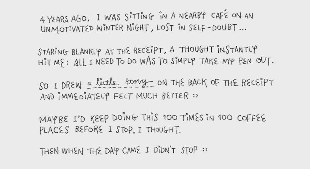
On the Christmas Eve of 2017 — one of those days that Odding felt neither inspired nor motivated, just lost in the miserable feeling of self-doubt — she decided to go to a nearby cafe to have a drink and some fresh air. Sitting in the cafe, she saw a person writing something on the back of a receipt. Instantly, she realized all she had to do to quiet her self-doubting mind down was pick up her pen. She drew a little story on the back of her receipt and immediately felt much better.
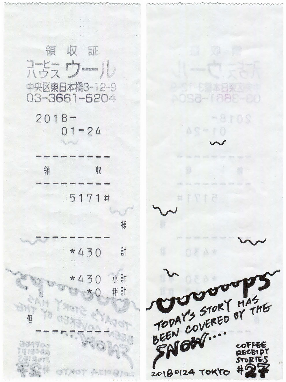
Though she’s now exceeded 700 creations, she only expected to create some 100 illustrated stories for fun. The first 150 or so were all collected in Japan. Then she began drawing comics while traveling overseas: 8 other countries were added in the next 2 years, until the Pandemic hit. These include Odding’s home country China, countries outside Asia such as Colombia and Morocco; and cafes in the airports when she was transferring, such as Toronto and Dubai.
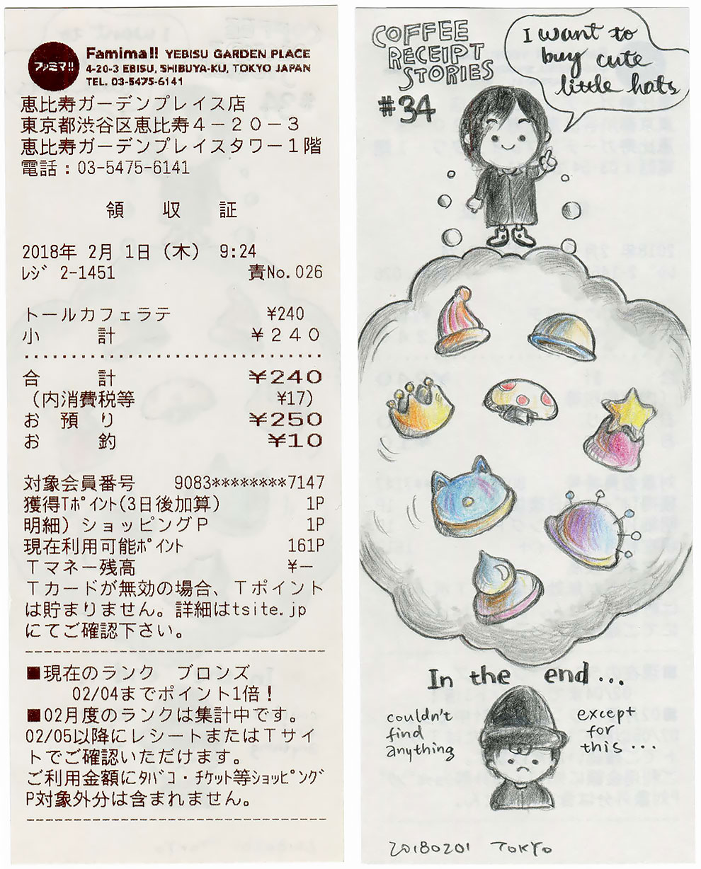
Odding started to organize her stories online after collecting more than 600. By then she had a clear vision for her future website: its main goal was to let the viewers feel like they were looking at real receipts, so she wanted to keep sizes close to the actual scale.
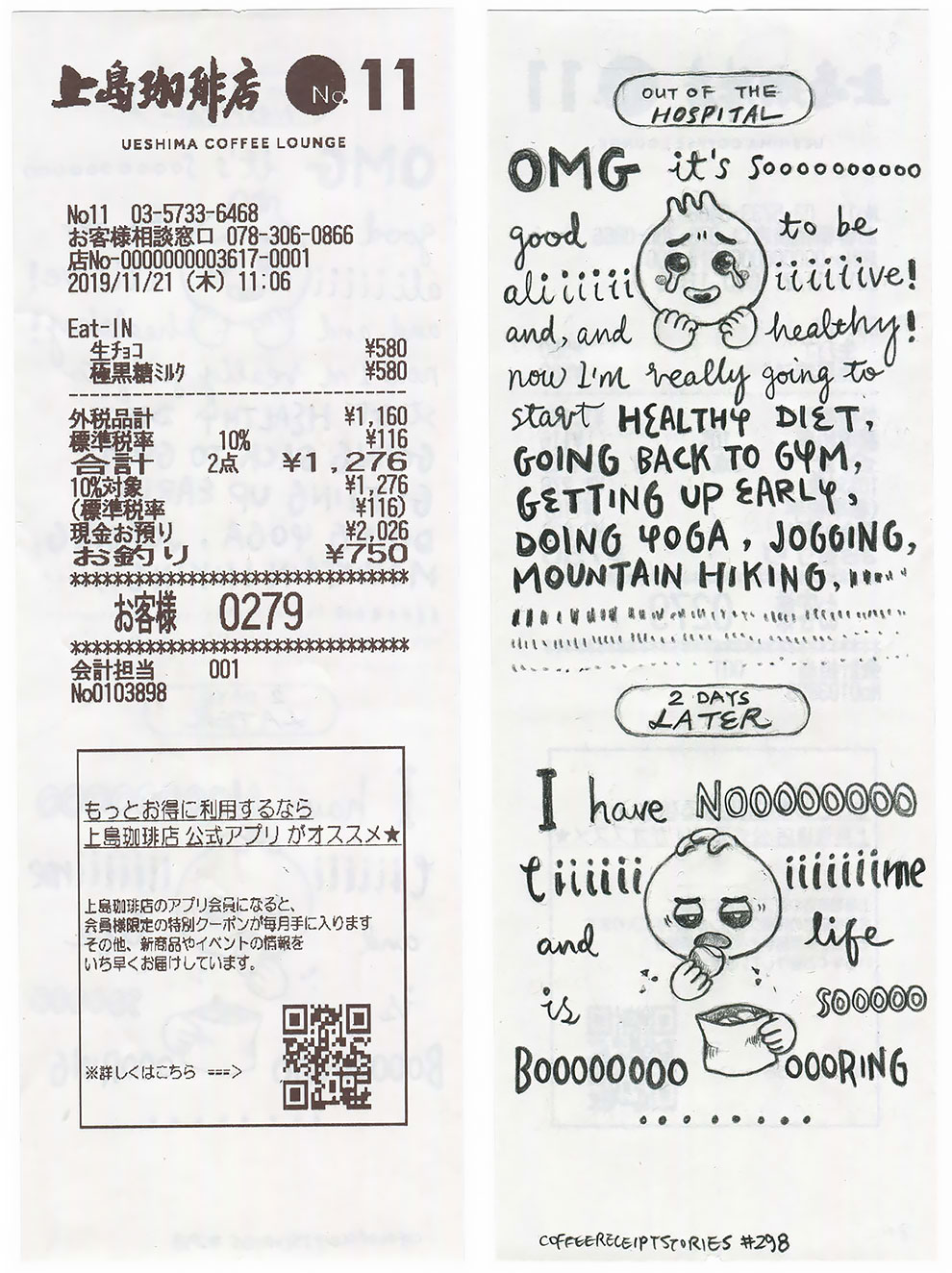
hat’s why she decided to go without a mobile version — phone screens are too small for such an experience. Since all the receipts are of different sizes, it was impossible to put them into a standard grid. Odding thought of using very small units for the grid and trying to fit each in.
That still sounded like a huge amount of work and felt too challenging for CSS. A developer friend that used Readymag, a design tool to create websites without coding, for prototyping and wireframing recommended it to Odding. She quickly established that it would allow her to simply drag and drop each receipt image to wherever she wanted, and that seamlessness won him over.
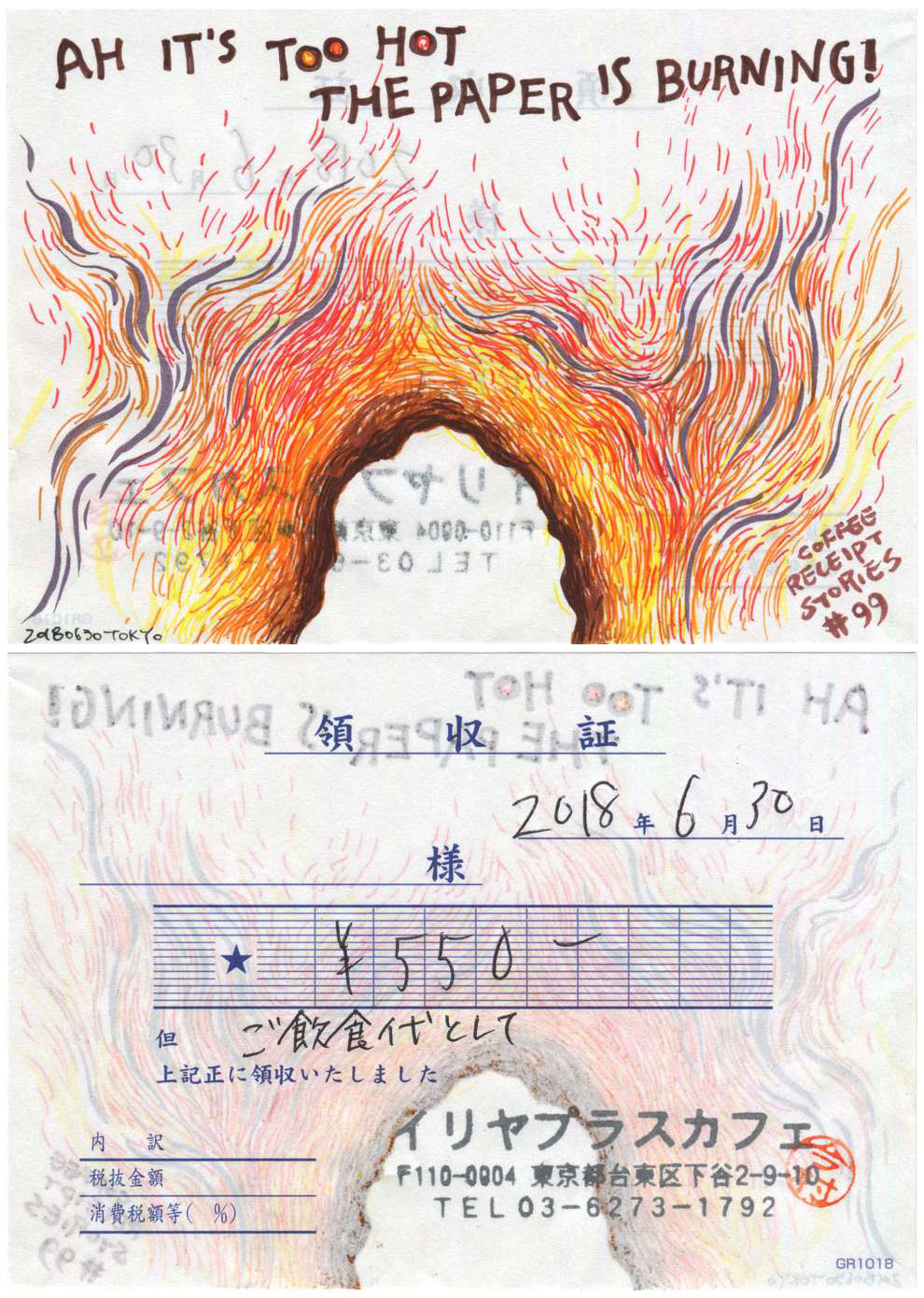
The most time-consuming and tedious part of the workflow for this website was scanning, cleaning up and editing all the receipts, which took a few months in total. With Readymag, the rest of the work (including UI and UX design) took just a few weeks in total. .
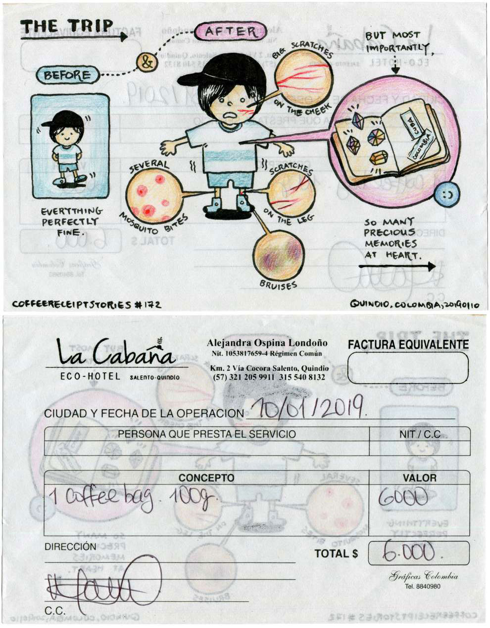
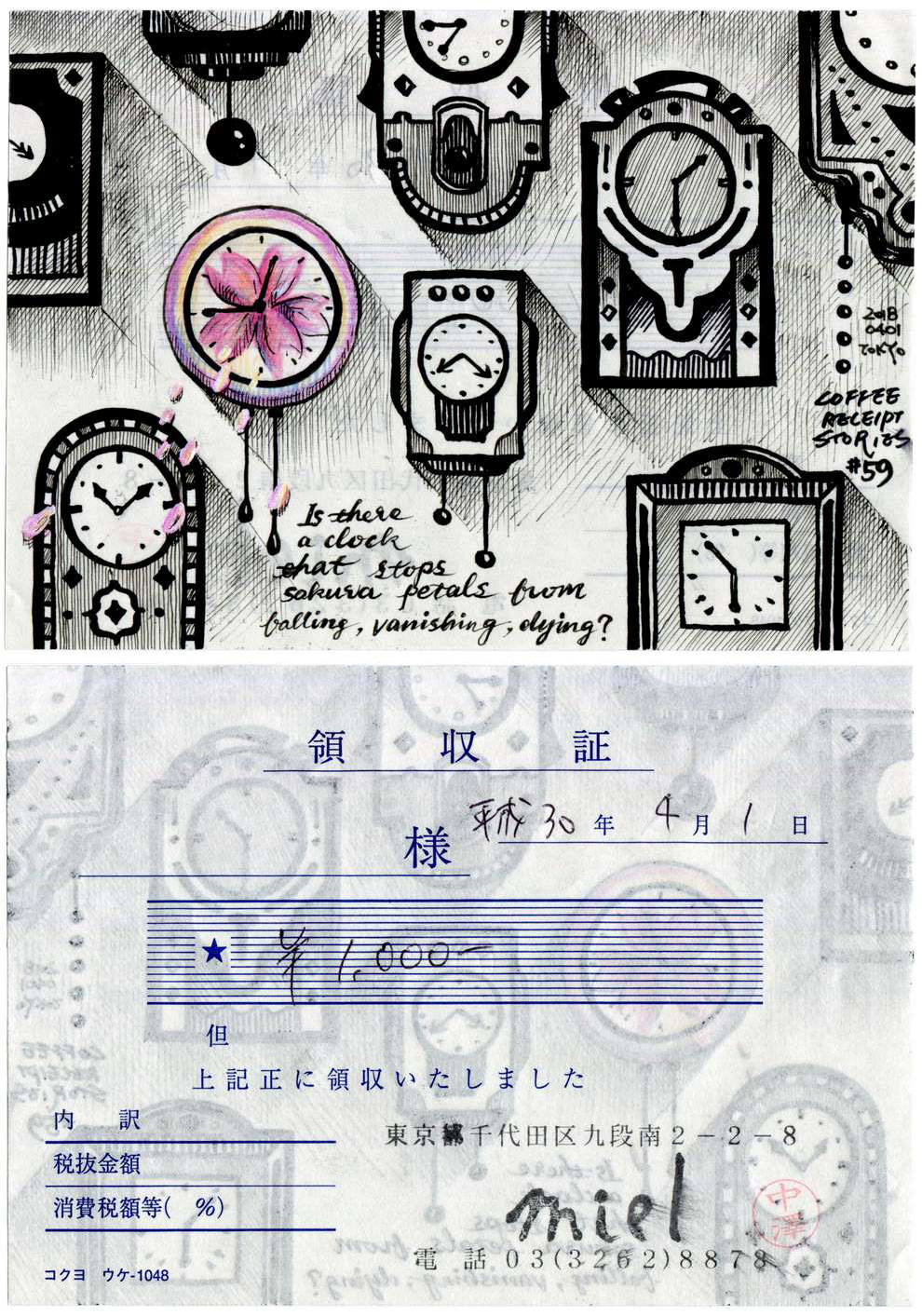
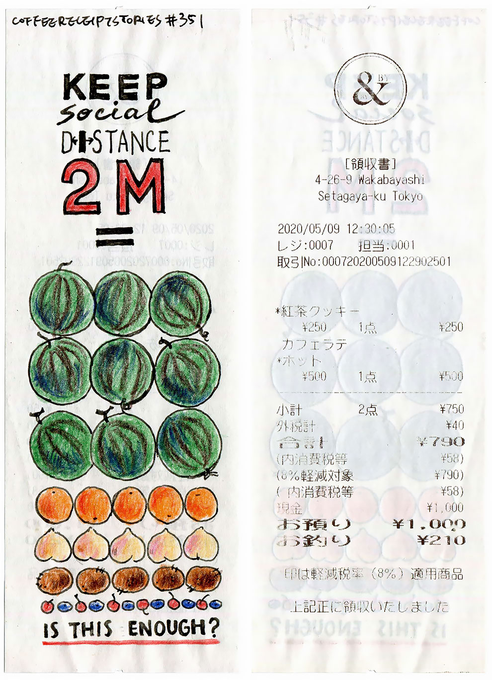
Odding laid out both sides of each recipe side by side and created a 0.1s opacity transition for hover state. This stunt made it easier for readers to examine the front and back of each receipt without adding extra buttons. A custom cursor was another fancy website feature used by Odding, who drew her own cursor so the whole site would look more handmade.
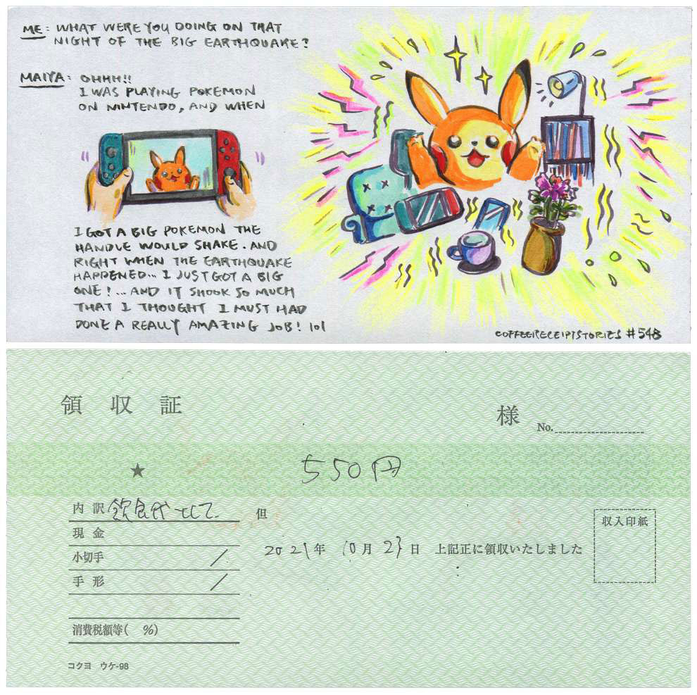
This website was challenging since there was no font to use (all text is hand-drawn), and everything else is image based. Fortunately basic principles like scales and kerning are still relevant. The biggest thing that stood out from typical web design is that Odding uses all-caps for descriptions, carrying over a tradition used in comic and graphic novels.
Odding recently quit her full time marketing job to work on her own, so expect more graphic stories on her website soon.