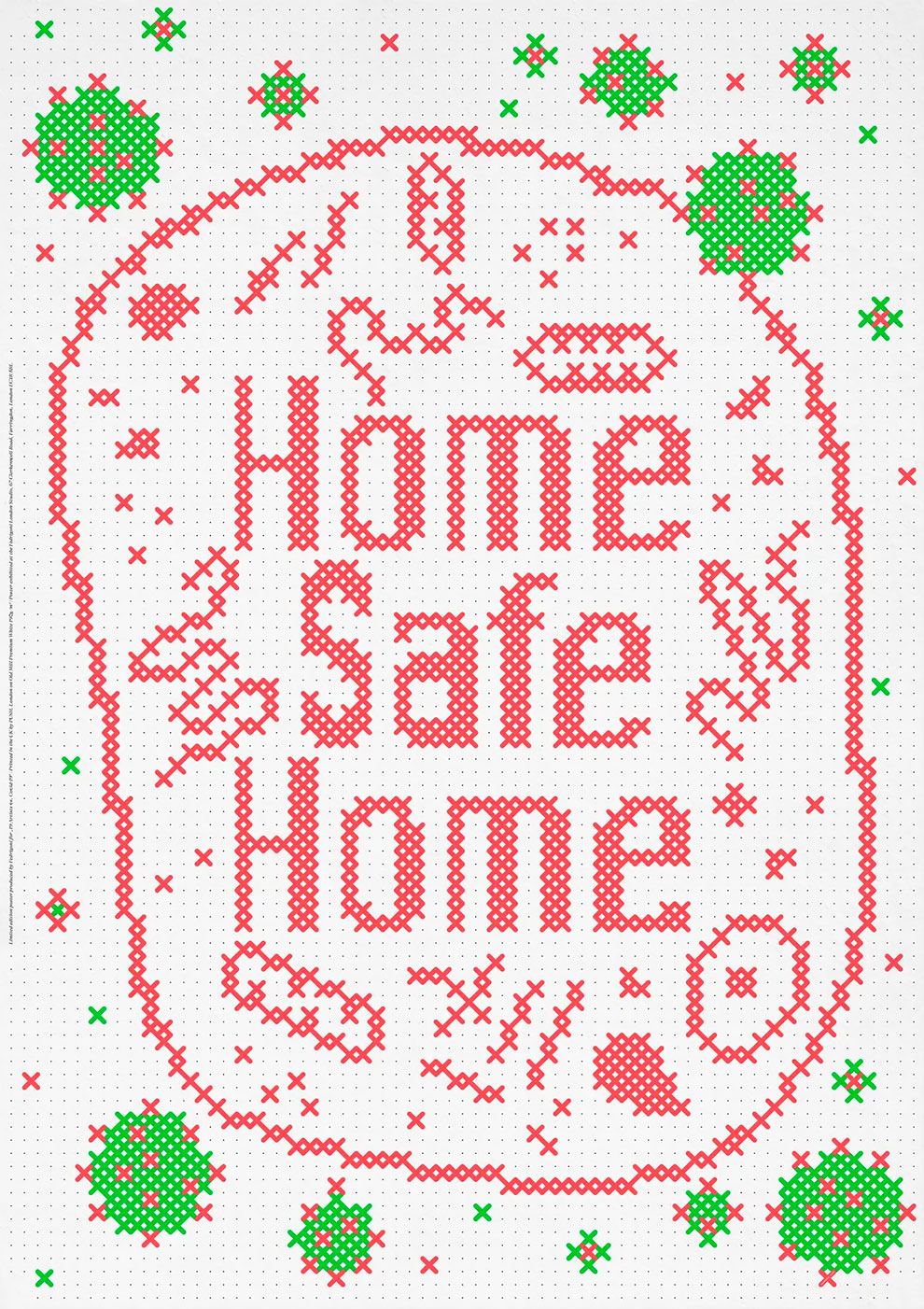
Home, Safe Home: Artists Create Inspirational Lockdown Messages
Gotz Gramlich
‘Our home is sacred. Here we decorate our living environment with memorabilia, here we dine with the family and here we sleep, which is the most vulnerable phase of our existence. The expression “Home, sweet home” stands for the described feeling, a tender and vulnerable sentiment. The security that we are allowed to experience daily in our lives is a value that we must protect.’
During these tough times, it’s important for us to come together as a community and support each other, especially those who are tirelessly working to keep us all safe.
Paper manufacturer Fedrigoni and Alvaro Lopez, a London-based Spanish graphic designer, have organised a collaborative project with 19 Artists to show their support in the fight against COVID-19.
The collection showcases 19 posters, based around the current global pandemic, using the message STAY HOME. Printed on Fedrigoni papers, by PUSH London, they are a limited edition of 75 copies per design. The posters are being sold on this website, distributed with the support of UPS, with all profits going directly to NHS Charities Together.
Once the lockdown is lifted and offices reopen, all 19 posters will be exhibited in the Fedrigoni London Studio in Clerkenwell.
h/t: guardian
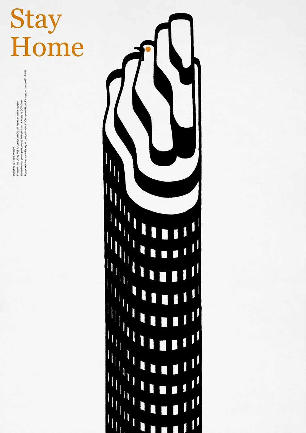
Pablo Amargo
‘Being at home while the Covid-19 lockdown is not easy, particularly when you live in a city. Of course some rooms are ample but others are small and offer not many possibilities. The challenge is to be able to endure the mental stress. Is individual attitude the key to turn the lockdown into something affordable and transform the scarce space into a place for freedom and hope?’
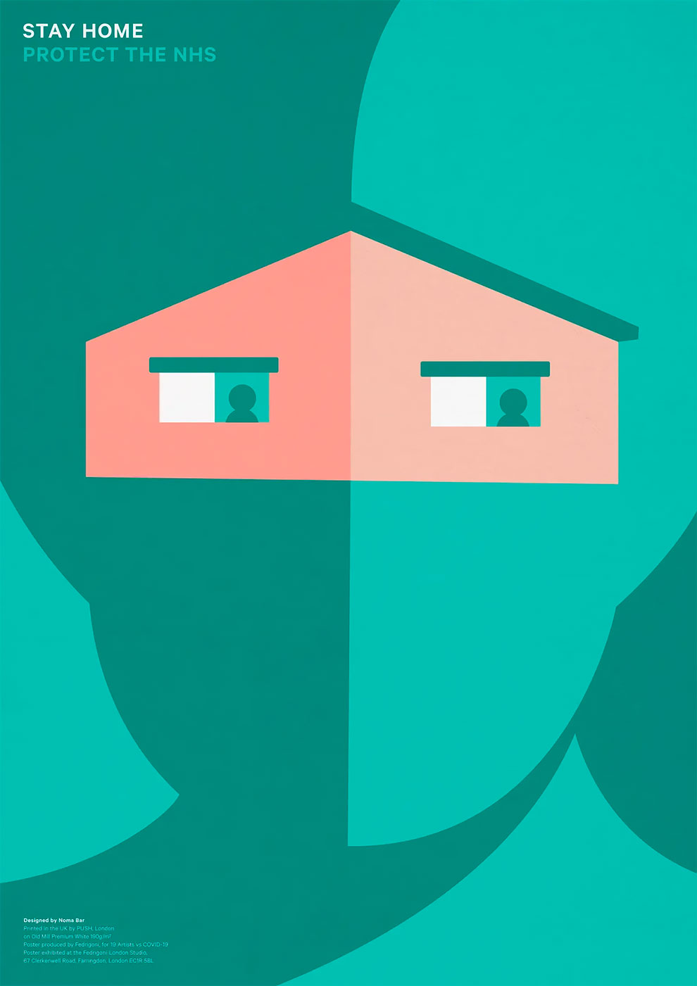
Noma Bar
‘My stay-at-home story is dedicated to our frontline heroes. I wanted the viewers to discover the house shape in between the gap of the mask and the head cover; the eyes are two people in quarantine sitting by the window. I think that you can feel the level of stress in the eyes. They look sideways as if something happened outside.’
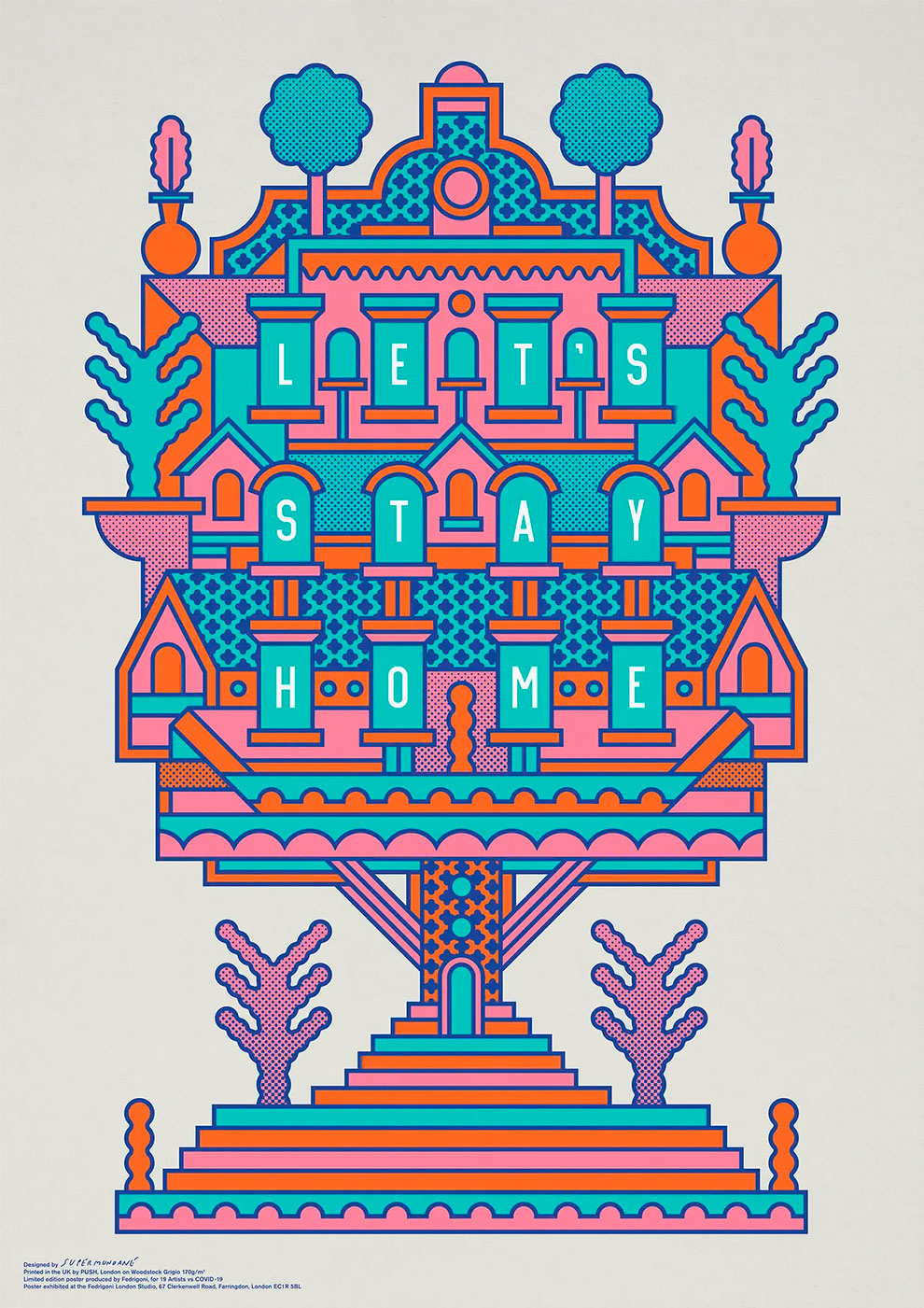
Rob Lowe
‘I like houses that have a feeling of a whole village in a single building. The building is a fantasy – I live in a small flat in London. I wanted to make the message positive and something people would want to have on their wall after all this is over. Adding “Let’s” to “Stay Home” does this. “Stay Home” is a command. “Let’s Stay Home” sounds like something that could be nice to do.’
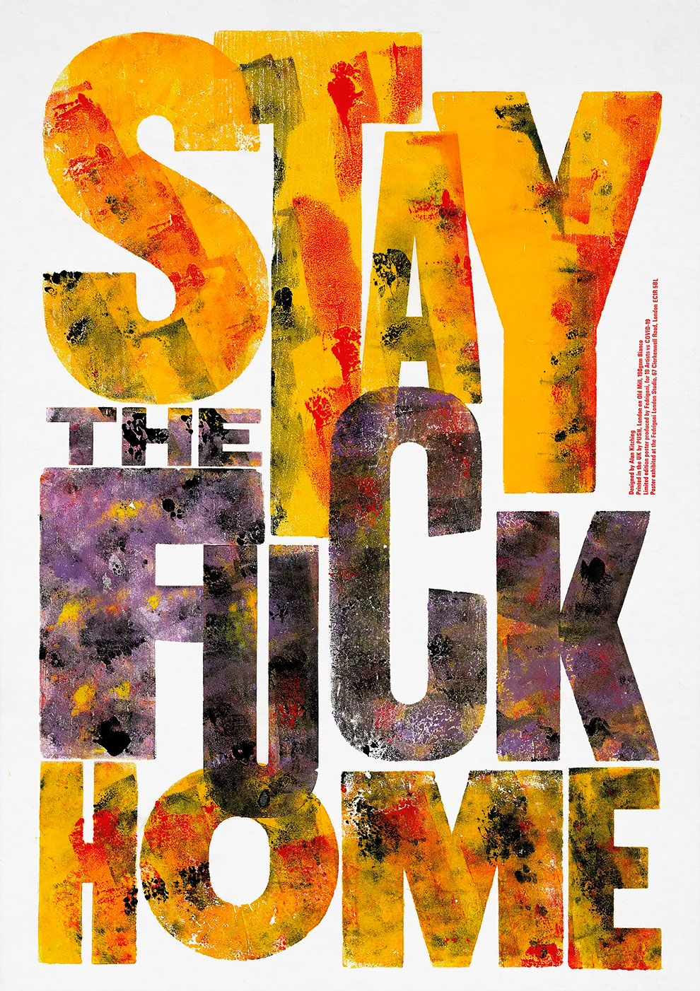
Alan Kitching
‘It’s an unprecedented period in history. At the time, we were in a dangerous situation. The poster had to reflect this. And tell people in no uncertain terms what was needed to be done. Plain and simple. That’s why I chose to use “strong” language.’
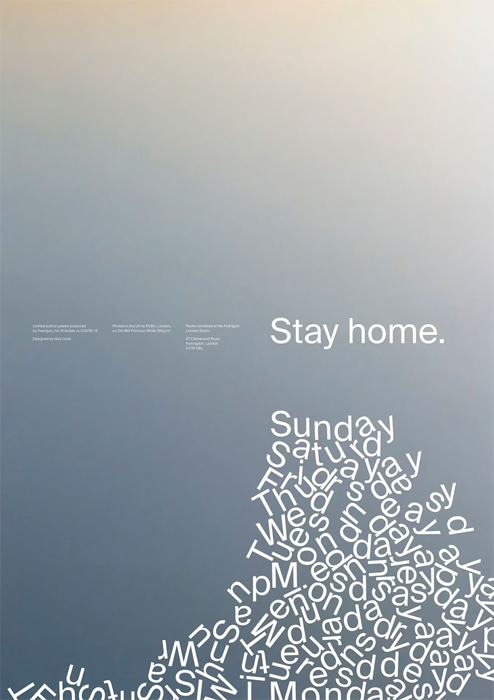
Nick Cook
‘I wanted to try to represent the Groundhog Day blur of lockdown and therefore break the usual form and function of the working week. The background was taken from a photograph of a sunset I had captured just before lockdown and was intended to be a nod to brighter and better days ahead.’
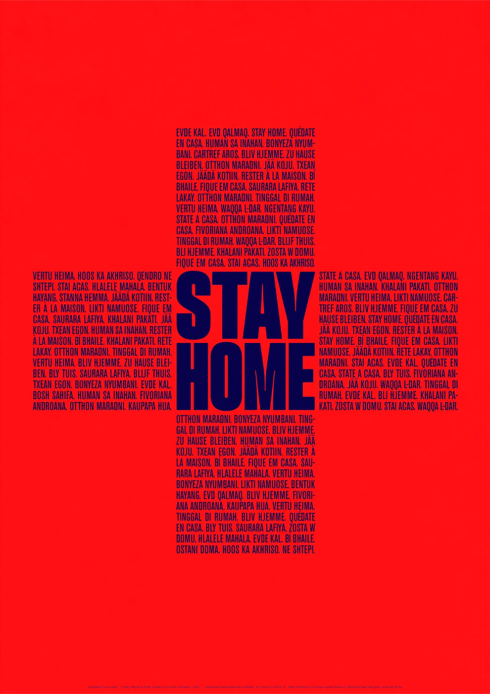
Alvaro Lopez
‘I wanted to reach people in a very direct and emotional way. The poster background is red, which symbolises the action and courage of the medical services. A cross in the centre builds the words “Stay Home”, with each of the cross’s arms showing the words in different languages.’
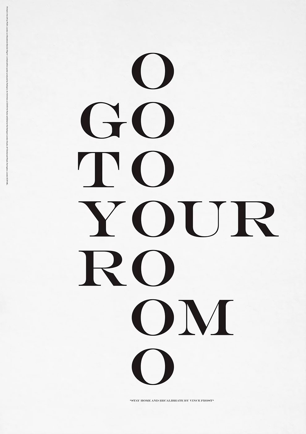
Vince Frost
‘Mother nature is upset with us and has sent us all to our rooms for time out. We saw this as a punishment for how badly we have treated the earth. The forced time at home was so out of character for us all and how we have lived our lives until now. It forced us to stop and think. Initially it was scary and tedious. The seven “O”s in the poster refer to the seven days of the week and time ticking by, the initial monotony.’
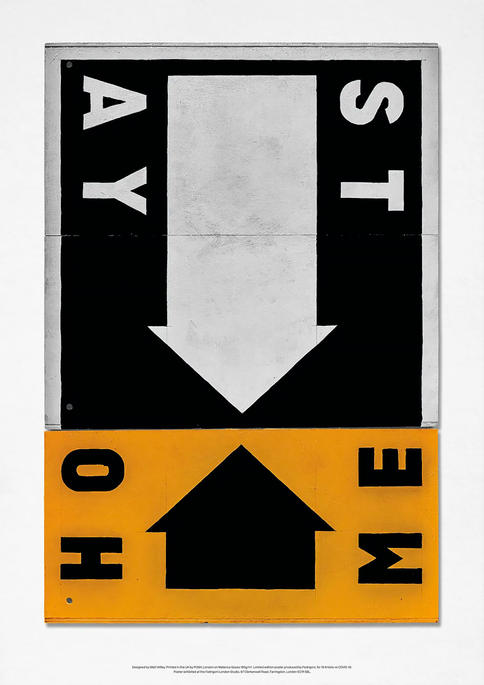
Matt Willey
‘The big you-are-here arrow doubles as a pictogram for a house. I wanted to make the poster as a physical object, a hand-painted sign, something you could nail to a fence or hold above your head, using things that I had access to around the apartment during lockdown.’
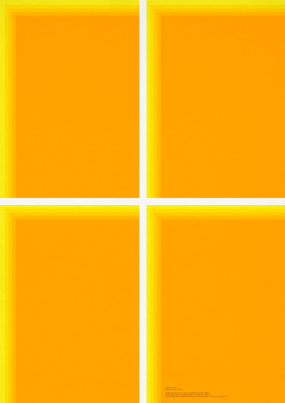
Nina Jua Klein
‘The role of the window as a threshold between our inside and outside worlds has become more apparent during lockdown. In the evenings I have found comfort in observing the light emanating from people’s windows, a reassuring confirmation that despite being isolated we are not alone. In this spirit my design aims to make the experience of staying home more joyful – a window to a more hopeful future.’
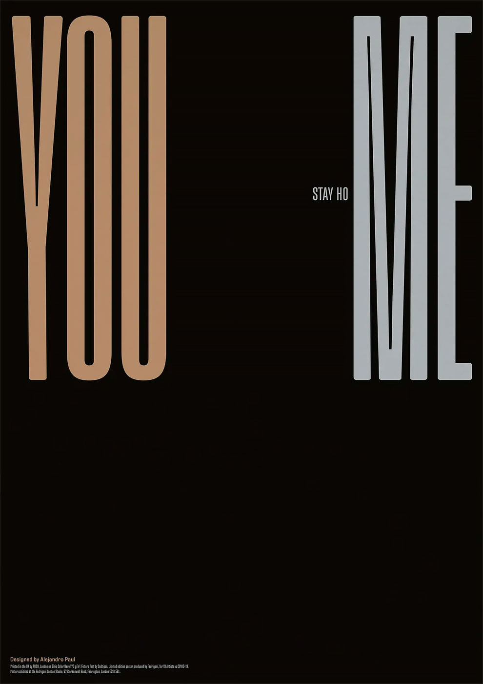
Alejandro Paul
‘The words “Stay home”, which have appeared since the pandemic, found us in different places but essentially it kept us away from our families. The distance, fear and the current circumstances kept us apart so we can be together again, you and me.’
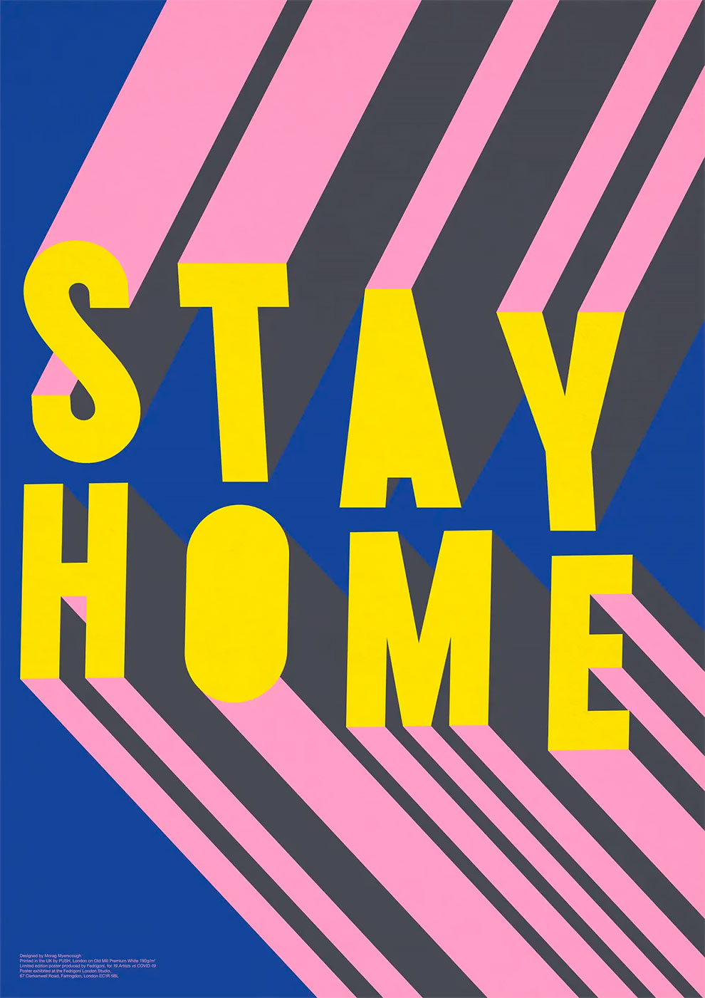
Morag Myerscough
‘My aim was to instantly get people’s attention by making a typographic beacon of neon/illuminated letters glowing out into the night sky. It was a message of collective unity: we were all in this together for the safety of everyone.’
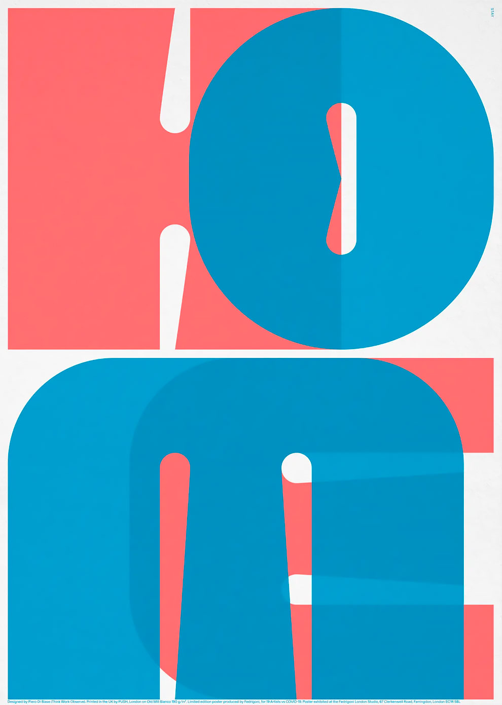
Piero Di Biase
‘These recent times have drastically changed our habits. Home became a new and central place in our lives. We had to reconsider it as a vibrant, energetic, colourful and comfortable space where everyday life and work overlaps.’
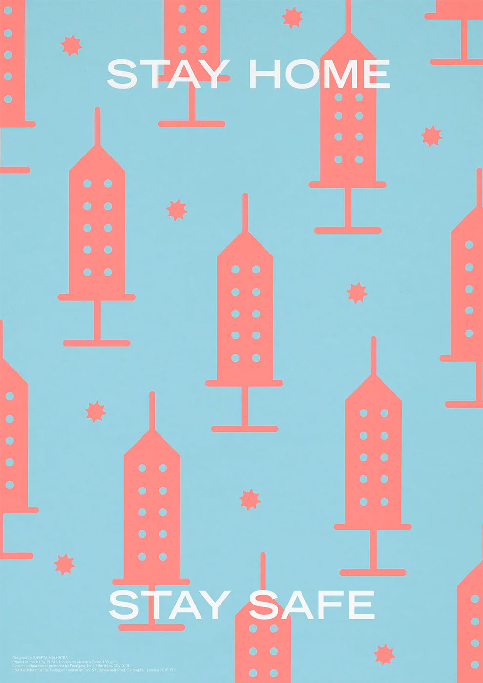
Shweta Malhotra
‘The poster portrays the idea of “Stay home, stay safe”. Creating a form of the vaccine that looks like tall apartment buildings, trying to bring out the fact that the only way to stay safe and protected right now is by staying home. That’s the only form of protection from the virus as of now.’
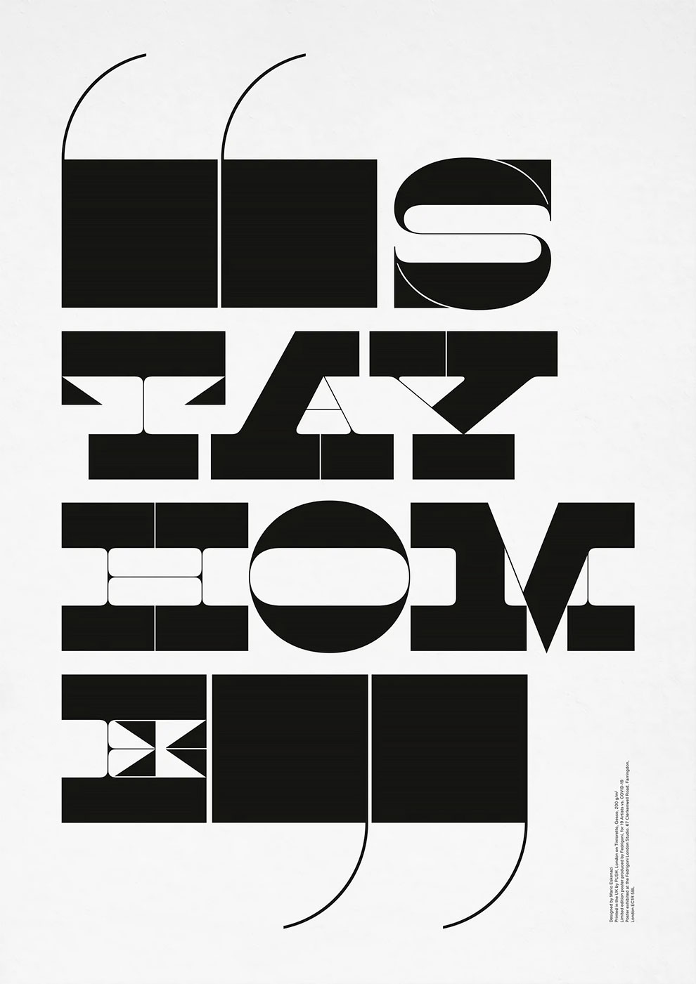
Mario Eskenazi
‘I tried getting the phrase “Stay home” to work as an illustration, starting from the premise that if the result is attractive it will read. The way I cut the words makes the poster into a typographic illustration.’
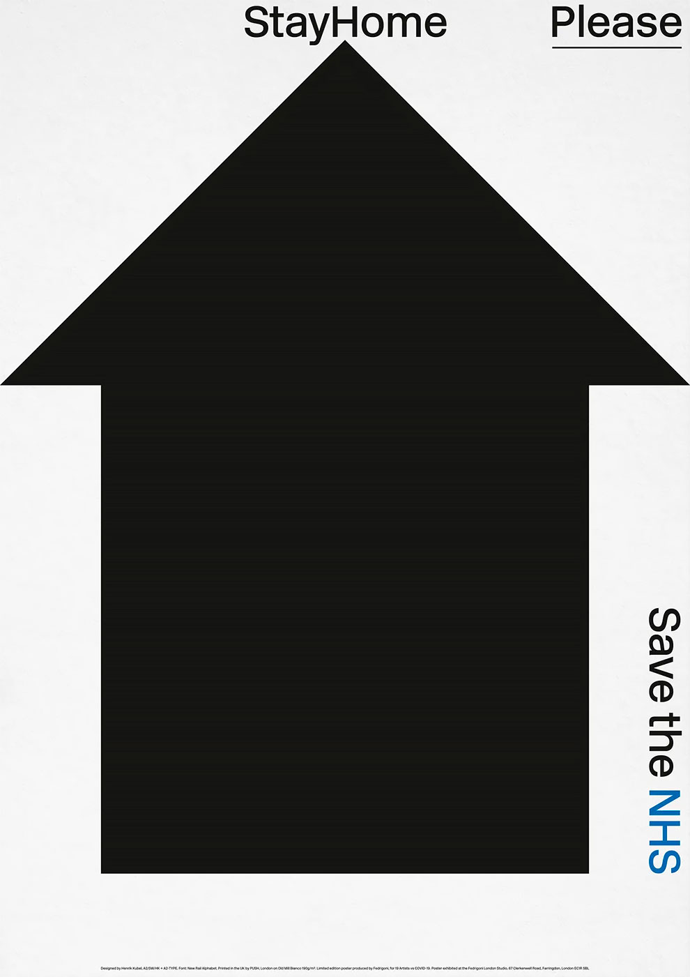
Henrik Kubel
‘An arrow or a house, depending on how you read it, pointing to the central message supported by a very British “please”.’
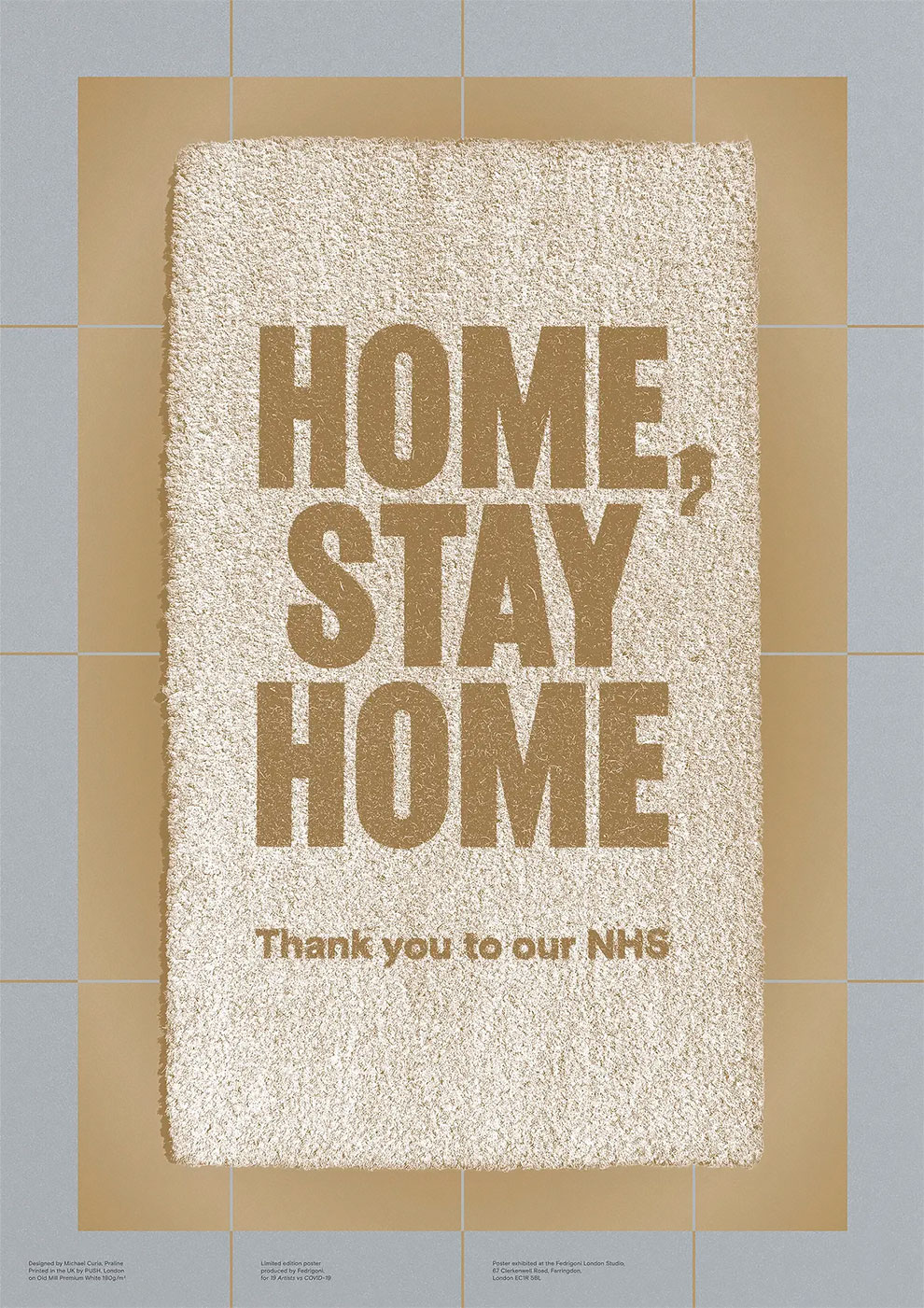
Michael Curia
‘“Home, stay home” is a graphic expression of the familiar “Home, sweet home” message. I thought about the physical objects that everyone associates with the home, and saw the doormat as a universal symbol.’
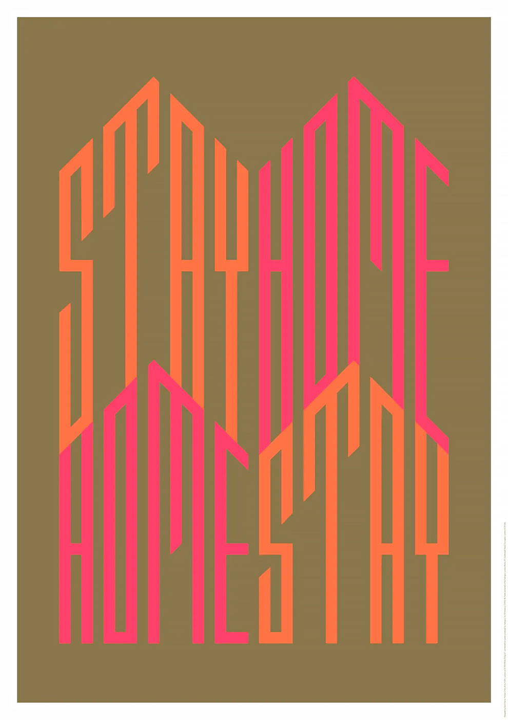
Sarah Boris
‘The structure of the type echoes both half-timbered house structures as well as vertical wooden slats painted in colourful hues that can be found on beach huts. The poster is printed in gold and two neons with the aim to bring joy, hope, energy and a special glow into people’s homes.’
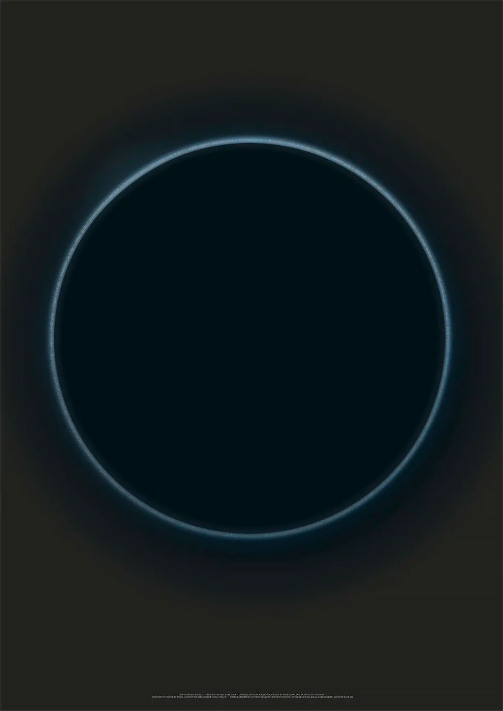
Michael Gibb
‘“The overview effect” is a term used by astronauts to describe their shift in awareness when looking back at the earth – as a planet we are unimaginably fragile, protected only by our paper-thin atmosphere. To me, this experience has had a similar effect as we reckon with our innate vulnerability. However, it has also inspired hope – we have come together as a species with a single focus like never before, no matter the language.’