Maps That Will Make You Look At The World With New Eyes
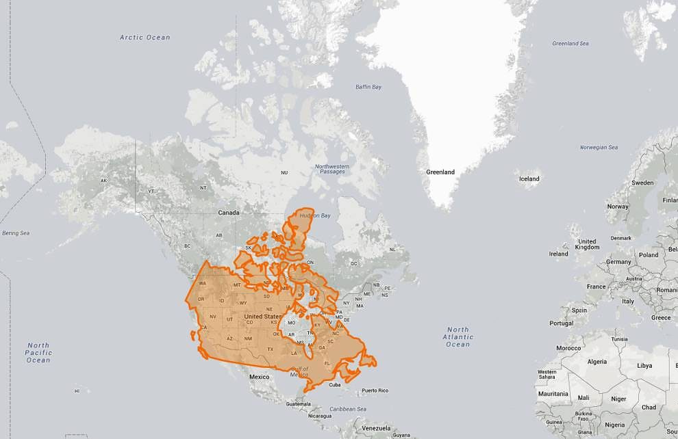
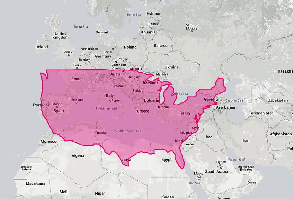
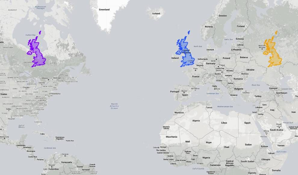
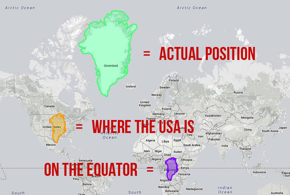
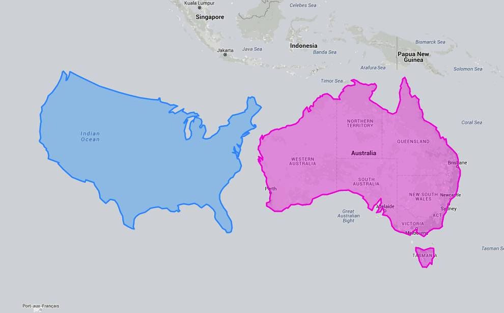
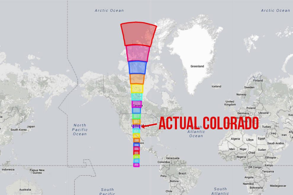
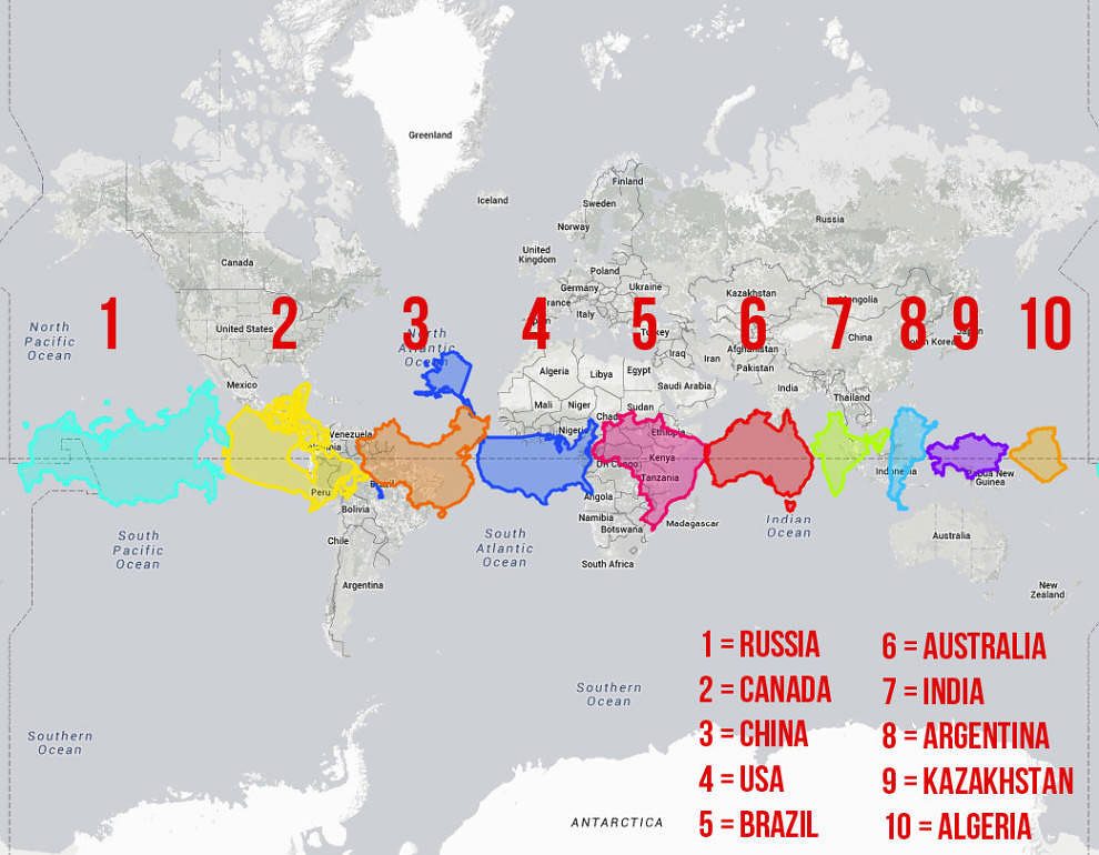
Firstly, you can see how the size of the US drastically changes as you move it north or south.
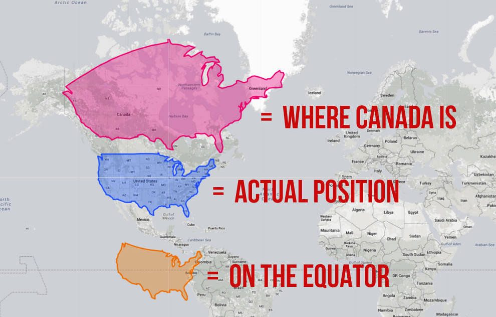
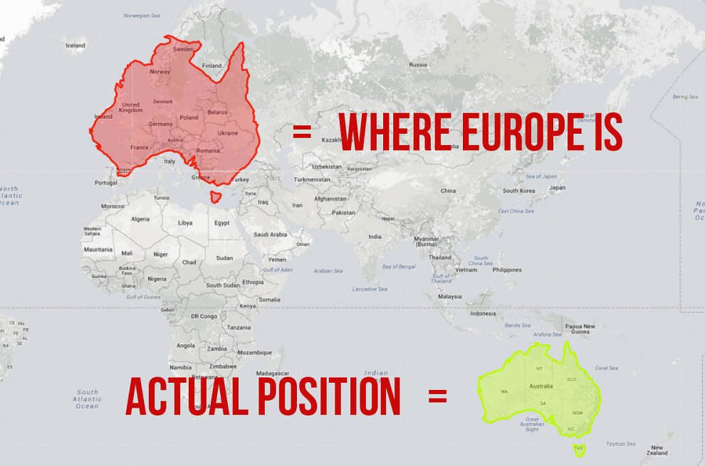
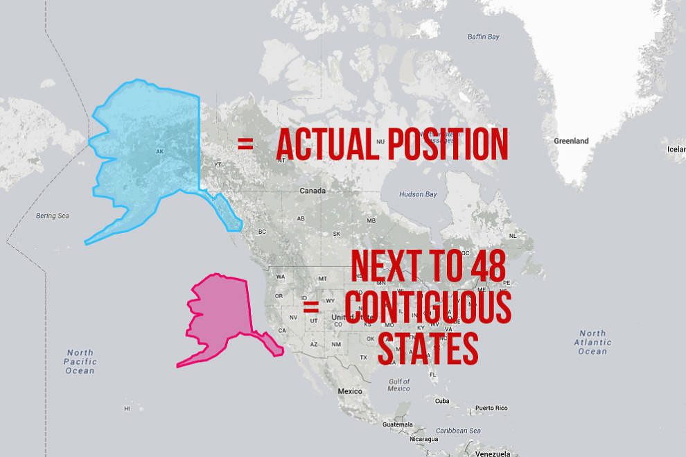
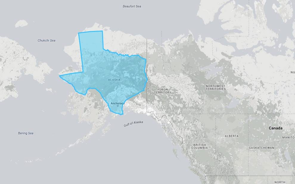
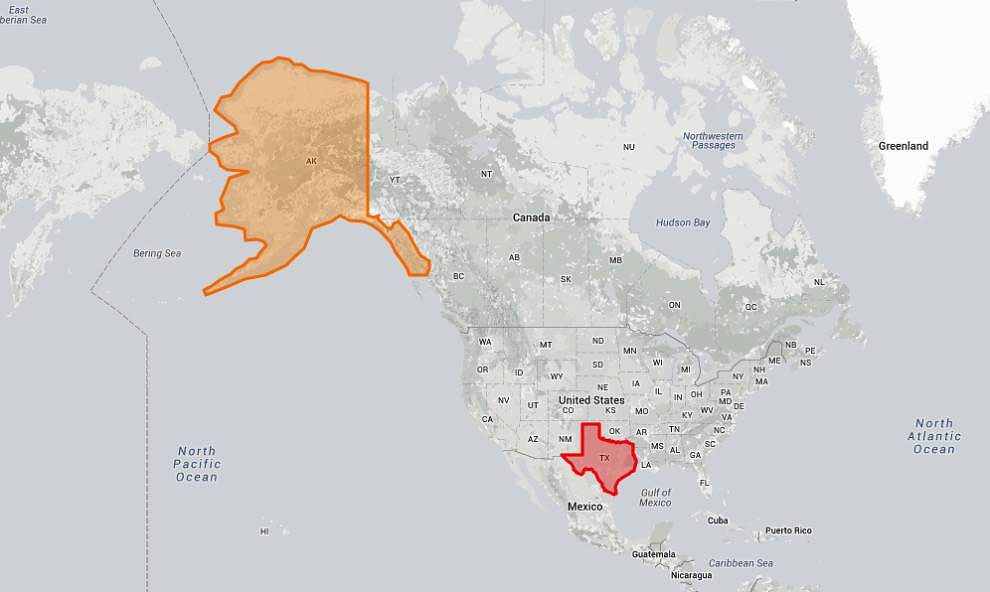
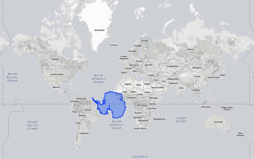
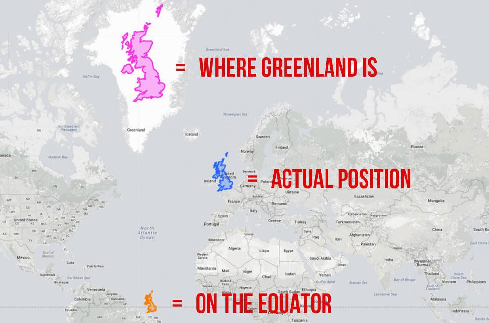
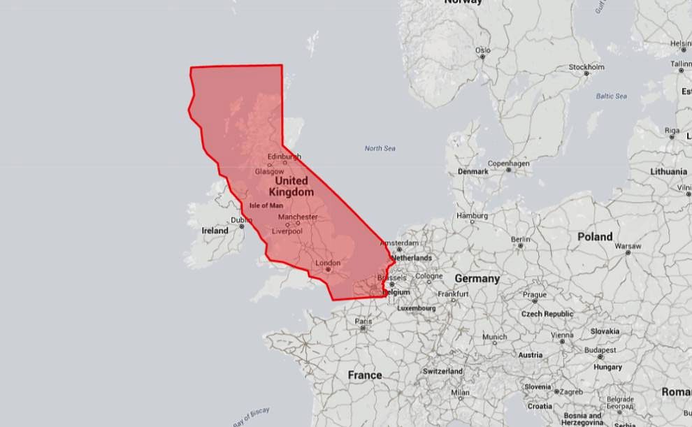
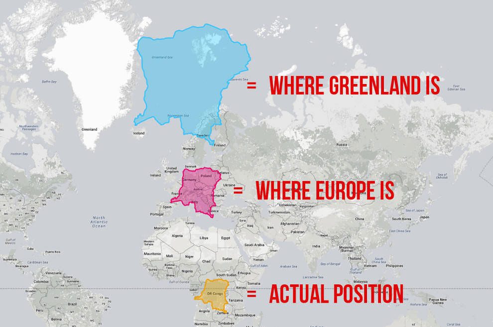
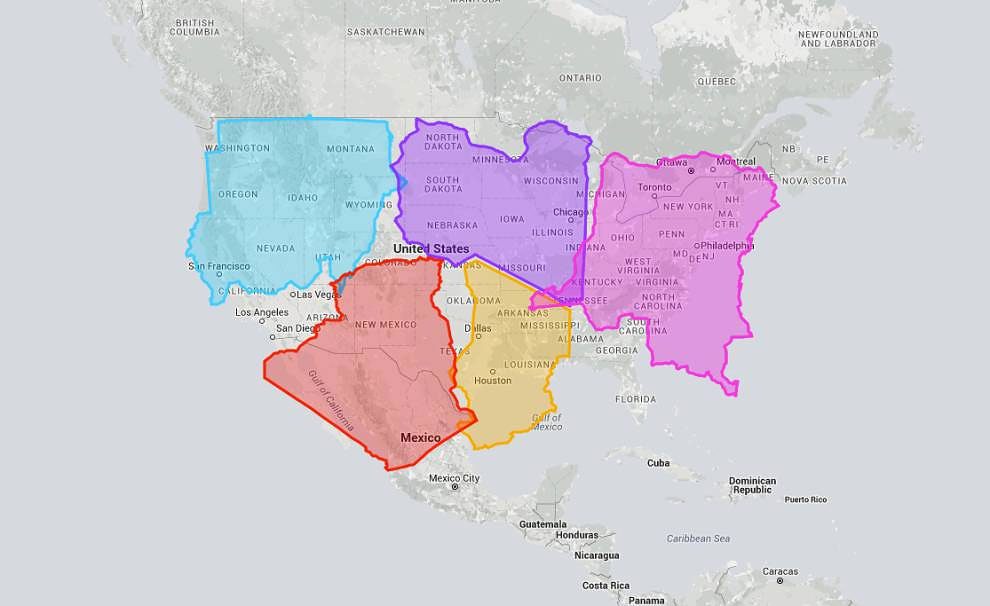
Some countries are significantly larger than they should be thanks to the Mercator projection, while others – anything near the equator – are definitely getting a bum deal. The US falls somewhere in the middle. On a standard map it’s dwarfed by Canada, but here you can see that moving it to where Canada is located makes it seem even more prominent than it already is. The True Size Map was created—a interactive website that allows you to drag countries and continents around the Mercator projection and discover just how big they are. You can do this for any country by simply typing its name into the map, allowing for a seemingly endless amount of comparisons. Note: This post will frequently use the USA as shorthand for the 48 contiguous states.
h/t: buzzfeed
