Graphic Designers Remade Old Buildings Around The World By Using Trends Of The 21st Century
At the very beginning, people developed architecture according to their needs. Protection from the elements and other dangers was the main reason for building a shelter. Over time, other aspects became important too, like seeing from inside the house, being more comfortable, the house looking better. The city also became part of the home. Interior and exterior design became more and more important.
Due to lack of knowledge and materials, the houses were stumpy, the windows were small, walls thick and crooked. However, people learned. The windows became bigger, the walls – slicker, and the overall design – more elegant and beautiful.
SSo what would be the next step in home design? These designers asked the same question and created a series of CG renderings to renovate six old houses from the 21st century, using current and future house design trends.
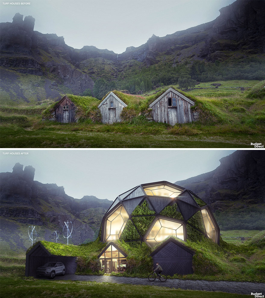
Turf Houses Renovated (Iceland)

An Icelandic turf house consists of a wooden frame stuffed with blocks of turf (grass still embedded in the earth) on a stone foundation. Only the front around the doorway is bared. The entrance leads to a big hall (sometimes via an antechamber) with a firepit in the middle. Our renovated turf house complex plays with the ‘badly hidden’ appearance of traditional turf houses, which seem to sink back into the landscape. The steel-frame dome looks partly natural yet completely alien. Panels of turf and timber alternate with glass windows, using reflections to create an improbable, angular mound of grass, wood, and… clouds! In a subtler touch, the wooden planks that form the facades have been rearranged at decorative angles.
More: Budget Direct h/t: boredpanda
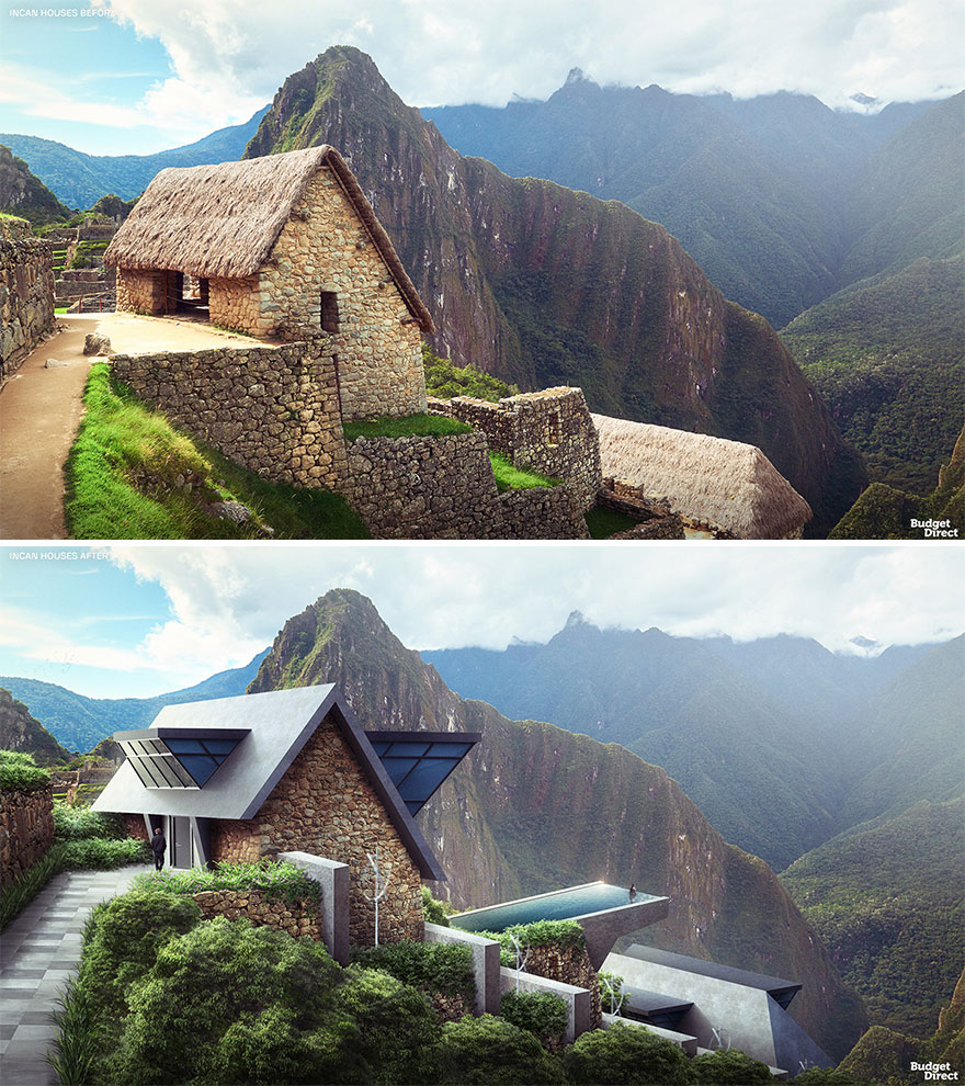
Incan Houses Renovated (Peru)

Incan architecture is renowned for the precise and sophisticated use of stone blocks. However, more humble Incan homes would often be built from unworked field stones or even adobe bricks. Roofs were sloped and usually made of thatched grass or reeds on a wood or cane frame. The settlement we chose to renovate boasts a particularly exhilarating view. We wanted to amplify the strangeness of the arrangement and create more space. We did so by designing wedge-shaped volumes of black concrete and glass that seem like prisms penetrating the rooves. The centerpiece is an infinity pool suspended from the top property, creating an unparalleled mountain view experience.
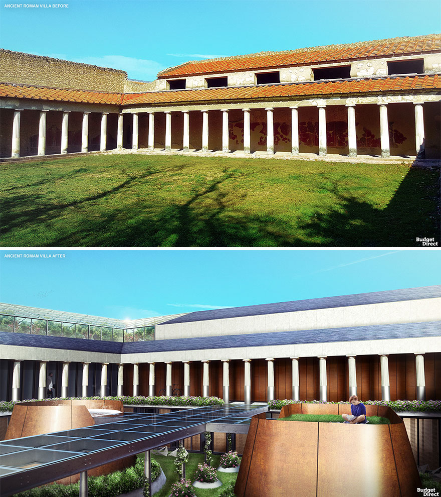
Ancient Roman Villa Renovated (Italy)

Villa architecture in ancient Rome was very diverse in design. But as a general rule, an entrance door in the middle of the façade would open up into a corridor leading to a courtyard. This would be the heart of life in the Roman home. Corinthian style columns or pilasters hung with retractable doors separated the courtyard from the surrounding rooms. How do you extend an enclosed courtyard? We’ve dug down to create a second level. An island hot tub and lawn add recreational options. They are reached by a glass bridge that allows light to reach the extra guest rooms around the new, lower courtyard. Solar brick roofs power the complex, while a greenhouse on top provides homegrown fruits and vegetables for the residents.
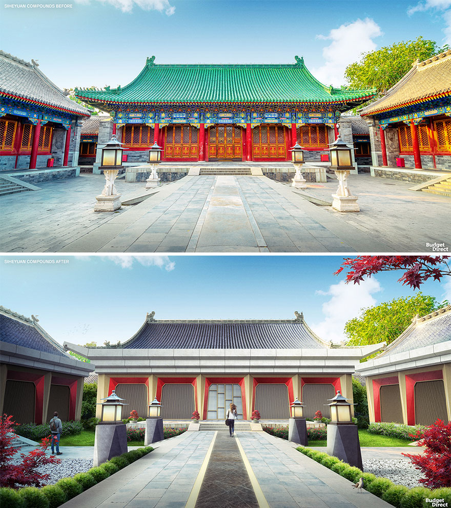
Siheyuan Compounds Renovated (China)

Chinese Siheyuan date back to the Western Zhou Period (1045–770 BC). A typical siheyuan is symmetrical and features four buildings around a quadrangular courtyard. These home complexes were built according to strict height, design, color, and decoration restrictions, depending on the status of the owner. As such, our updated siheyuan boasts an overdue cosmetic makeover. New columns and facades feature angular surfaces, creating a clean-cut, stoic, yet kinetic vibe. The beautiful original roofs have been kept mostly intact, but the addition of solar panels adds a welcome touch of sustainability. Finally, the courtyard has been treated to new grass and pebble areas useful for meditation and play.

