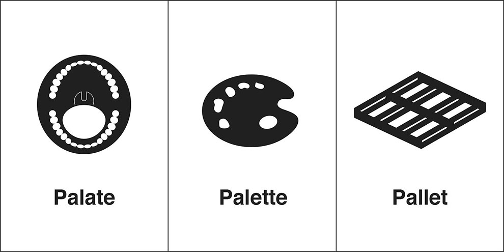
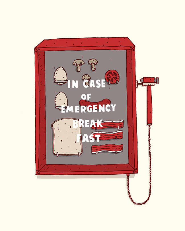
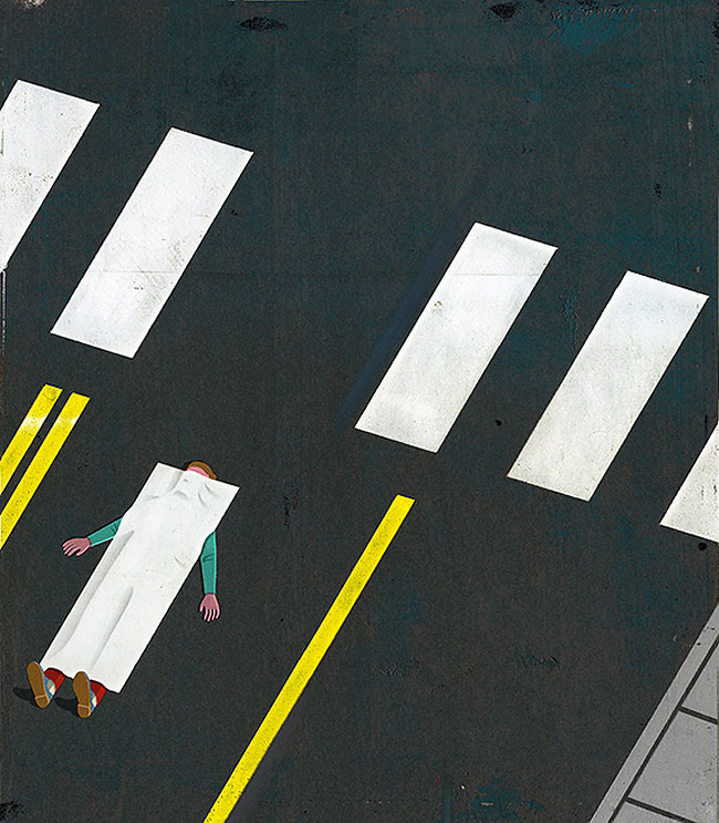
Clever Illustrations Of “Same” Words That People Confuse Way Too Often
What happens when a frog’s car breaks down? It gets toad away. If you’re like me and laughed at this joke more than you probably should have, you know that words are fun. Continue reading »
Clever KFC Ads Perfectly Replaced Fire With Spicy Fried Chicken
The best print ads often make you look twice. A perfect example? This campaign for KFC Hot and Spicy out of Hong Kong. Continue reading »
Designer Ji Lee Makes Clever Calligrams That Visualize The Meanings Of Various Words
New York-based designer Ji Lee started creating calligrams 20 years ago in his typography class at art school. What started as an assignment turned into a lifelong hobby and Lee’s passion for typography has led him to create over a 100 calligrams so far. Continue reading »
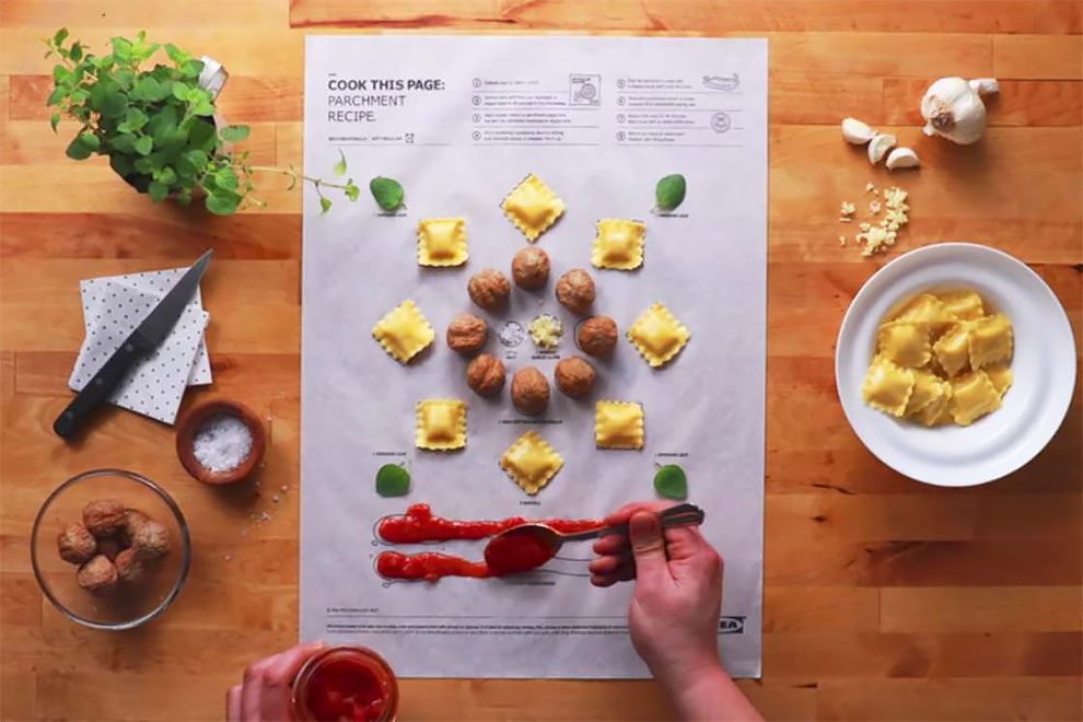
IKEA Invents Clever Posters To Cook
IKEA Canada has created an amazing recipe book entitled Cook this Page, which lets you use its pages to cook directly on them! If this book illustrates recipes in the purest visual tradition of the brand with posters, it proposes you to detach a page, to place the required ingredients on the drawings, then to fold the sheet before putting it in the oven! Printed on cooking paper, the IKEA Cook this Page is a great concept, very playful, which can help some to get into the kitchen. A creative operation created by Leo Burnett Toronto. Continue reading »
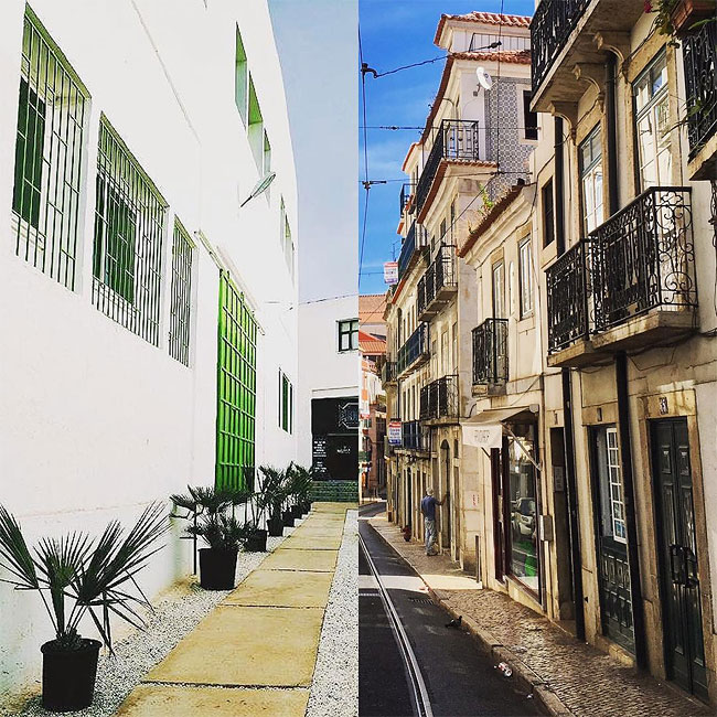
Clever Half-And-Half Photos By A Couple On Opposite Sides Of The World
Becca and Dan are travelers, photographers and a couple. Dan is currently doing a year of traveling and visiting a new city every month across four continents. Becca previously spent 2.5 years in Hong Kong and China, and is currently based in New York City, traveling internationally on her own. Continue reading »
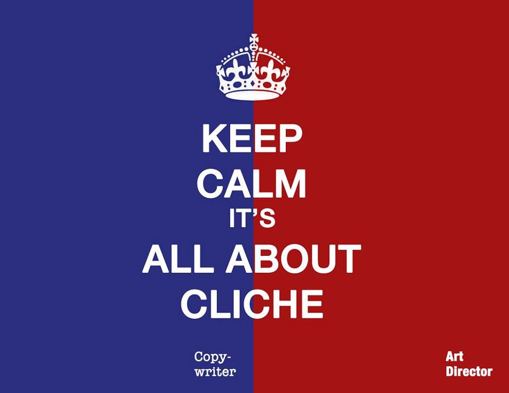
29 Clever Illustrations That Show The Differences Between Copywriters And Art Directors
In the late 1950s, advertising legend Bill Bernbach came up with the idea of pairing art directors and copywriters into teams. The strategy worked and DDB ended up creating some of the most iconic work of that era. Since then, the art-copy team structure came into existence at most, if not all, agencies. They may be working towards a common goal, but as a creative species, copywriters and art directors are not all that similar. Their differences are best highlighted on a Facebook page titled ‘CW Versus AD’ where Caio Pena (art director), Henrique Parada (art director) and Letícia Hanower (copywriter) share their cool, quirky illustrations on this subject. Continue reading »
Illustrator Brings His Cartoons To Life With Clever 3D Tricks
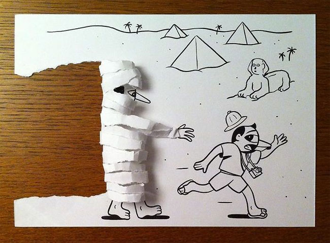
Danish artist, HuskMitNavn, has turned his black and white drawings into something special. With a little tweaking, and a few clever folds, his art transforms into a full 3D world where the characters literally jump off the page. Continue reading »
Life In An Ad Agency Comically Shown Through Clever Use Of Stock Photos
We’ve all seen our share of cliché stock photos. Ad-inspired merchandise store The Incumbent Agency decided to make good use of these typically mundane images by injecting a good dose of humor and transforming them into brilliantly relatable portrayals of life in an ad agency. Continue reading »
Simple And Clever Pictures That Perfectly Sum Up Every Day Life
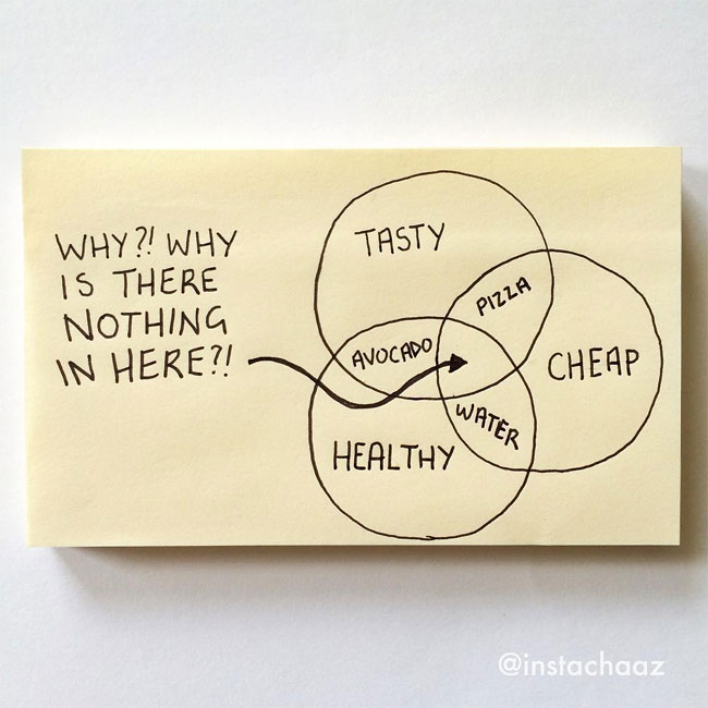
Сhaz Hutton makes funny drawings that somehow perfectly capture the trials and tribulations of every day life, and they will crack you up. Continue reading »
Ukrainian Copywriter Practices His Skills By Creating Clever Print Ads Every Day
Have you heard about the ‘365 challenge’? The one where you’re supposed to do something every single day for one year? These things actually work, and if done honestly, they can become a good way to hone your skills. That’s what Ukrainian copywriter Andrii Mischenko decided to do to flex his creativity muscles. Continue reading »
Clever Tables That Create An Illusion Animals Are Emerging From Water
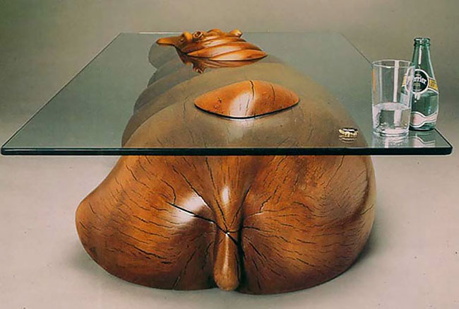
Looking to spice up your living room with a unique piece of furniture? A coffee table portraying a floating animal by Derek Pearce should do the trick. Derek Pearce is a man with one unique vision. Called ‘Water Tables’, he creates stunning coffee tables that portray animals “floating through water”. From hippos to dolphins to ducks – he designs the tables so the animals would be plunging in and out of the glass, which represents the water’s surface. The result is truly amazing! Continue reading »
Clever Mash-Ups Of Everyday Objects by German Artist Martin Roller
German artist Martin Roller constructs assemblages of objects in hilarious and astonishing ways in his body of work. Taking found object from the streets of Berlin, he photographs interesting mash-ups of everyday objects and remnants of trash, transforming their original function. Continue reading »
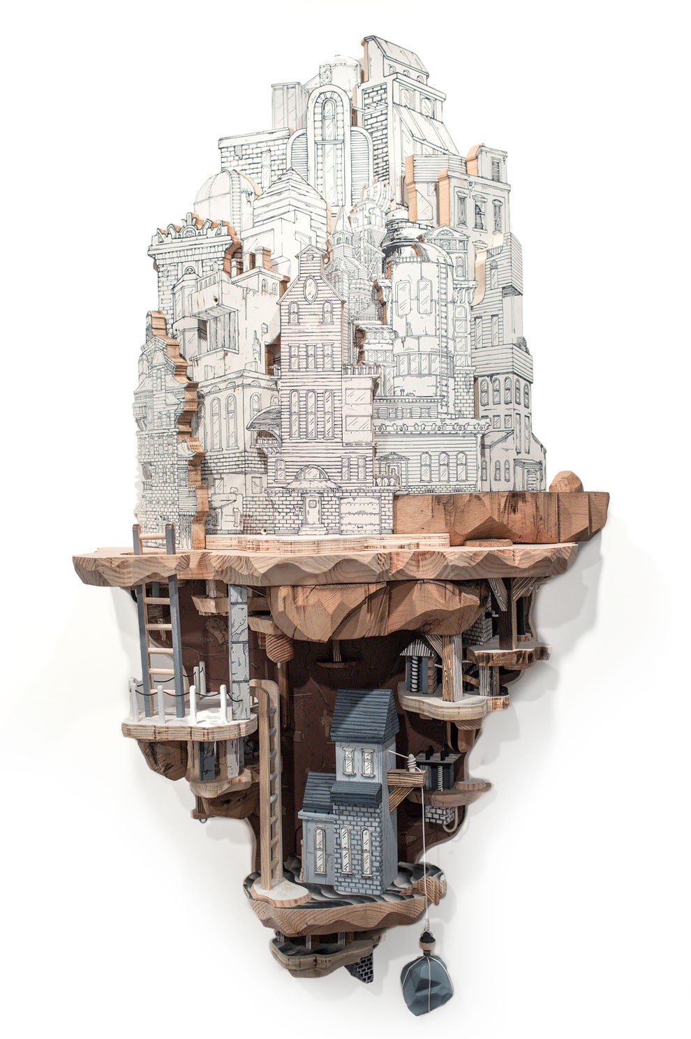
Clever Combinations Of Illustrations And Wood Carvings Create Extraordinary Miniature Cities
Luke O’Sullivan uses a combination of drawings and sculptural carvings to construct wondrous urban landscapes. His extensive metropolitan pieces strike a balance between recognizable architecture and impossible structures in order to create fantastical subterranean systems. The 3-D artworks protrude into space, similar to a diorama display, but O’Sullivan purposively ensures that his miniature worlds are rooted partially in reality and partially in the absurd. Continue reading »
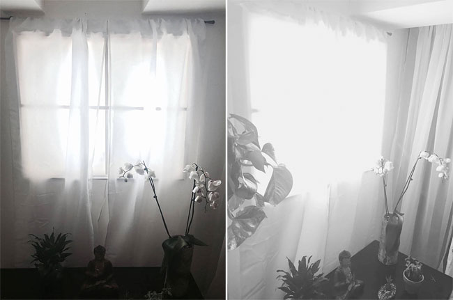
Clever Way To Make Your Basement Seem Brighter
A woman decided to do something about her basement that lacked sunlight. So, she built a fake window with ‘artificial sunlight’ created by LED lights. Looks believable. Continue reading »
18 Clever Digital Images Which Keep You Guessing
There is no need to put too many words on paper to write a crucial message. Elite advertising campaigns tend to provide a lot of value with just one simple phrase. This is what Manipula Art, a Brazilian creative production agency, does with its multi-disciplinary philosophy. Continue reading »
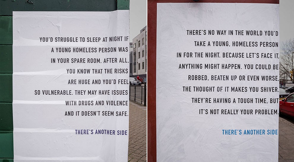
The Trick Copy On These Clever Ads Shows Another Side To Homelessness
Here’s a clever outdoor campaign from Publicis London for the homelessness charity Depaul that manages to tell two different stories with the same copy. The ads are being placed on corners, with text on each side. If you read only the left side, the copy is all about the negative ideas people have about giving up a spare room to a homeless youth. But reading them in full, the ads actually argue for the benefits of volunteering.
“There’s another side to the story,” says the tagline. Continue reading »
Clever ‘Lose The Waterbeard’ Campaign By John Keatley
Seattle-based advertising and editorial photographer John Keatley worked with MiiR Bottles in creating this clever Lose the Waterbeard campaign. Ian Goode of Gigantic Squid helped him make the waterbeard magic. Continue reading »
Cute And Clever Illustrations By Jaco Haasbroek
If you are looking for something that could lighten up your somewhat heavy day, here is a treat for you – cute and clever illustrations by Cape Town-based artist and designer Jaco Haasbroek. Check them out and for sure you would end up having bright smiles on your faces. Continue reading »
Clever, Well-observed Editorial Illustrations from Toronto-based Peter Thomas Ryan
On first glance Toronto-based illustrator Peter Thomas Ryan’s style appears simple and almost naive in some images, but the cleverness lies in his ideas and composition. Peter’s created work for The Wall Street Journal, Scientific American, The Washington Post, Variety among a whole heap of others and it’s interesting to see how adaptable his work can be. Continue reading »
Clever Redesign Of McDonald’s Takeaway Bag Lets You Eat A Big Mac Without Mess Read
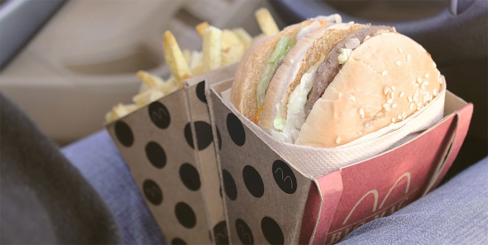
Design student Jessica Stoll, from Arizona State University, has created a packaging redesign concept for McDonald’s Big Mac, which not only looks like a delightful Happy Meal for adults, but also reduces mess when eating on-the-go. Continue reading »
Clever Ads Feature Classic Artists Photographing Their Self Portrait
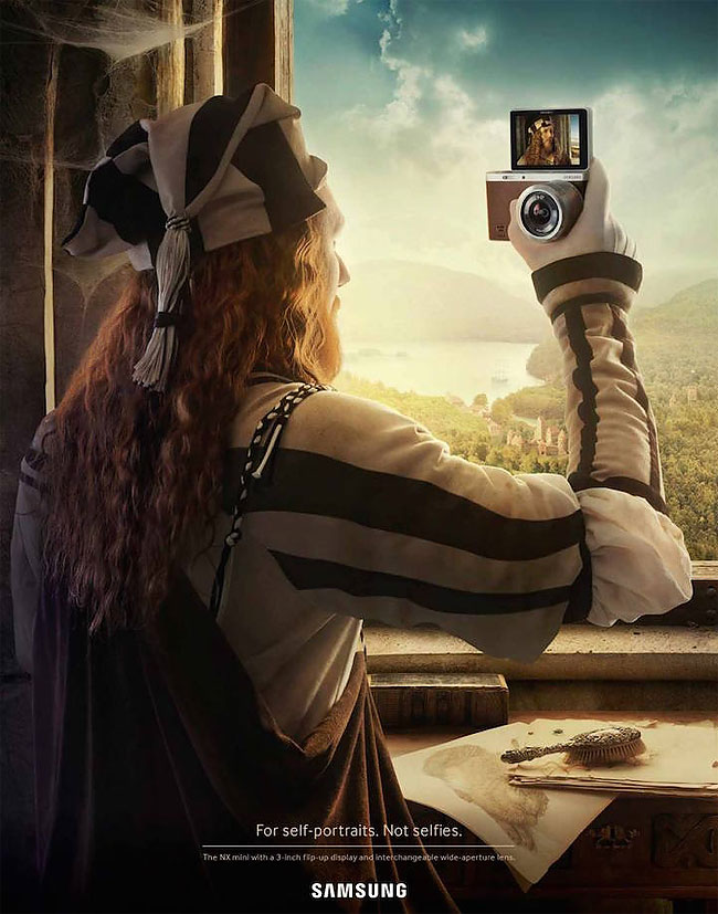
Albrecht Dürer – Poster for the camera SAMSUNG “NX mini” with a 3-inch flip-up screen.
Advertising agency Leo Burnett Switzerland created a tongue-in-cheek campaign that’ll appeal to both selfie and fine art lovers. Three posters feature the iconic artists Vincent Van Gogh, Frida Kahlo, and Albrecht Dürer snapping their picture using the Samsung NX Mini camera – the tagline for the campaign is For Self-Portraits. Not Selfies. In each image, the subject holds the NX Mini as the viewfinder reveals a mirrored portrait. Continue reading »
Pornhub Will Use One Of These Clever Ads In Its First National Ad Campaign
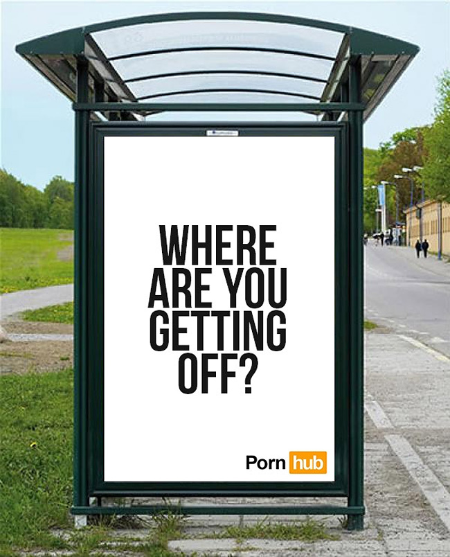
Those who have been waiting with bated breath for the results of Pornhub’s SFW advertising contest were assuaged today with the unveiling of 15 finalists. And there’s quite the smattering of innuendo and suggestion in this batch, featuring a few videos, some clever image and word plays, and some that almost literally spell it out.
To those just tuning in, the site challenged the world to make G-rated, family-friendly ads for the site in March. Check out the finalists below and vote on PornHub’s SFW tumblr.
Here’s hoping this contest has a happy ending. Continue reading »
