Clever Redesign Of McDonald’s Takeaway Bag Lets You Eat A Big Mac Without Mess Read
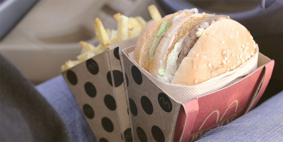
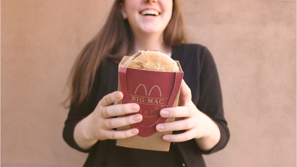
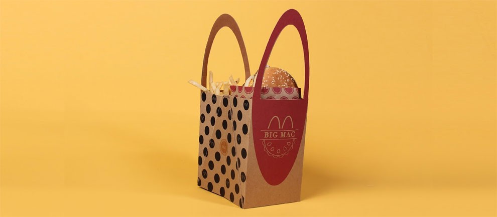
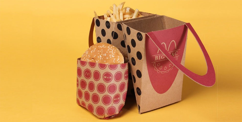
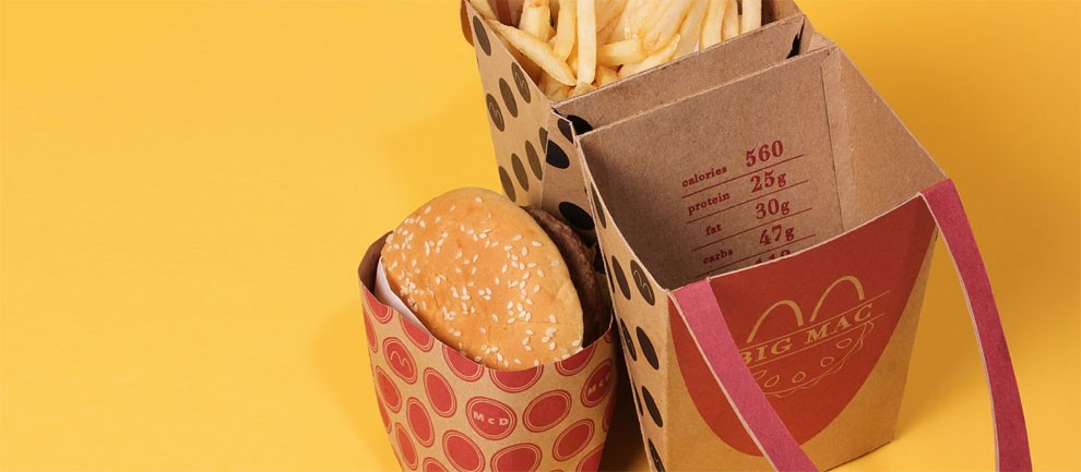
Design student Jessica Stoll, from Arizona State University, has created a packaging redesign concept for McDonald’s Big Mac, which not only looks like a delightful Happy Meal for adults, but also reduces mess when eating on-the-go.
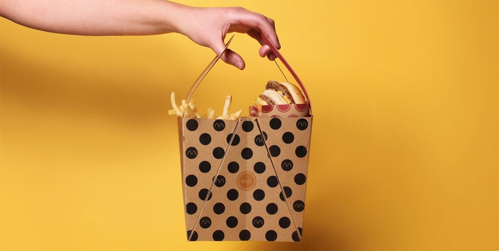
The project was inspired by the problematic process of trying to eat a Big Mac while navigating through traffic on the way to work or school, and rummaging through the takeaway paper bag for lost fries.
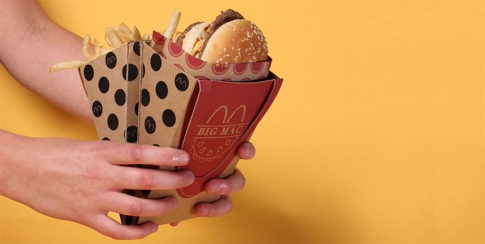
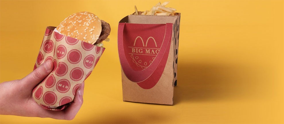
The two-sided carrier fits the burger and the fries nicely at the top. It can stand upright on any flat surface, or transforms into a tapered diamond-shaped package when folded, which can be easily held in just one hand or wedge snugly between your legs.
What do you think — is this packaging more user-friendly for takeaway meals?
