Humorous Posters Of Graphic Design Puns That Will Make Designers Laugh
Graphic designers have altogether different mindsets, the way they perceive things, the way they guess meaning within the lines, the way they devise ways to the healthy outcome of their projects and the way they don’t take negative criticism at heart show that their temperament is different, stable and optimistic.
They get the humor positively, they become sarcastic positively, they show irony in their designs, and they bring out amusement and interesting features into their creation. If I say, they develop a relationship with their tasks, it won’t be wrong.
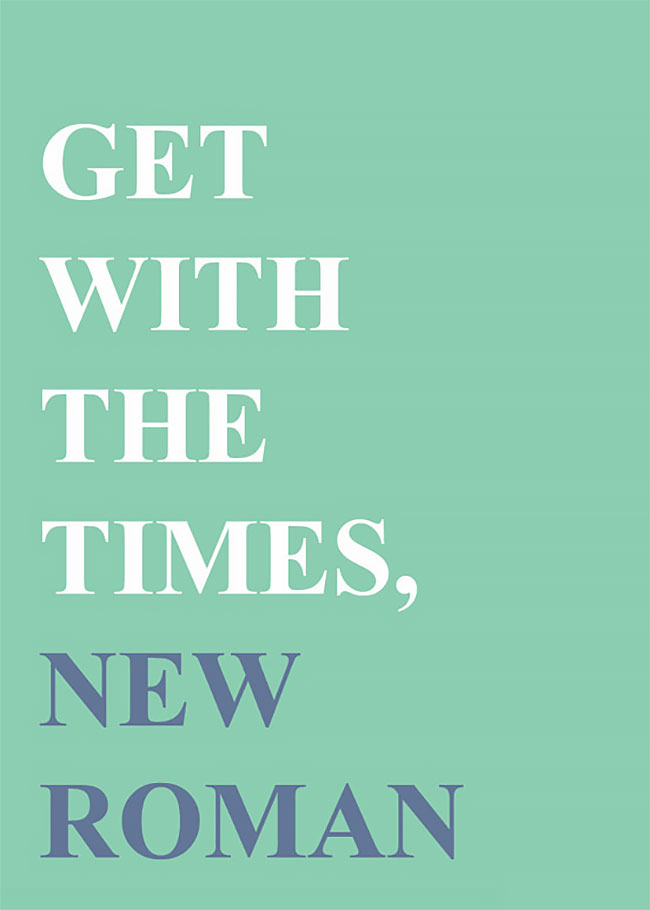
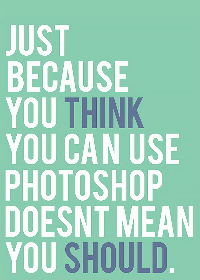
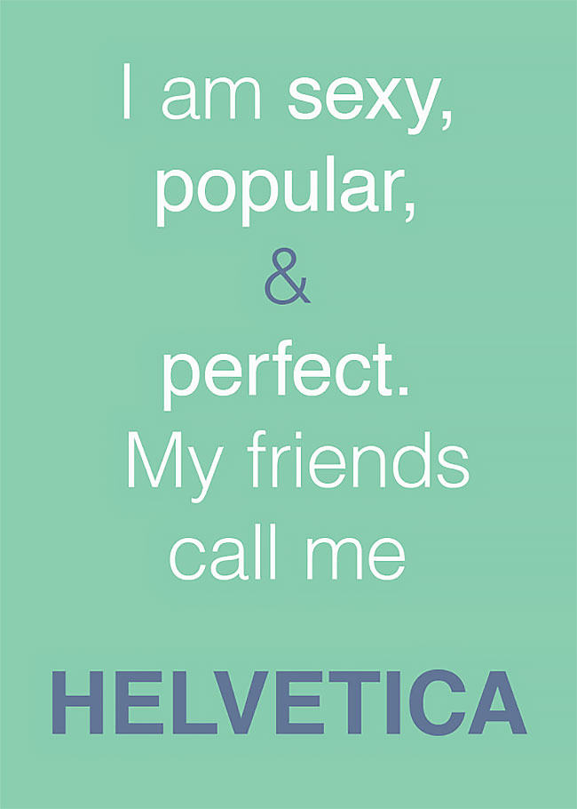
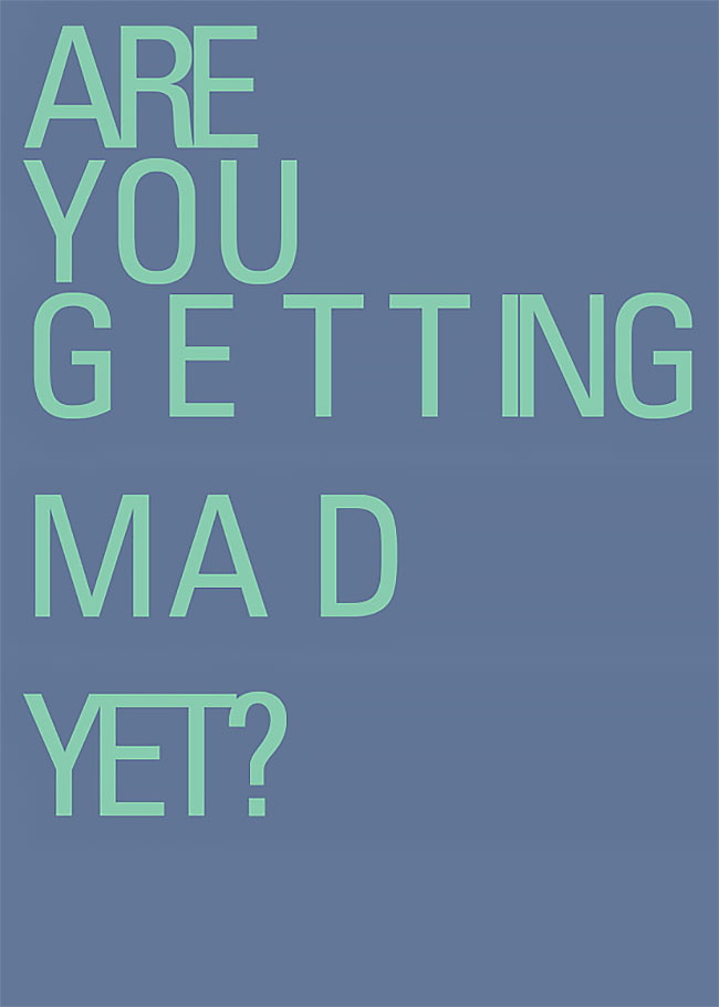
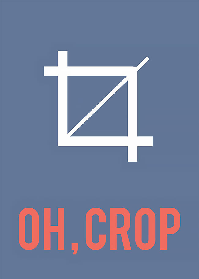
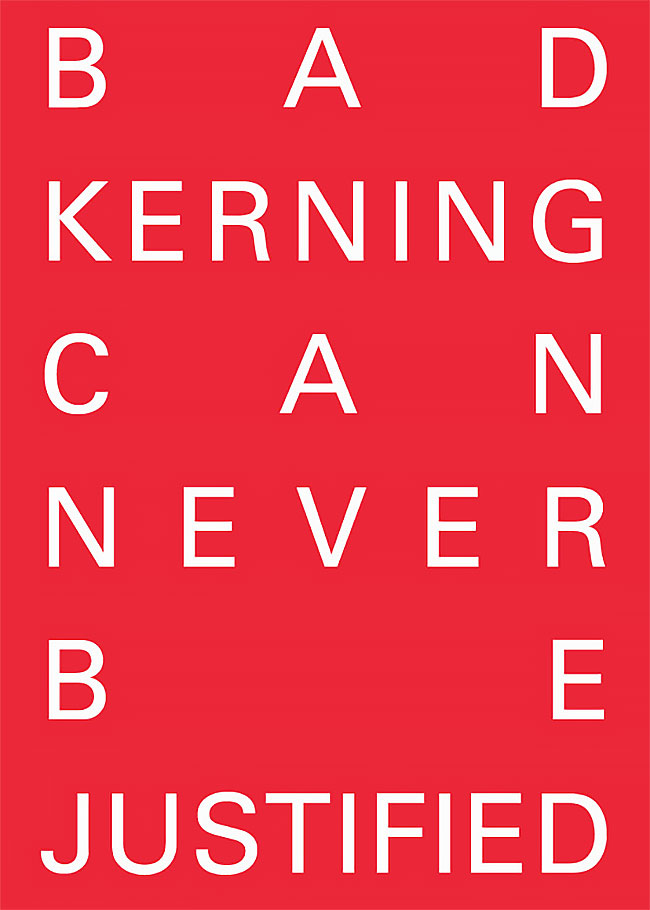
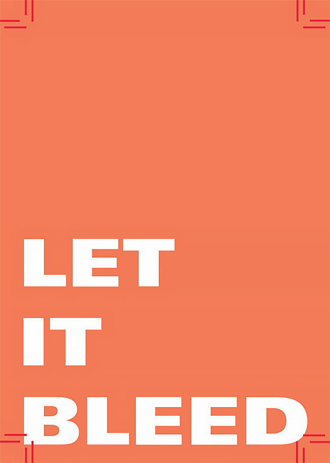
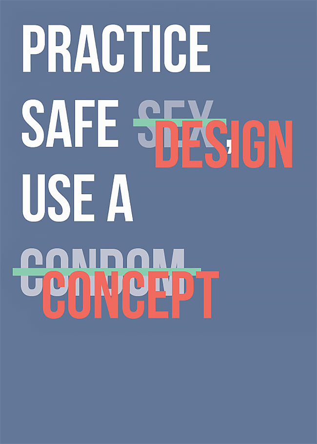
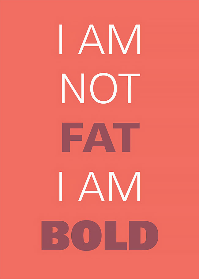
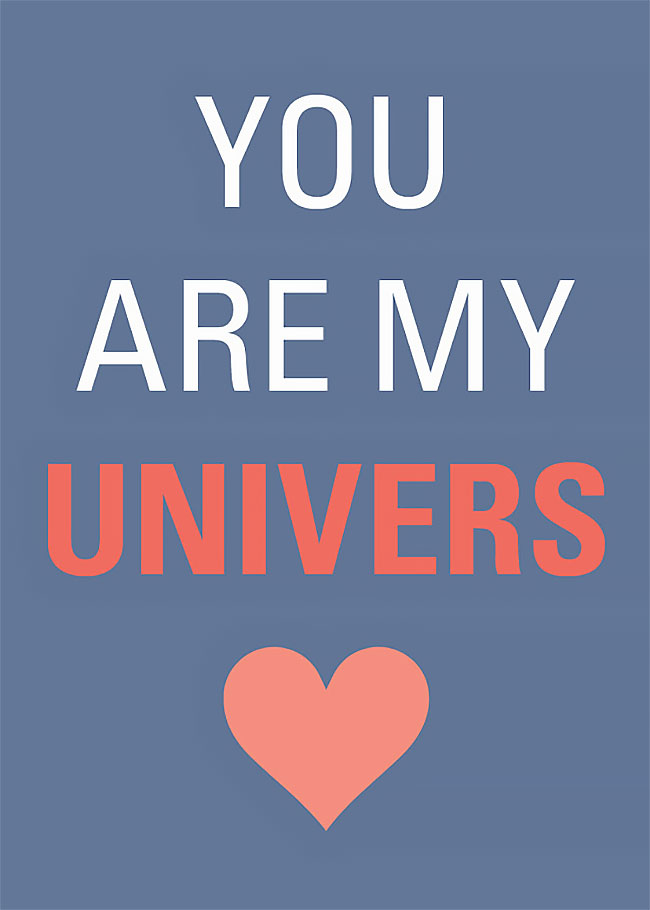
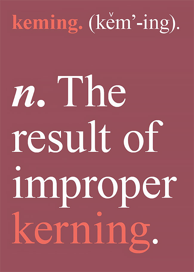
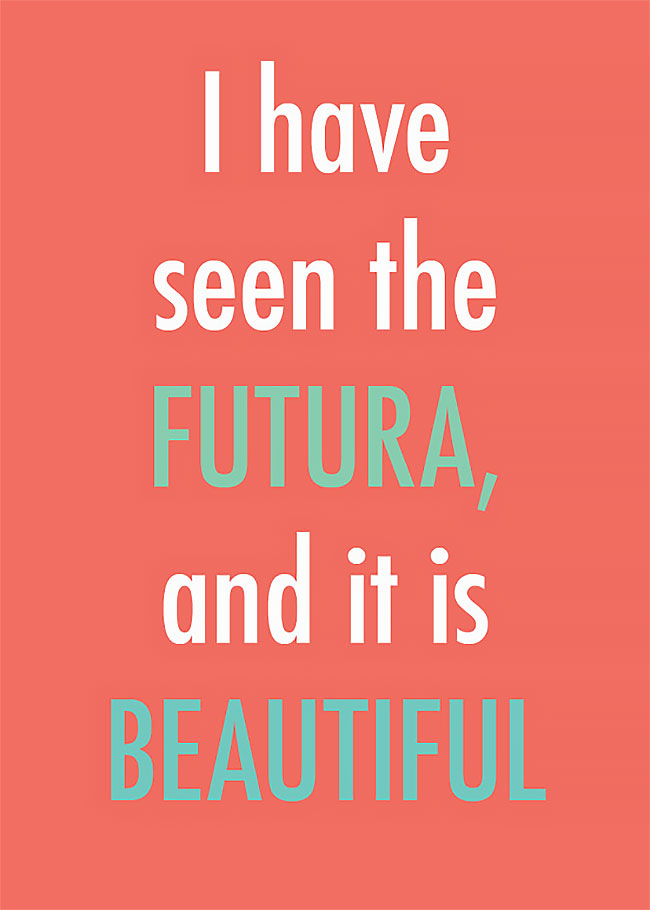
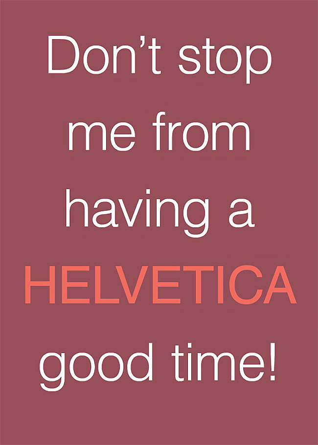
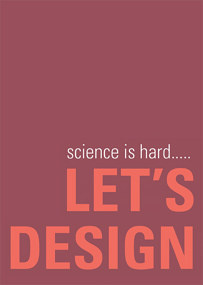
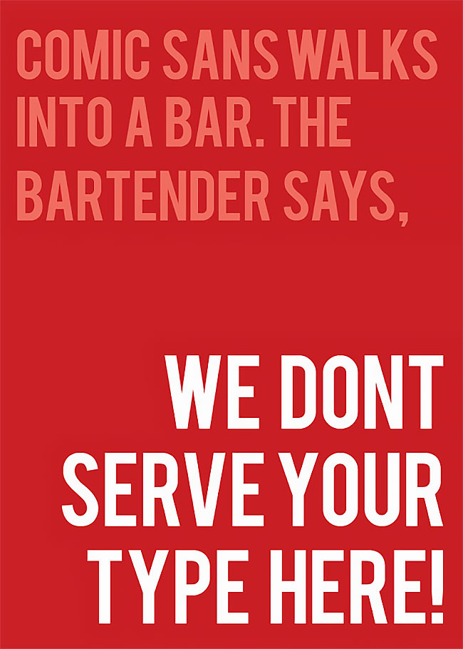
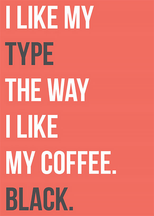
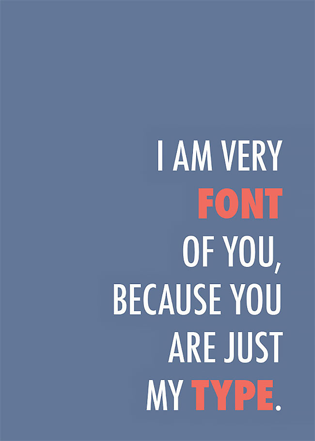
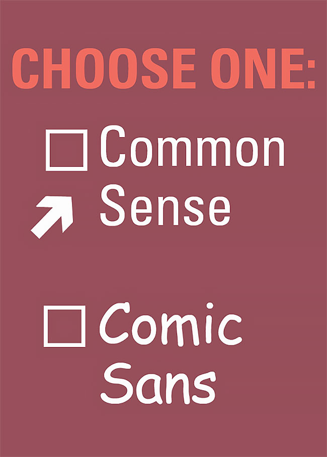
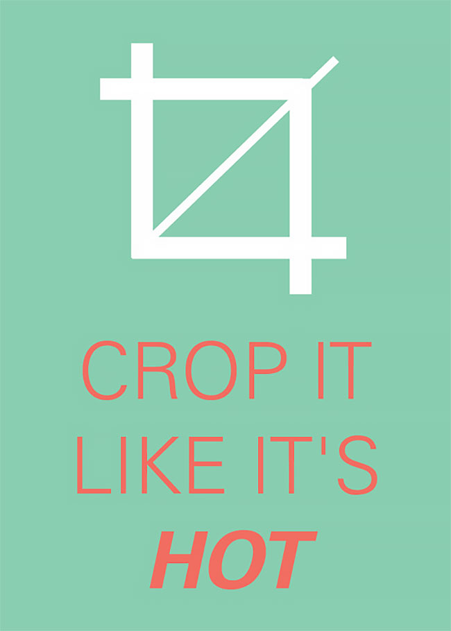
To inject some light-hearted humor into graphic design, marketing and promotions assistant Sara Heffernen has created a set of colorful, minimalist “Graphic Design Pun Cards”.
Featuring simple graphics and funny words, these cards illustrate the various quirks of being a graphic designer and poke fun at the many issues that they are concerned with at work.
For instance, one of the cards reads, “Bad Kerning Can Never Be Justified”, with the text cleverly set to the justified layout style.
h/t: designtaxi
