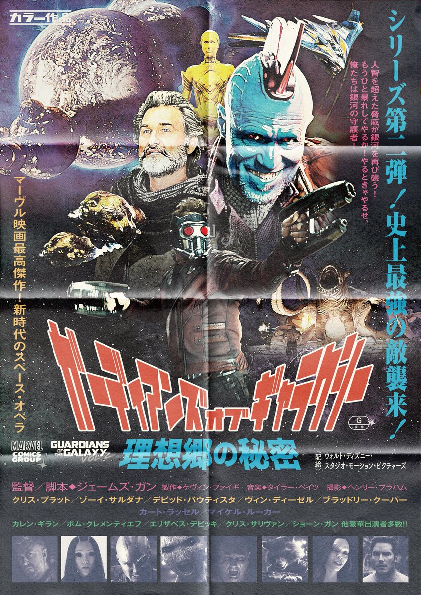
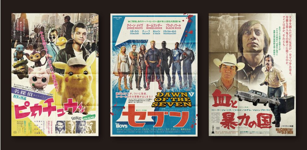
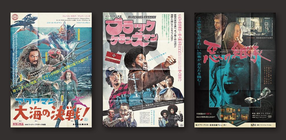
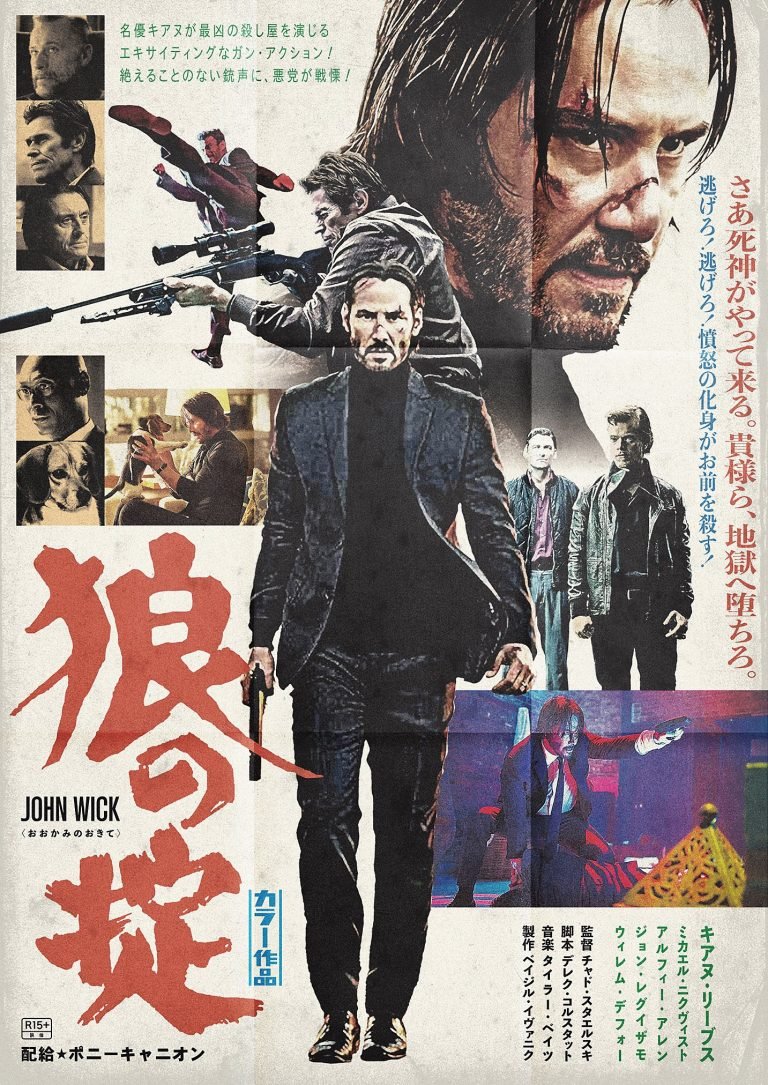
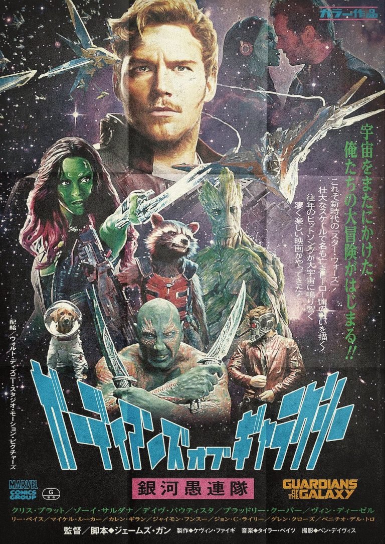
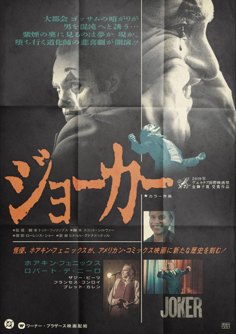
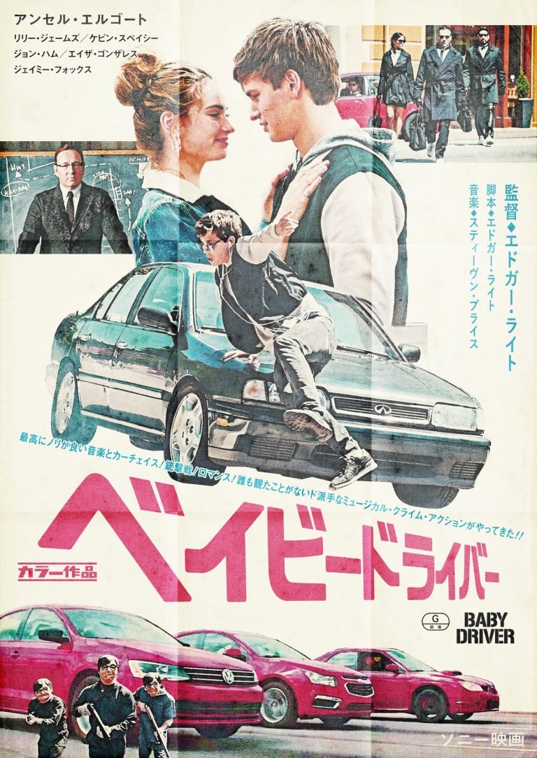
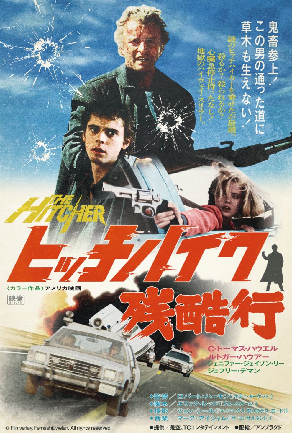
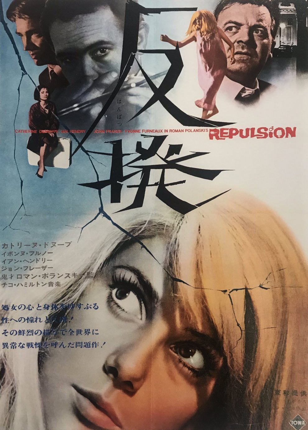
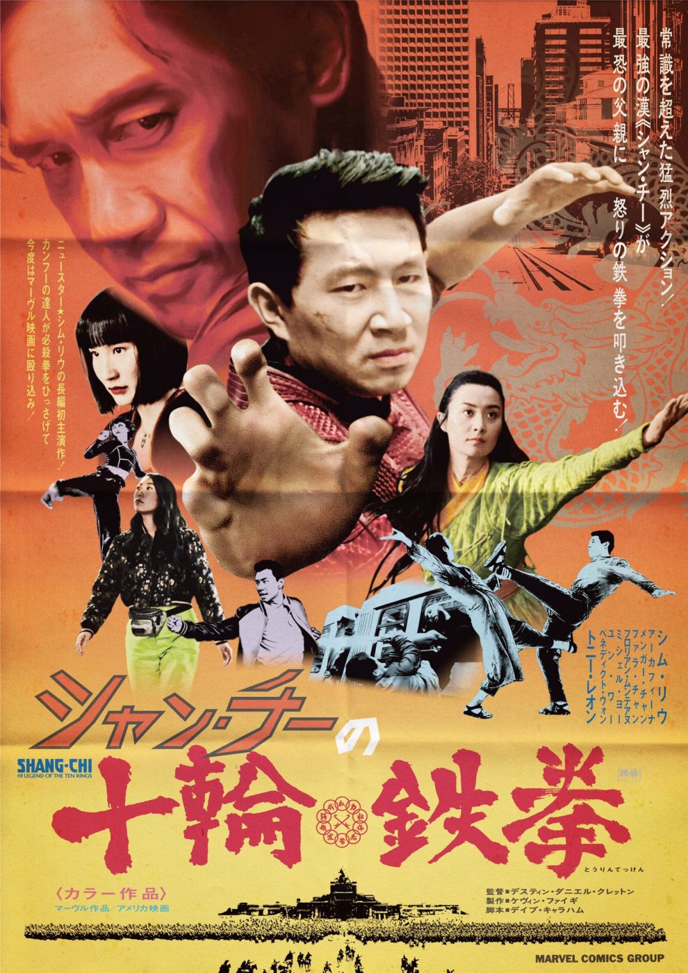
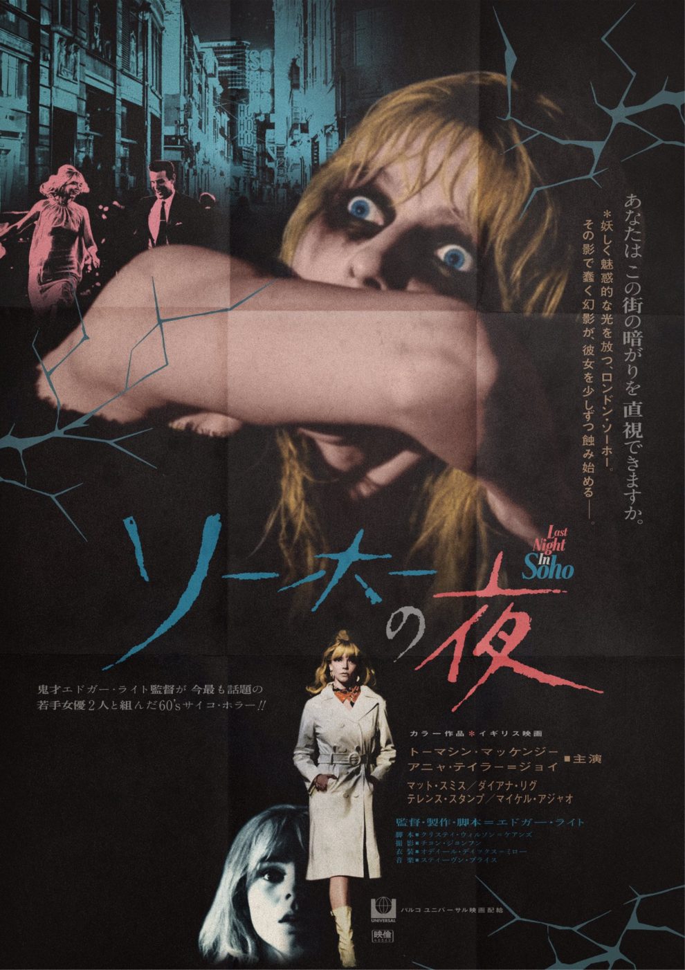
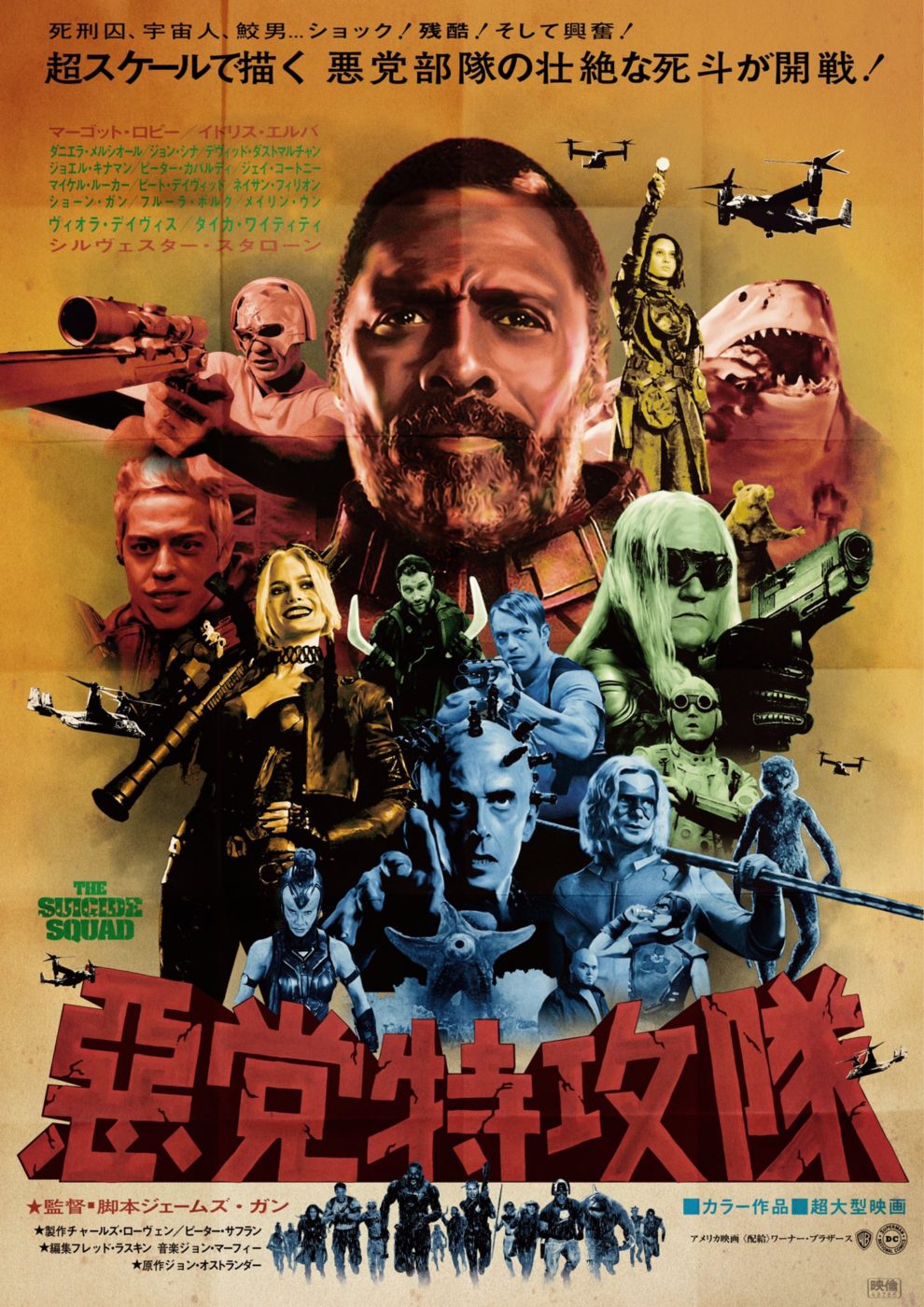
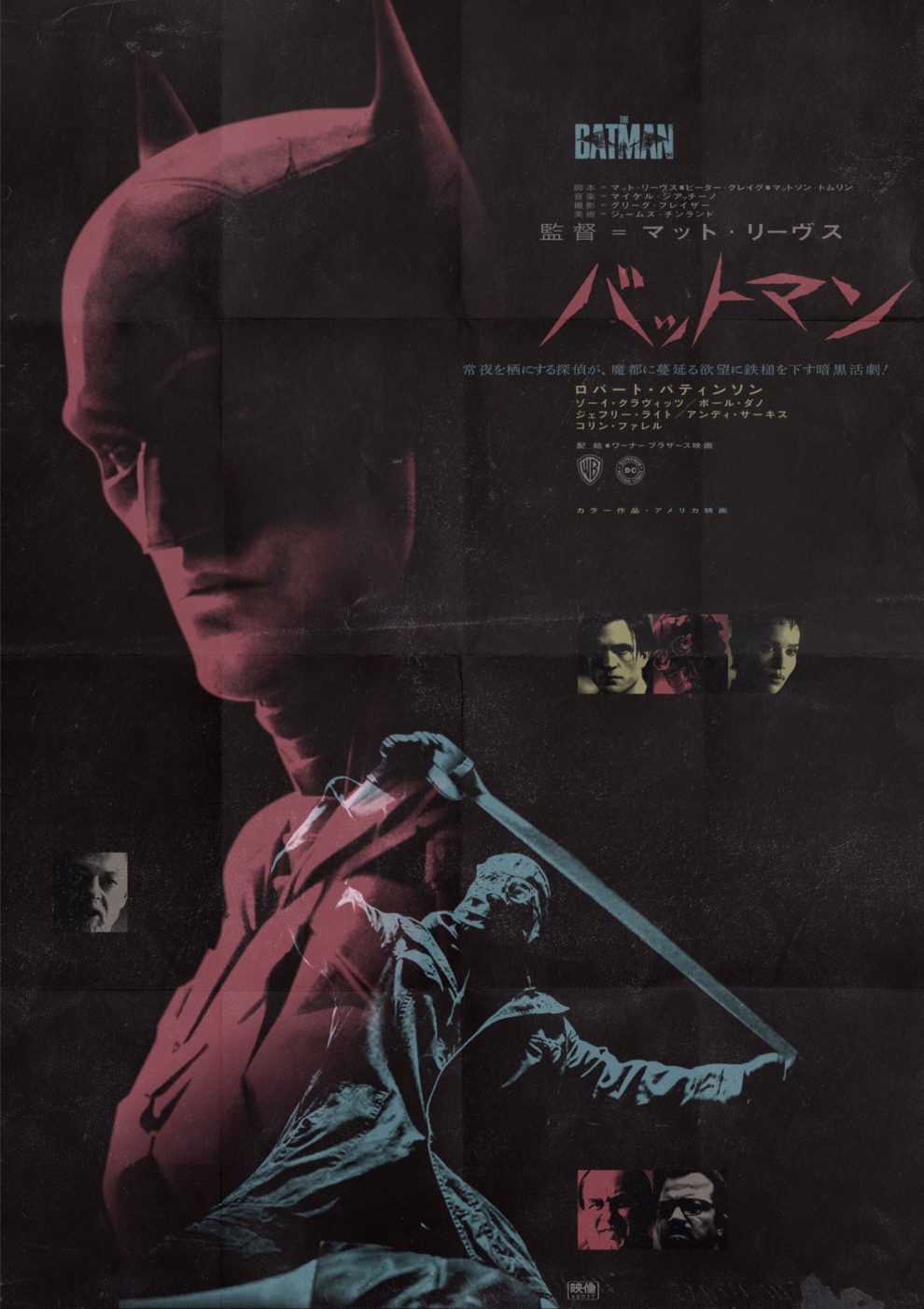
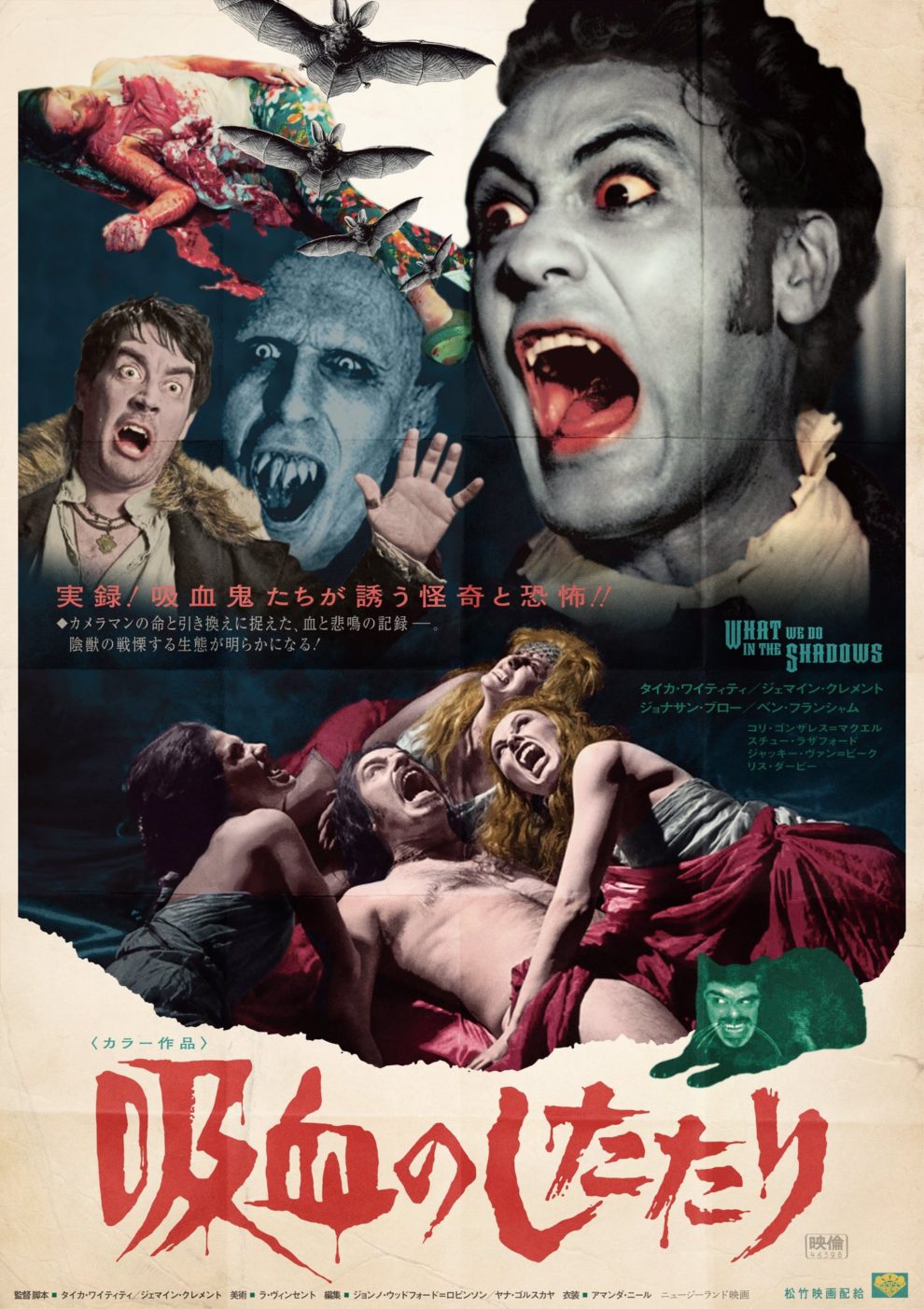
Talented Fan Takes John Wick, Pikachu, and Marvel Heroes Back to The Golden Era of Japanese Poster Graphic Design
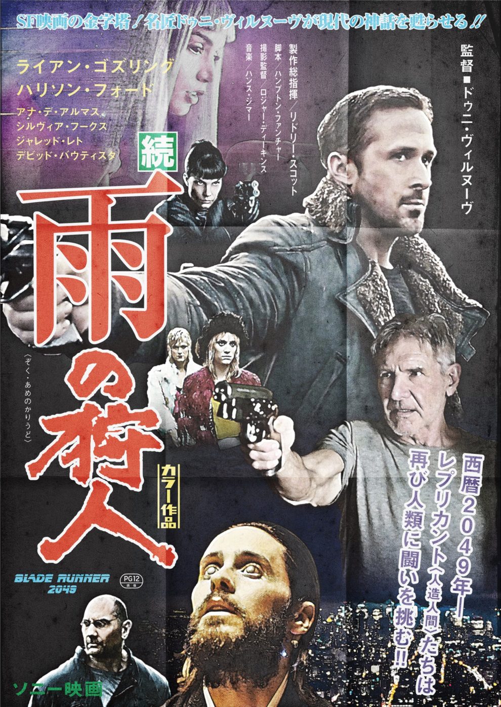
How do you promote a film in an era when there are no trailers, no Metacritic, and no reviews on Youtube? At the very least, make the most informative poster for it. Put as many characters in it as possible, tell the story, show more footage, and maybe people will realize that it’s worth going to such a movie.
The Japanese Twitter user Corned Beef Taro (@UMAI_ONIKU_TARO) draws the posters for contemporary blockbusters in this superinformative style, just as they promoted cinema in Japan in the 70s and 80s. In addition to the intricate layout, where you have to fit in a huge number of details, the designer also takes care of purely atmospheric details, such as bending marks. And, of course, the title of the film is translated into Japanese: for us this localization is commonplace, but in Japan it has only been resorted to in the past.
