The New York Times Magazine’s Logo Reimagined
As part of a special innovations issue, The New York Times Magazine invited eight designers to reimagine its age-old logo to fit the current times.
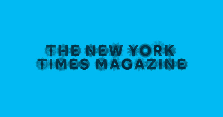
Magpie Studio
This idea developed from our basic belief that innovation never stands still. After experimenting with ways of applying movement to type, we hit on the concept of revolution and took it quite literally — rotating the letterforms to create beautiful, yet seemingly random, shifting shapes.
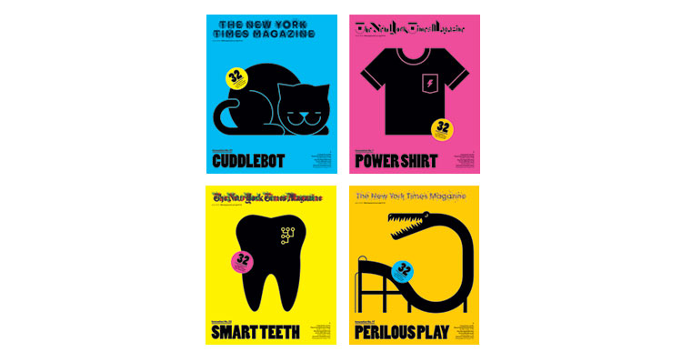
You should have seen the letters we received in 1967 when the newspaper’s legendary design director, Louis Silverstein, decided to remove the period at the end of The New York Times logo, which had been there for 116 years. “How would you like to wake up and find your wife’s face had changed?” one reader asked. We hate to imagine what that reader would think of this week’s cover. We asked eight designers to re-imagine the logo. Four ended up on four different covers, and another four ran inside the issue. We also have 10 additional sketches. Here, the designers describe how they approached the assignment.
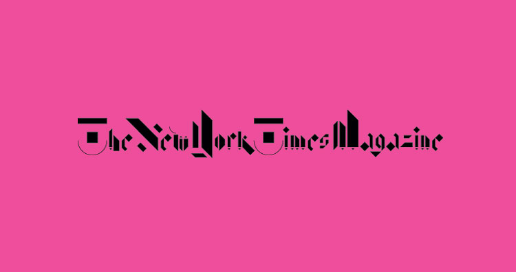
Non-Format
We were looking to put legibility to the test. By abstracting the gothic script of The New York Times Magazine’s logotype, we reduced it to a seemingly arbitrary collection of geometric shapes. When viewed individually, each letter may be difficult to recognize, but we hope that when gathered together, the letters create a logotype no less familiar than the original. As the brilliant type designer Zuzana Licko once said, “You read best what you read most.”
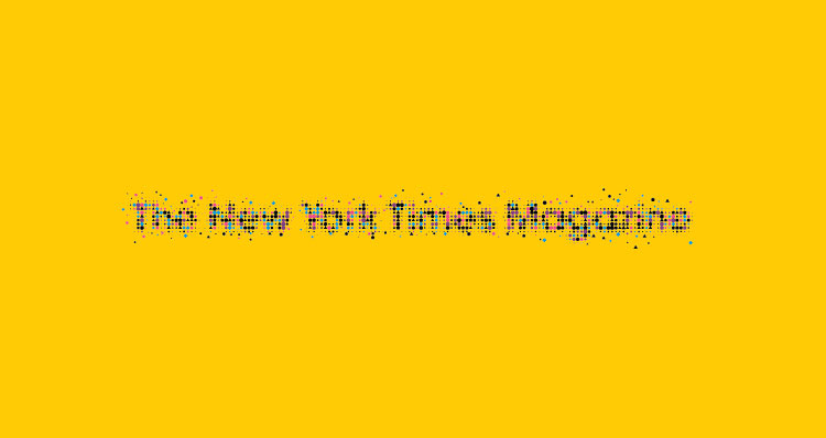
Alex Trochut
All the shapes — circles, triangles, pentagons — breaking out of the normal logo space are meant to symbolize the spread of information and ideas. Classic and chaotic: that seems like a pretty good definition of The New York Times.
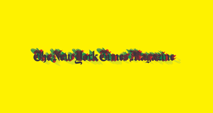
Christopher Clark
I wrote a program that altered the shapes of the original logo, then layered them on top of one another so the original still shows through. The results look vaguely like ink drawings blown in the wind.

Benjamin Critton
It’s a heavy-handed homage to the standard New York Times logo — an almost clumsy, vaguely familiar iteration of an inimitable thing. The uppercase letters are simplified versions of the original, and the lowercase ones are governed by the arbitrary rule that no single character may be rendered in the same form.
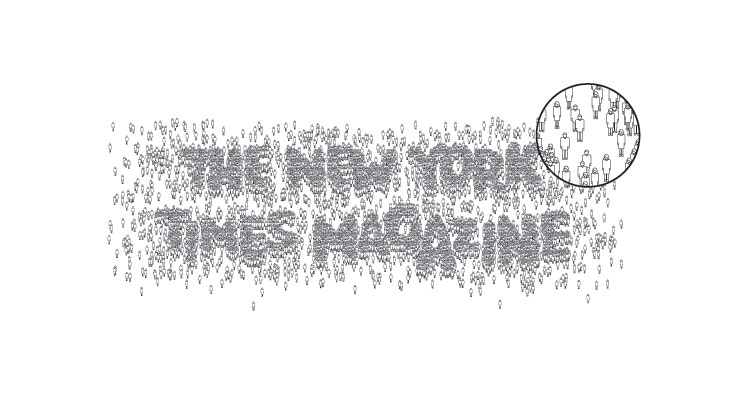
Natasha Jen, Pentagram
Surrounded as we are by technological advancements, it is easy to forget that one of the greatest innovations is the new group dynamics that we, the people, are shaping. Enabled by digital technology, we have become media. Without “us,” it’s all impossible.

Mother NY Design
We wanted to speak to the latest breakthroughs in communication using one of humanity’s oldest forms — the pictogram. It also helps that pictograms, like emoticons, have been fully incorporated back into our daily language.

Helmo
Rather than concentrate on the form of the logo, we decided to focus on the words themselves. We hid some with a correction fluid called Tipp-Ex., and we wrote over others in AG Schoolbook font, and — boom! — you’re looking at an old logo in a new way.
Correction: June 5, 2012. A previous version misidentified the font that Helmo used. It is AG Schoolbook, not Helvetica.
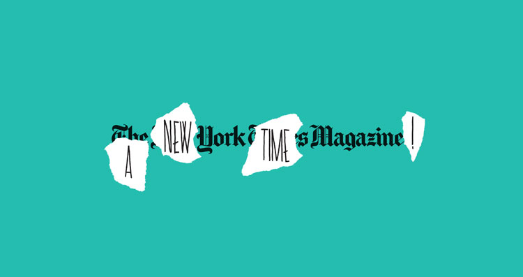
Helmo
This sketch is a variation on the previous design, presenting another message.
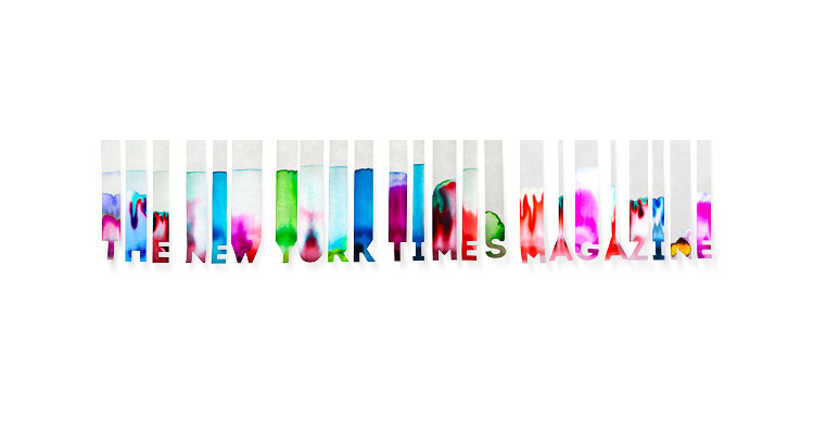
Magpie Studio
The concept sketched here celebrates experimentation as the path to innovation by using experimental chromatography, which is a process undertaken without a clear idea of what you’re going to get — a celebration of the unexpected, across the spectrum.
Magpie Studio
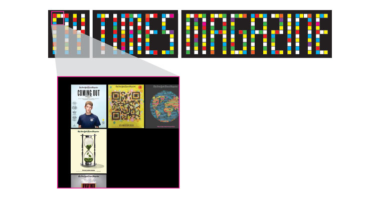
The idea sketched here reignites those most loved, loathed and talked-about Times Magazine covers by using them to create a dot-matrix masthead.
Magpie Studio
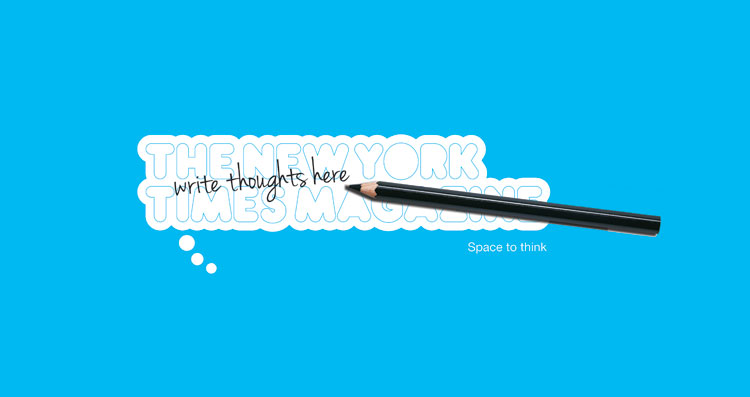
Innovative ideas often start as a sketch or a scribbled note. This idea sketched here allows readers to leave their mark, with a doodle, idea or thought for the day. A Times Magazine pencil could be given away as a gift.
Magpie Studio
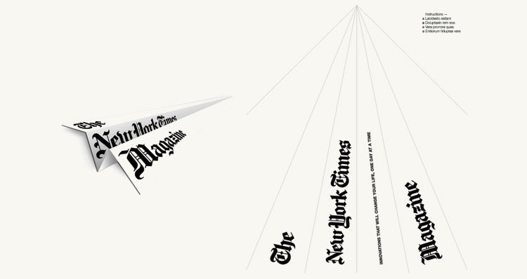
Flight is undoubtedly one of man’s greatest achievements. In a nod to that, the cover sketched here becomes an interactive piece, whereby readers can introduce their own high-flying Times Magazine logo.
Magpie Studio
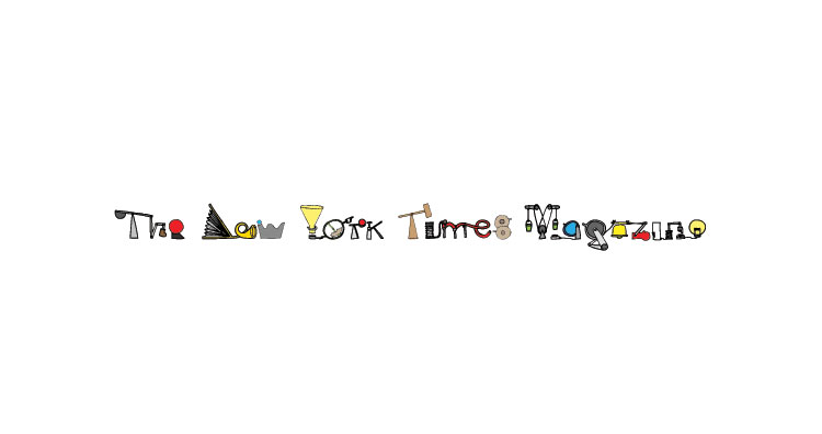
In appreciation of the work of Heath Robinson and Rube Goldberg, the Times Magazine logo sketched here is represented as a machine for new thinking and innovation; churning out ideas through an elaborate set of objects and triggers.
Mother NY Design
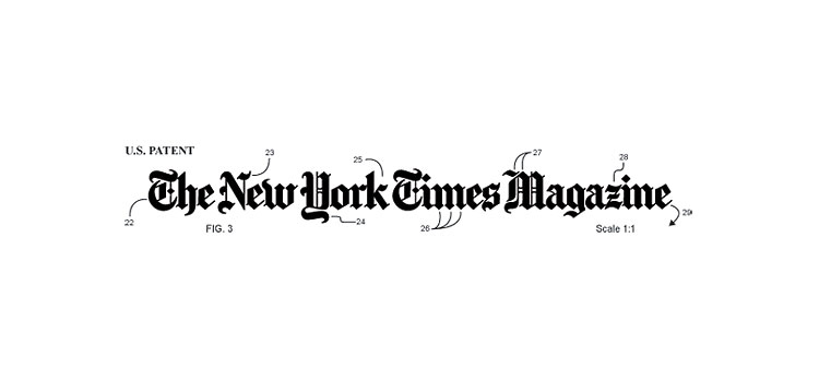
This sketch evokes the drawings often required to register for a patent, which could call to mind patents that are a century old as well as the recent tech world trend of acquiring companies solely for their patents.
Mother NY Design
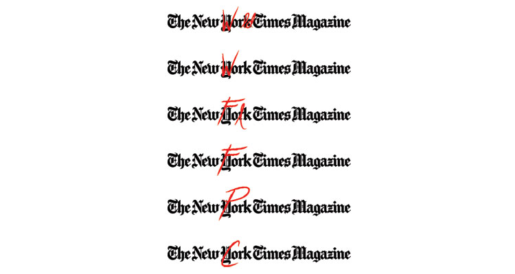
This sketch gives the existing logo new meaning through word play on “York,” alluding to innovations in business, music, dining, farming and wine.
Mother NY Design
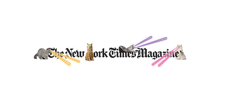
This sketch plays with the boundary between digital and print by proposing to take a tech innovation — the iPhone App Catpaint, which allows the user to place images of cats and laser beams on top of any existing image — and running it in a print magazine.

