Absolut Looks to Create an Icon for the Future with Bottle Redesign
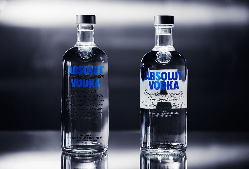
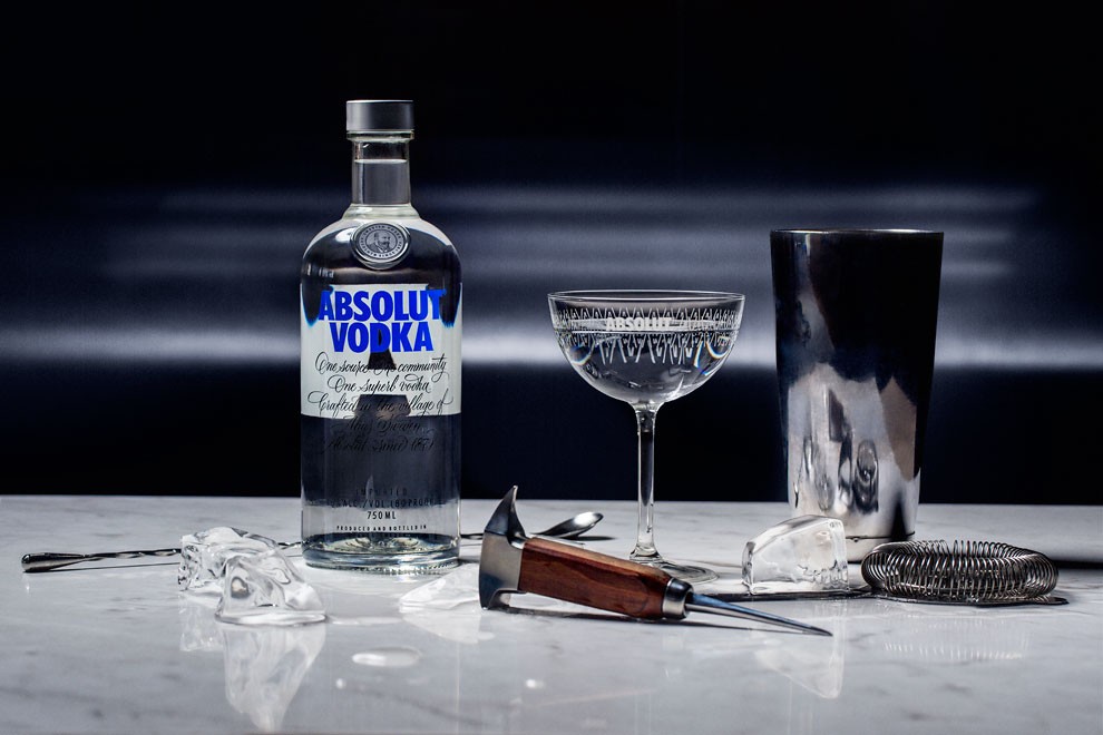
This year, Absolut looks to the future and makes a new mark by introducing a freshly redesigned bottle – an icon for the future made by a passionate group of creatives who push boundaries in their pursuit of perfection.
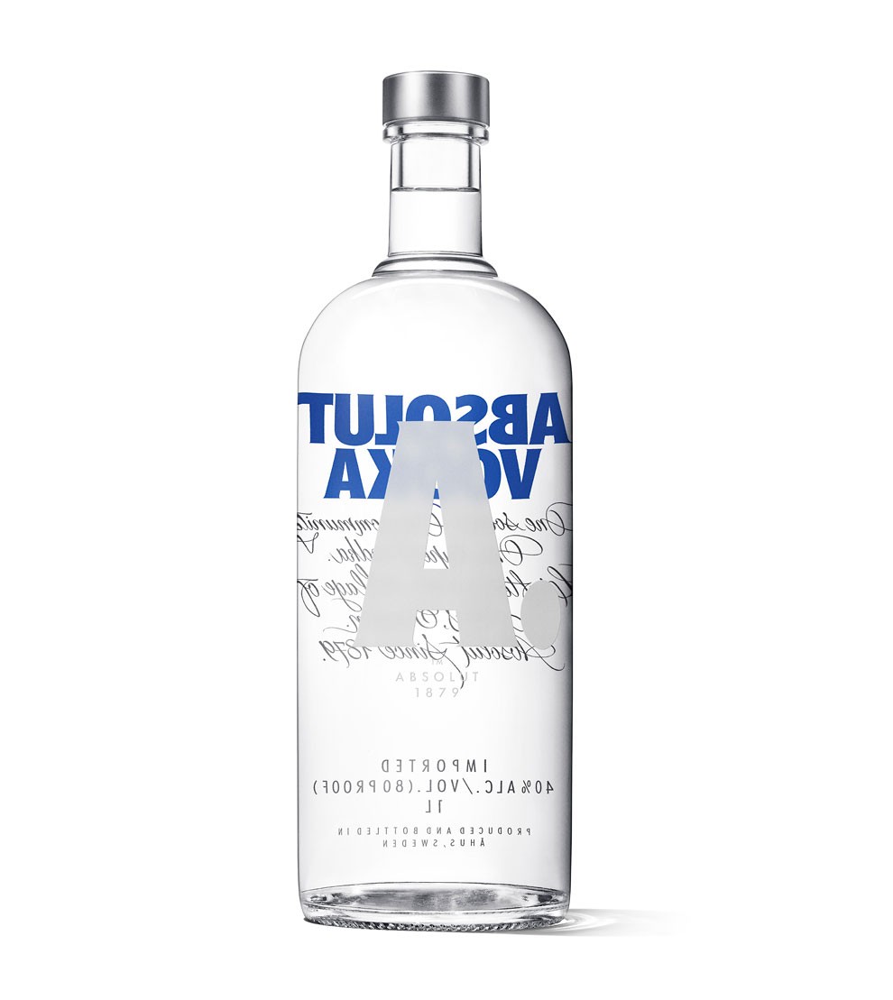
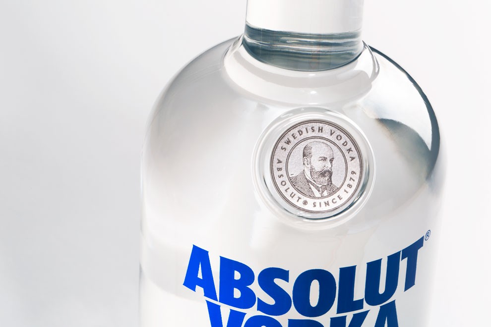
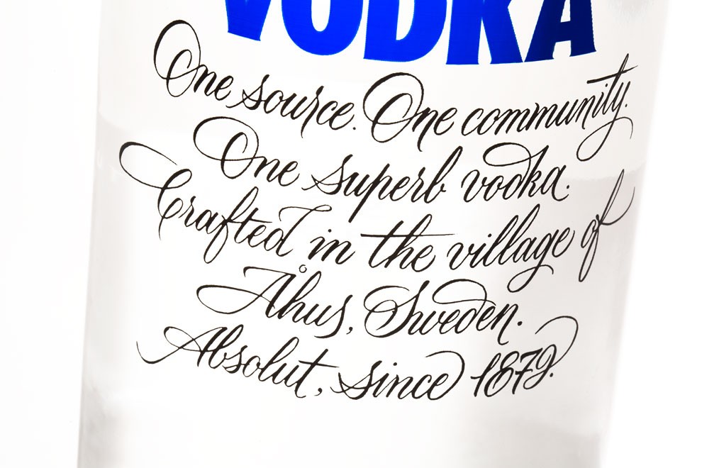
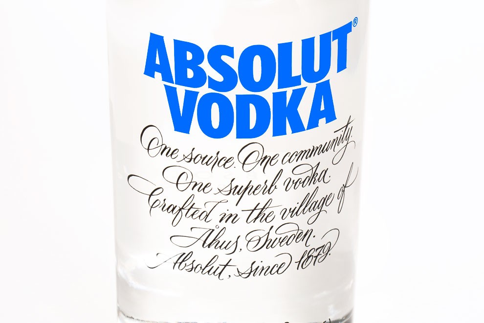
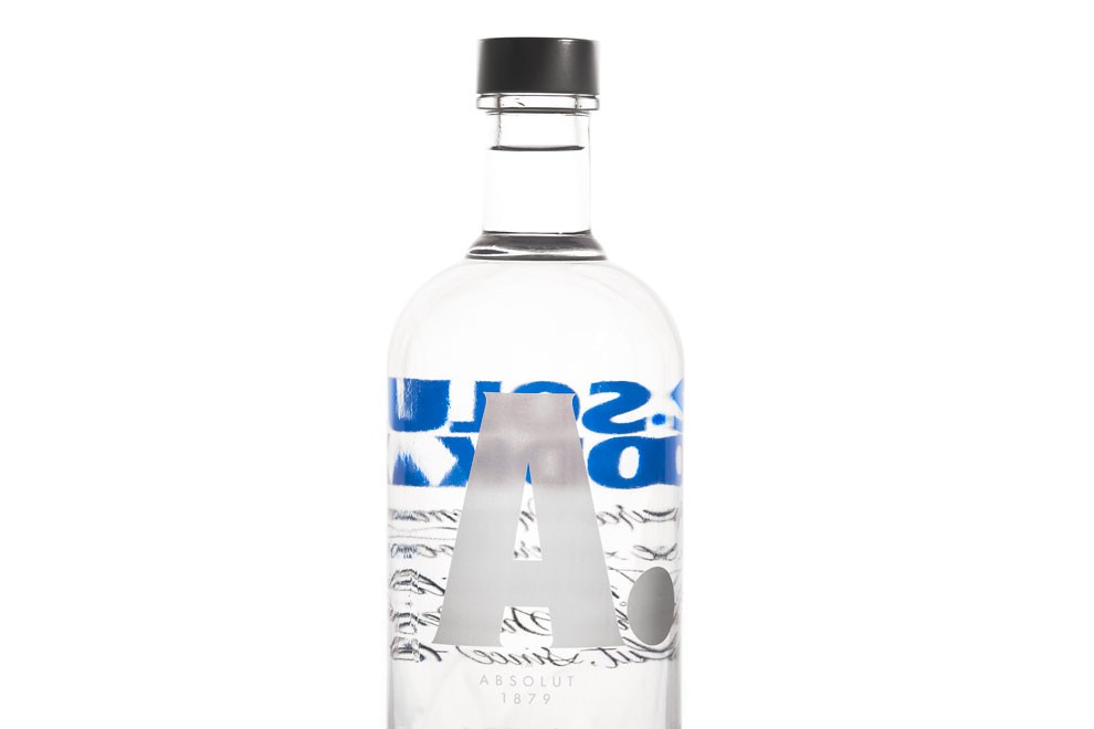
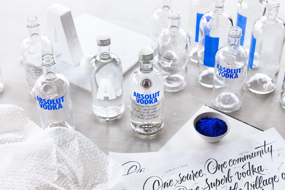
Since its launch in 1979, the Absolut Vodka bottle has stood out for its shape. The new bottle is a transformation of the original, featuring an updated two line logo, a new script, a redesigned medallion, reduced glass weight and a new brand signifier. To update what was already seen as a perfect bottle, Absolut brought together a group of creatives including a master illustrator and master calligrapher, each adding their mark to the new bottle through their own pursuit of perfection.
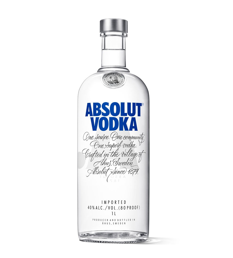
“The Absolut bottle has been iconic for several generations; now it’s time to make the next bold statement for Absolut. Our goal has been to transform an already perfect bottle to make it even better. We were extremely privileged to work with the very best creatives within their discipline. The new bottle maintains everything that is Absolut Vodka – bold, original and creative, making it ready to face to future.” says Peder Clason, Global Brand Strategy Director, Absolut.
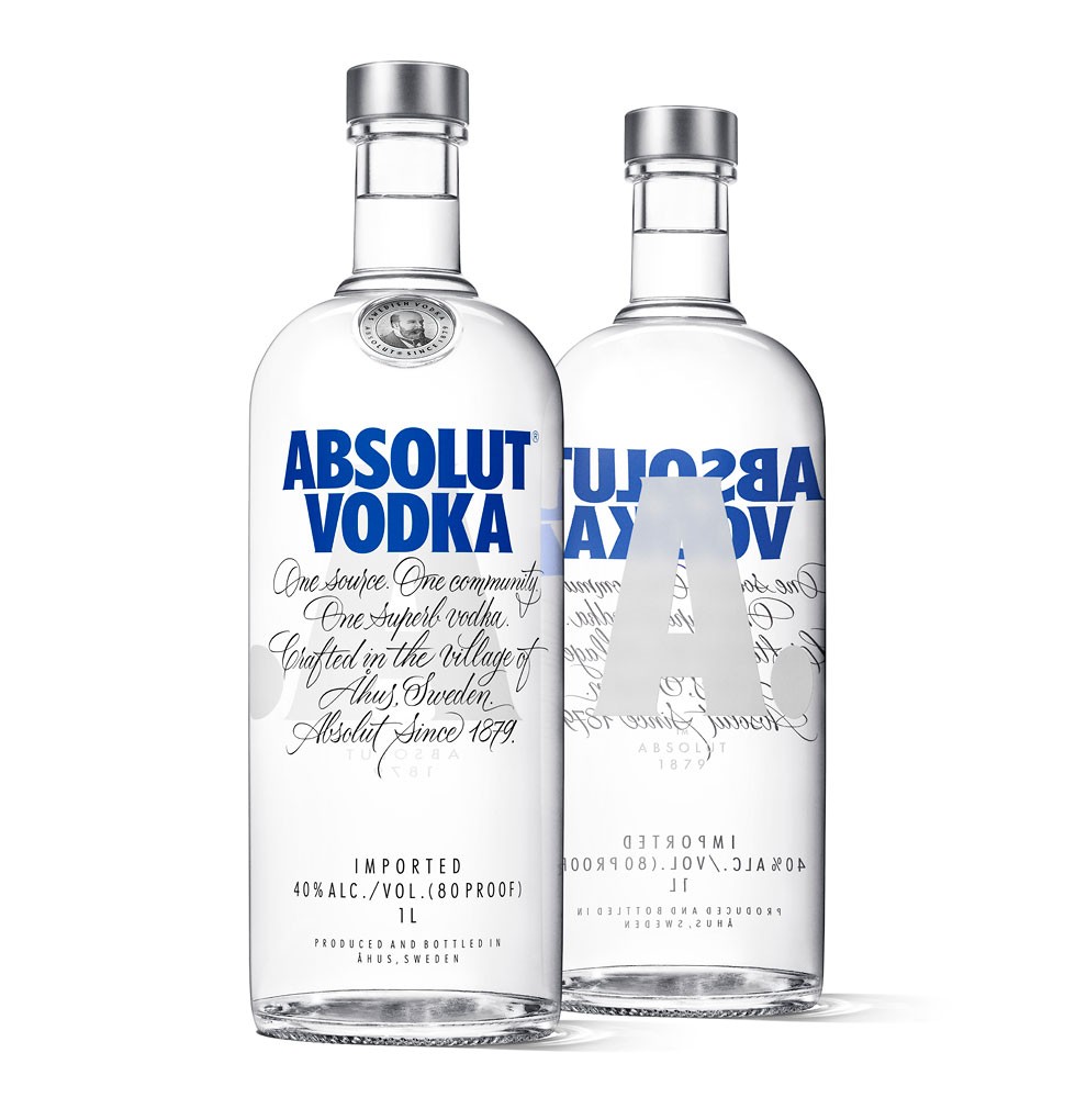
A trendsetter among the design community, the Absolut Vodka bottle is already respected all over the world. The bottle refresh was done in collaboration with Brand Union, which accepted the challenge to create an icon for the future. One of the most significant updates was to add a brand signifier to the back of the bottle, adding a bold, new short hand for the Absolut brand. The iconic shape of the bottle has been strengthened to feature more clearly defined shoulders, straightened neck and body, and a flattened bottom, while also using a reduced glass weight to minimize environmental impact.
