Pantone Have Announced Their Two Colours Of The Year For 2016
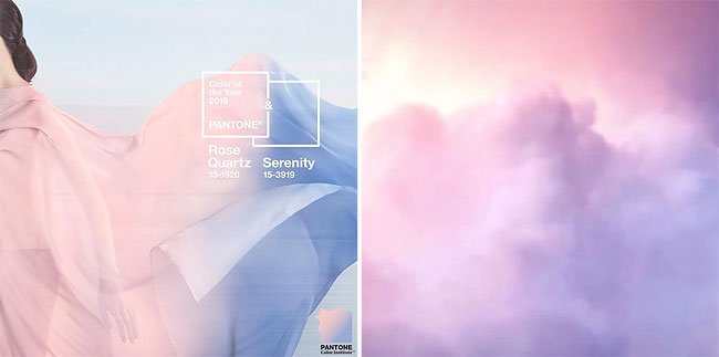
Goodbye rich, passionate, earthy marsala. Hello peace and calm. Pantone has announced its colour of the year for 2016, and this time, there’s a pretty major twist.
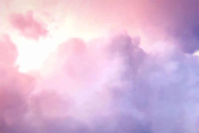
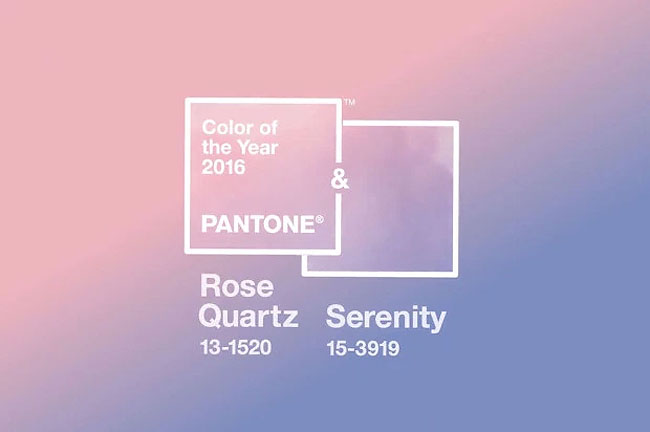
Oooooooh. Ahhhhhh. (Picture: Pantone)
Rather than selecting one colour to represent all that’s going on in the world, they’ve chosen two – for the first time ever.
So, *drum roll*, here they are. The colours of the year for 2016 are Rose Quartz (PANTONE 13-1520) and Serenity (PANTONE 15-3919).
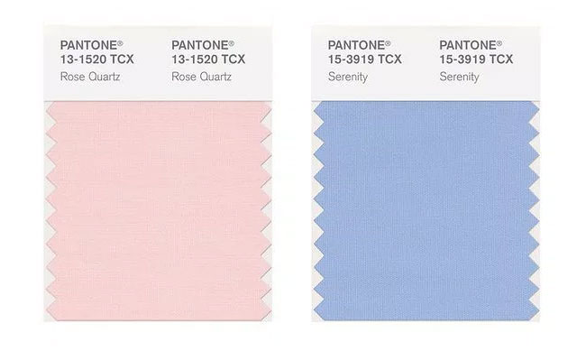
Pantone’s colours of the year for 2016 are Rose Quartz and Serenity (Picture: Twitter/Pantone
Rose Quartz is a soft pink shade, described by Pantone as ‘a persuasive yet gentle tone that conveys compassion and a sense of composure.’ Sure sure.
Serenity, meanwhile, is light blue; ‘weightless and airy, like the expanse of the blue sky above us, bringing feelings of respite and relaxation even in turbulent times.’ Cool.
https://www.instagram.com/p/-0TJ4qxHr2/
Together, the colours embody calm and relaxation – and they have a deeper meaning.
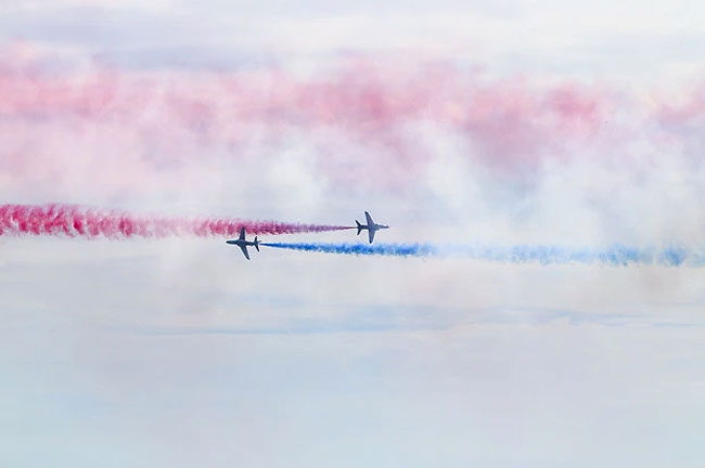
Ed Norton’s take on the Rose Quartz and Serenity. (Picture: Getty)
Pantone hopes Rose Quartz and Serenity will act as a soothing counterbalance to all the stresses of the modern world, fulfilling our deeper ‘yearning for reassurance and security’.
https://www.instagram.com/p/-1RfJkRHrR/
The colours also symbolise a new embrace of gender fluidity, showing two stereotypically male and female colours coming together in one blur.
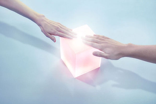
The colours represent gender fluidity. (Picture: Getty)
And – as noted by Quartz – the colours are pretty similar to those on the transgender pride flag.
Drake’s already a big fan.

Reactions to the colours have been mixed, with a lot of people commenting that they seem a little baby shower-ish. But we have a feeling we’ll grow to like them. They do feel quite soothing.
h/t: metro
