Coronavirus Logos: Iconic Logos Reimagined For The Age Of Coronavirus

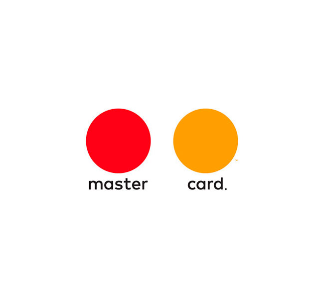
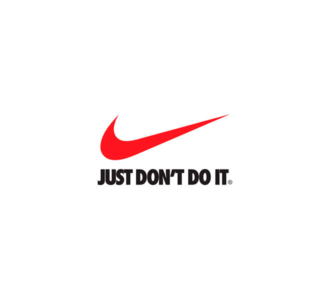
Jure Tovrljan, a creative director based in Slovenia, has given makeovers to famous brand’s logos to make them more relevant for the coronavirus age.
“Just an idea of how logos should look like in these difficult times. Hang in there, guys. Stay home” says Jure Tovrljan of his viral graphic design project aptly named “Coronavirus Logos.”
More: Behance h/t: typeroom, adage

Posted on Behance this week of massive lockdowns and self-quarantine, Tovrljan recreates some iconic logos in self-distancing mode.

From Mastercard circles to the iconic Olympics circles, famous marks are changed under the Slovenia-based creative’s rebranding.

“Things around COVID-19 seriously started to go out of hand and all my social media feeds were flooded with cheap memes,” says Tovrljan.

“I decided to revive an old passion, logo design and I saw an opportunity for some quality content that I would be glad to see on my social feed in these difficult times.”

“I had some negative comments at first, but it was all done in a positive spirit. I just wanted to spread the message in a different way and let people know to keep their social distance, stay at home if possible. After the ball started rolling, everyone saw it as something positive and creative” he told Ad Age.


