These Designers Remade Iconic Logos In Different Styles, And Here Are The Results
Instagram
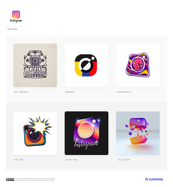
When talking logos, there are some that immediately pop into our heads as they’ve aged like fine wine and gained worldwide recognition. It’s difficult to imagine Apple, McDonald’s, or Google’s logos as anything other than what they are now, but it sure sounds entertaining.
The team of an image and video editing platform called Kapwing says “A strong logo can undergo a revamp without losing its essence. But can it resist being dominated by one of graphic design’s cornerstone styles?” To find out, Kapwing’s creatives have recreated six iconic logos in these six essential styles: Art nouveau, Bauhaus, Psychedelic, Pop art, Retro ‘80s, and 3D design. Scroll down to see the results.
More: Kapwing h/t: boredpanda
Instagram – Art Nouveau
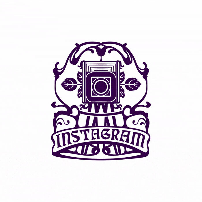
According to the team of Kapwing, “When Instagram decided it was time to simplify and “flatten” its logo like everyone else, they asked every staff member to draw Rise’s logo from memory. “That gave us a sense of what was burned in,” said Ian Spalter, head of design. Our re-styled versions demonstrate just how hot the square-and-concentric-circles brand burns.”
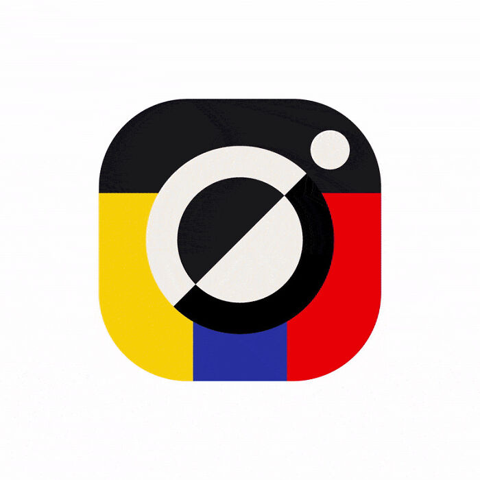
Instagram – Bauhaus
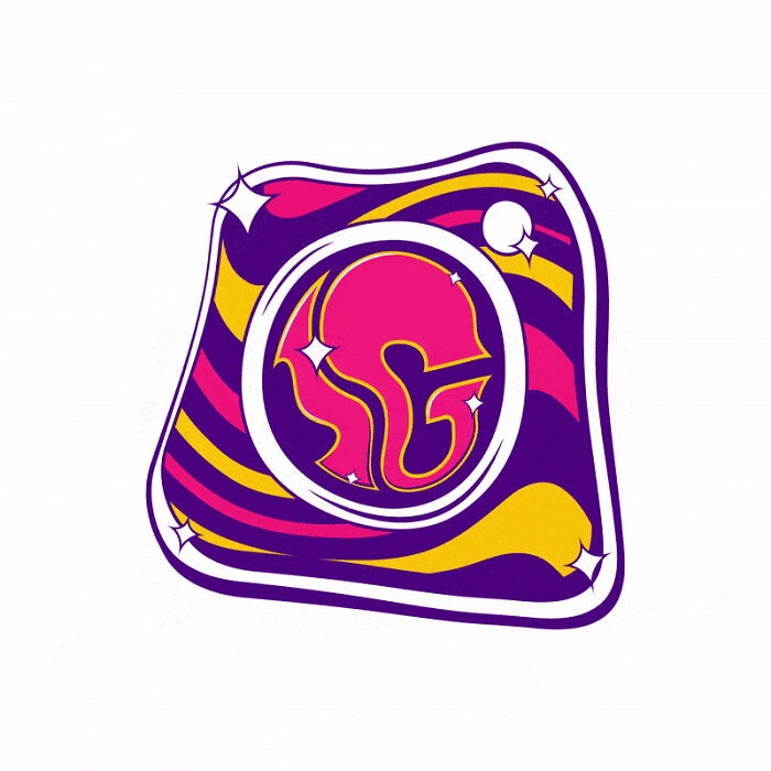
Instagram – Psychedelic
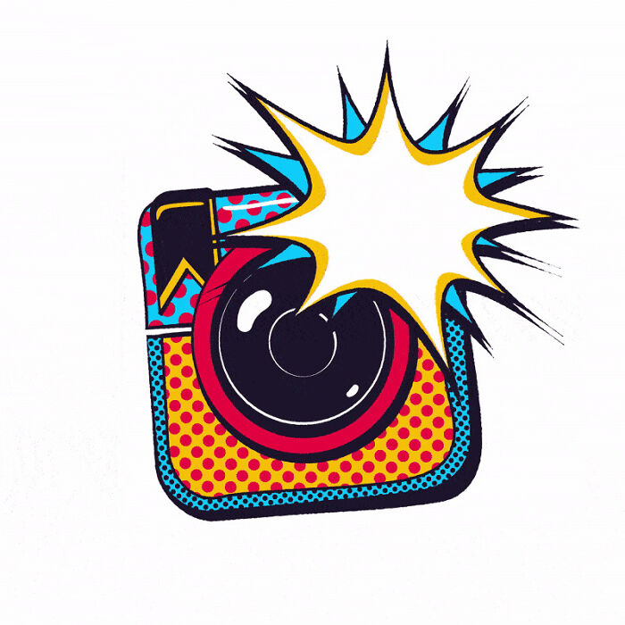
Instagram – Pop Art
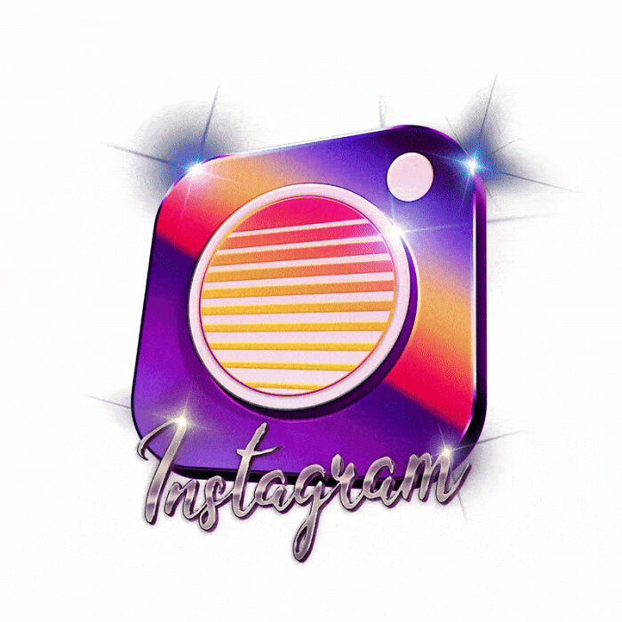
Instagram – Retro 80s
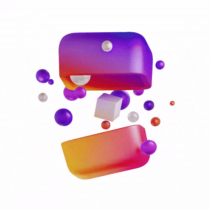
Instagram – 3D Design
McDonald’s
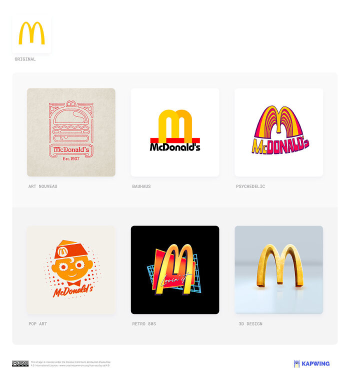
“The ghost of Speedee haunts the rock ‘n roll quiffed burger boy of our 1950s pop art style McD’s logo. But the versions that retain prominent arches demonstrate the power of a simple motif to conjure a brand’s aftertaste in your mouth,” designers of Kapwing say. “McDonald’s is going through a big identity crisis lately, not least rebranding its Twitter handle in the style of South Korean boy band phenomenon BTS. Can the arches bear the strain?”
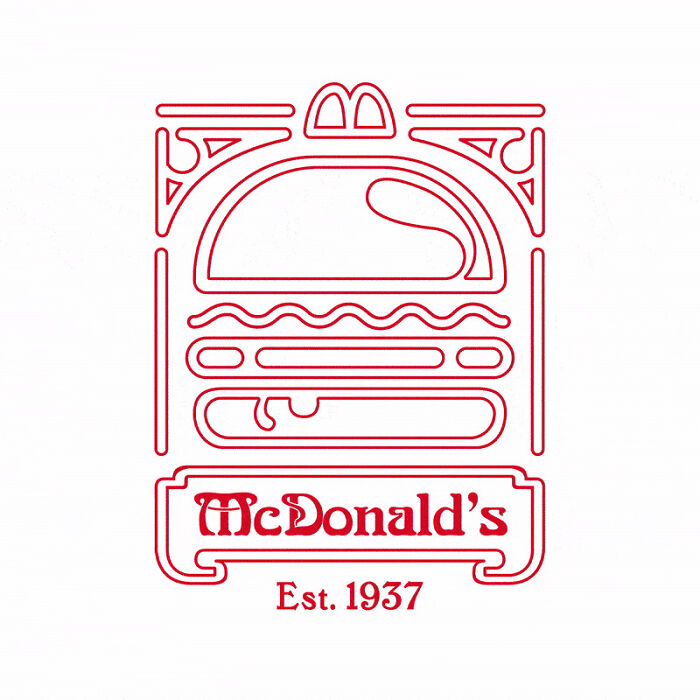
McDonald’s – Art Nouveau
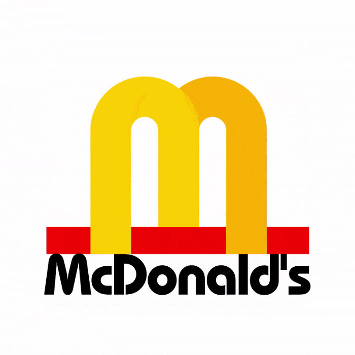
McDonald’s – Bauhaus
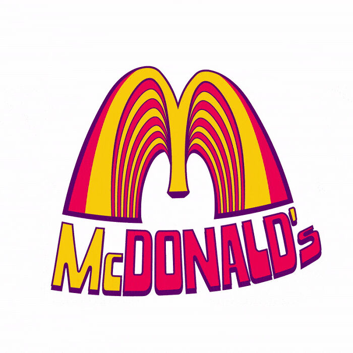
McDonald’s – Psychedelic
McDonald’s – Pop Art
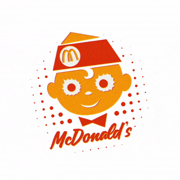
McDonald’s – Retro 80s
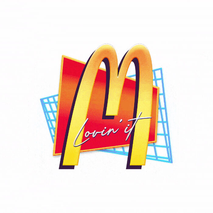
McDonald’s – 3D Design
NASA
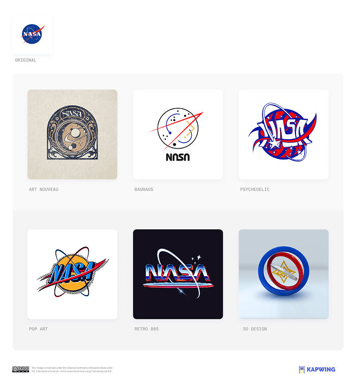
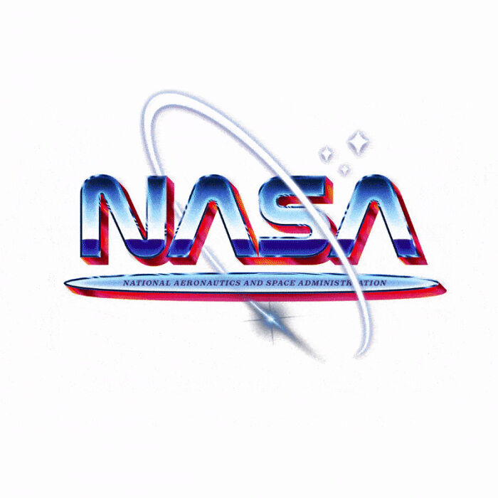
According to Kapwing, “NASA already has a ‘1980s version’ of its logo. Their looping, red, text-only logo known as the ‘worm’ did most of the work between 1975 — 1992 (and recently made another comeback). So our 1980s version imagines the best of both worlds: a meatball in the decade that gave us the bubblegum heroics of Explorers and Flight of the Navigator.”
NASA – Art Nouveau
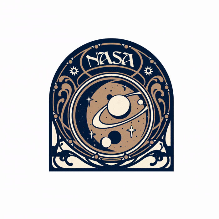
NASA – Bauhaus
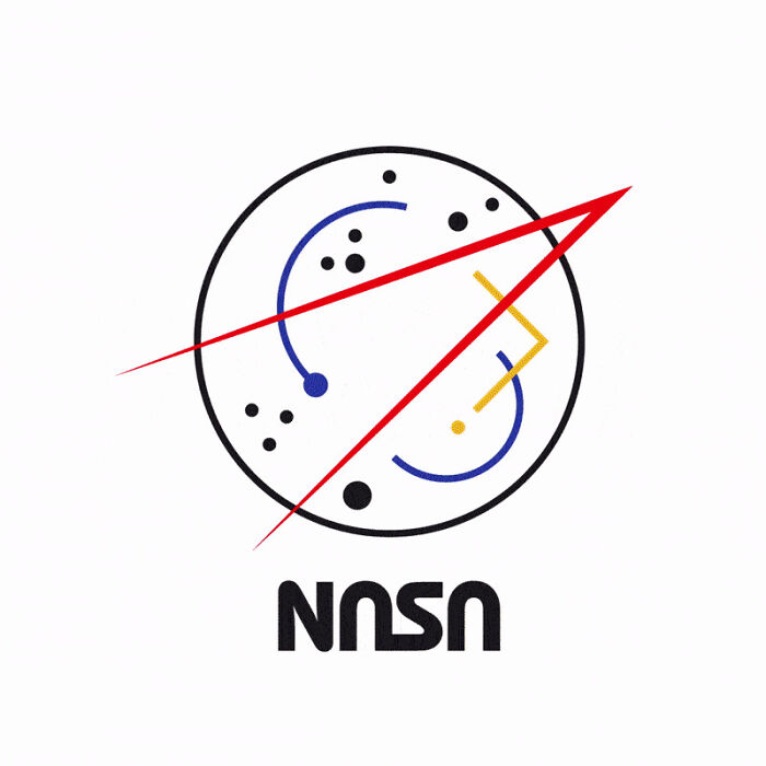
NASA – Psychedelic
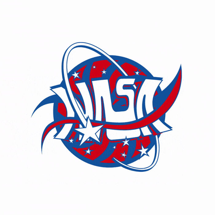
NASA – Pop Art
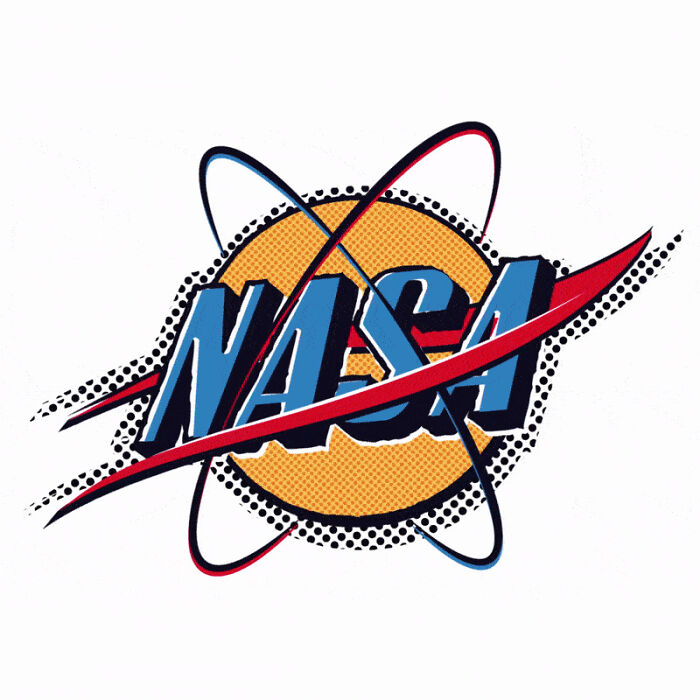
NASA – Retro 80s
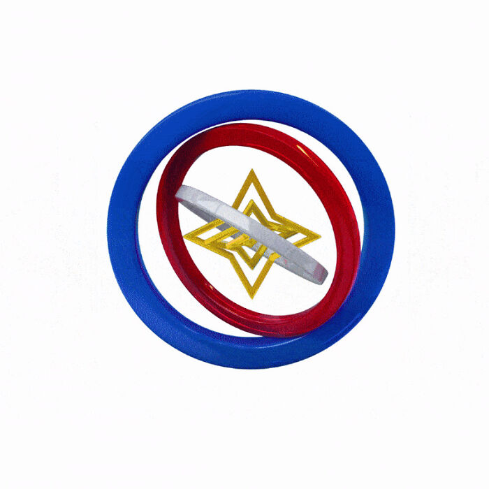
NASA – 3D Design
WWF
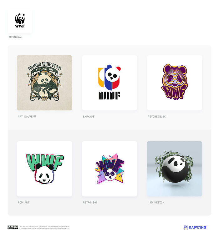
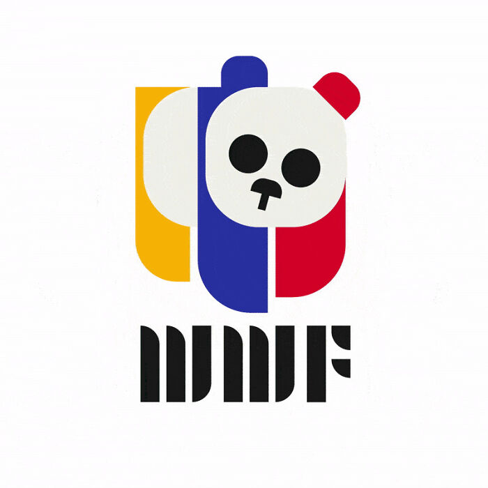
Kapwing’s Bauhaus-style redesign of the WWF logo “adds a splash of color while simplifying the form. And it maintains the cuteness without resorting to the child appeal of our 1980s version. Scientists say the power of cute can be used to ‘hijack our brains,’ which makes it a useful tool for marketing – but it’s essential not to compromise the seriousness of your brand.”
WWF – Art Nouveau

WWF – Bauhaus
WWF – Psychedelic
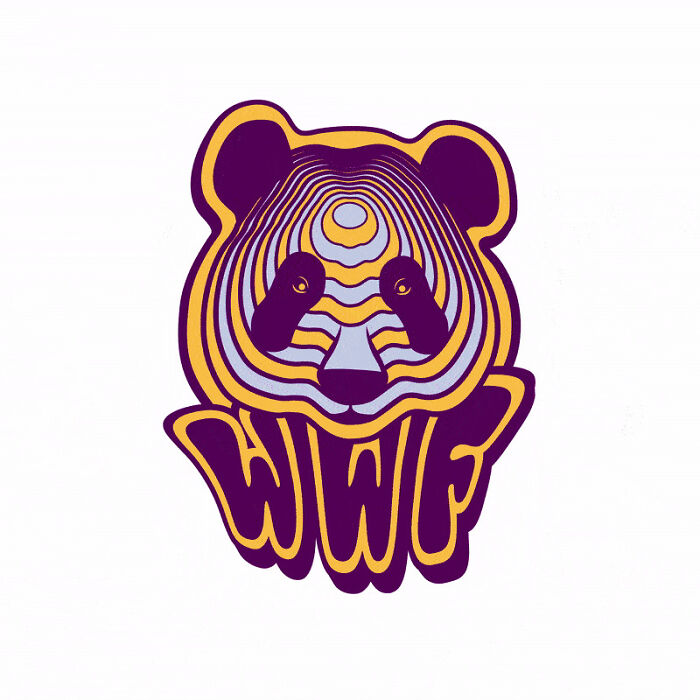
WWF – Pop Art
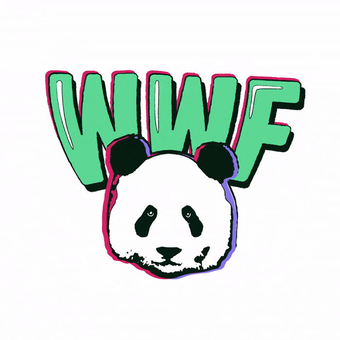
WWF – Retro 80s
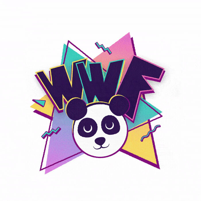
WWF – 3D Design
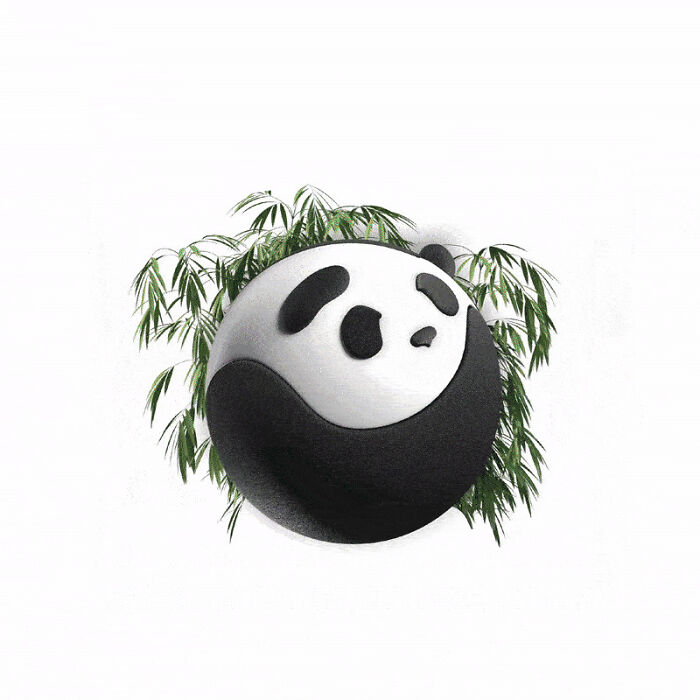
Google
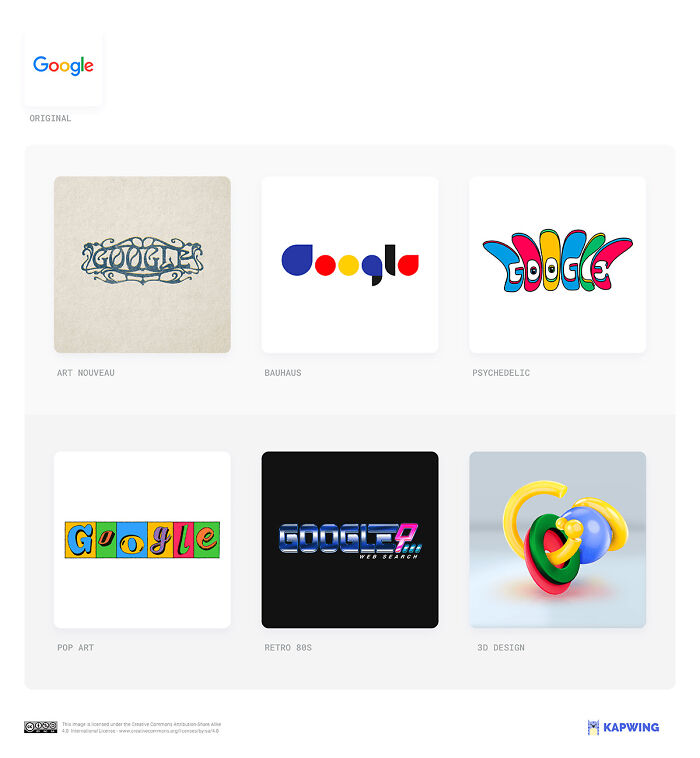
“The simplicity of the post-exclamation, post-drop shadow logo has allowed for infinite variations via the regularly-changing Google Doodle,” – Kapwing creatives explain. “So, while none of our redesigns look implausible, the two that are most evocative are those that imagine Google in a realistic alternative timeline: either the vaporwave look of our dial-up era 1980s logo or the augmented-reality bubbles of the 3D version.”
Google – Art Nouveau
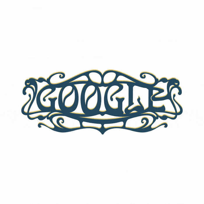
Google – Bauhaus
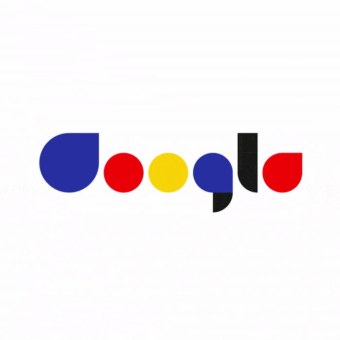
Google – Psychedelic
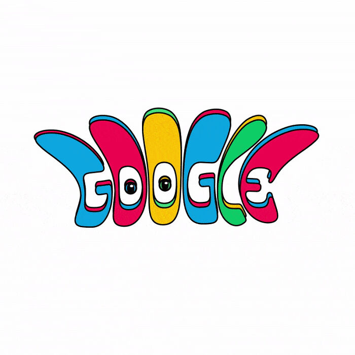
Google – Pop Art
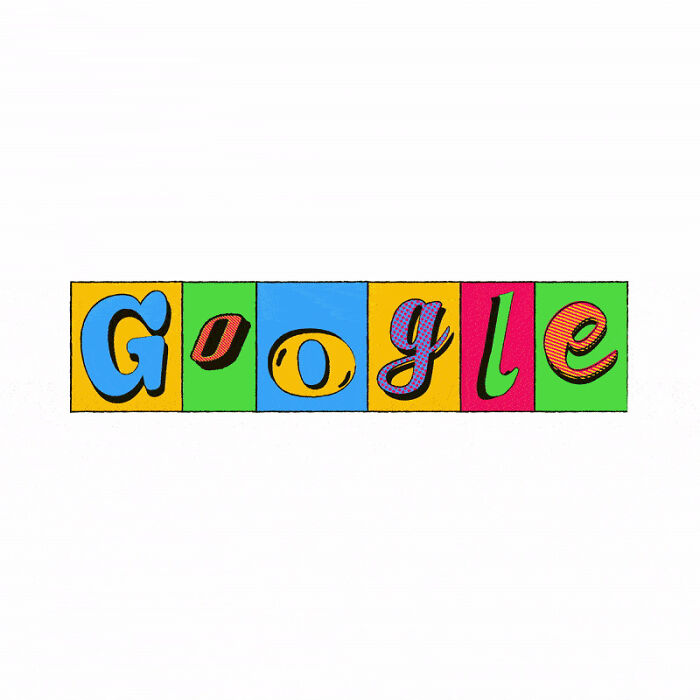
Google – Retro 80s
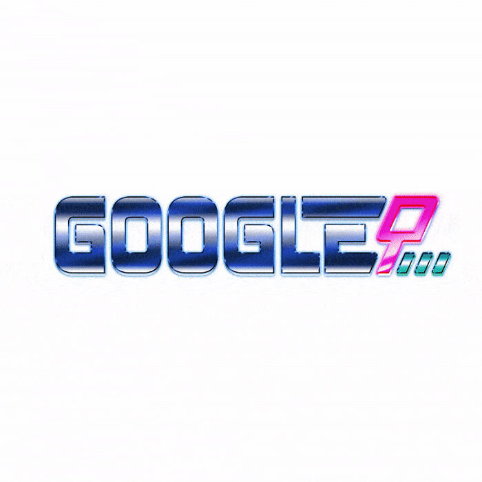
Google – 3D Design
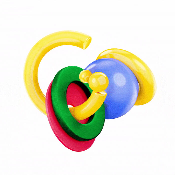
Apple
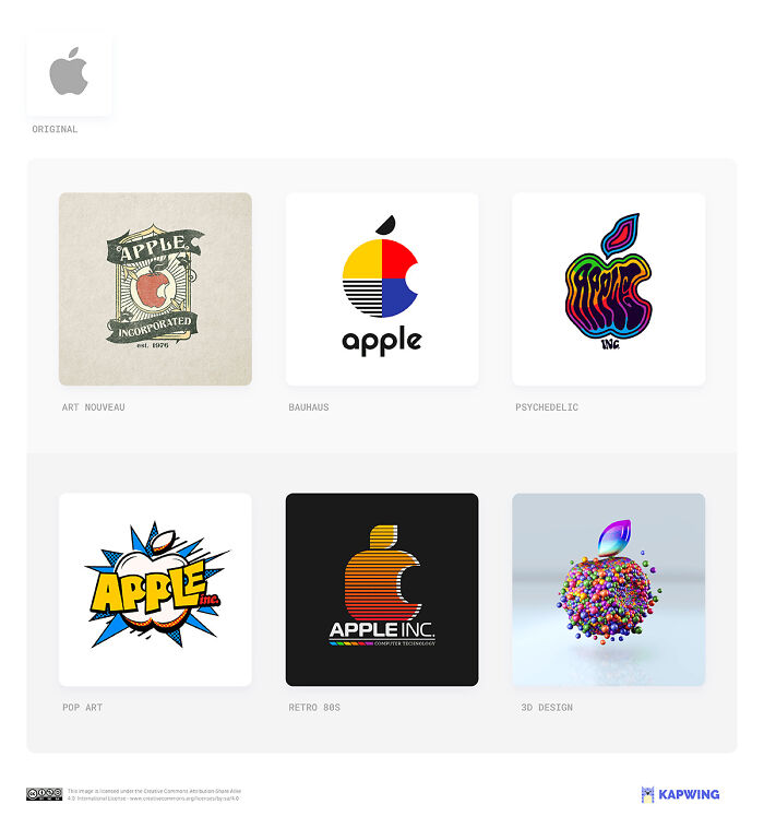
Kapwing’s art nouveau take on the Apple logo is “not far from the brand’s original 1976 artwork — a woodblock print of an apple gravitating towards Isaac Newton’s head with the words “Apple Computer Co.” wrapped around it. But the Bauhaus version most clearly articulates Steve Jobs’ vision: clear, artistic — a tool to amplify your abilities.”
Apple – Art Nouveau
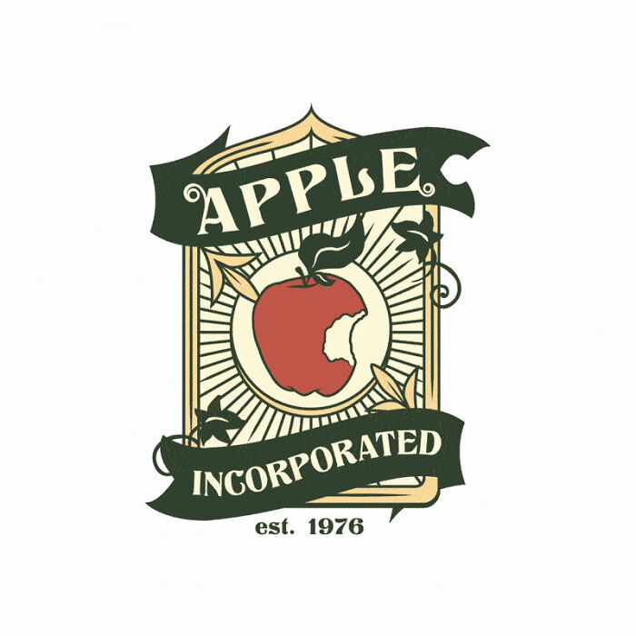
Apple – Bauhaus
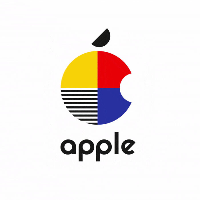
Apple – Psychedelic
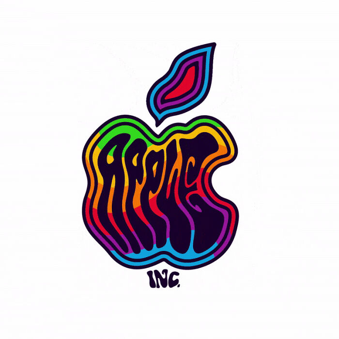
Apple – Pop Art
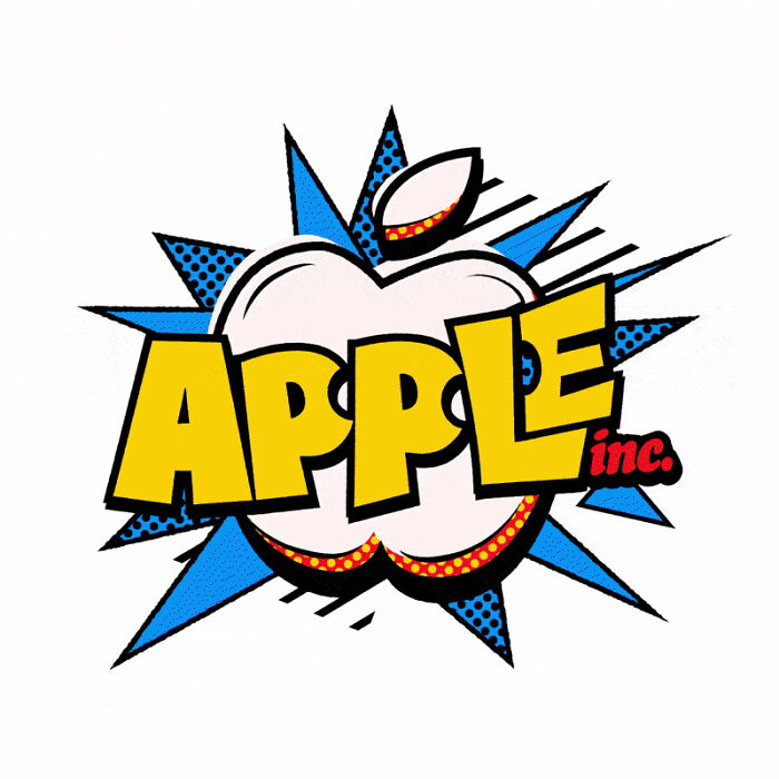
Apple – Retro 80s
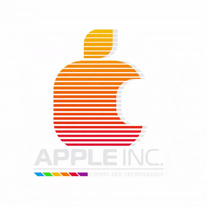
Apple – 3D Design
