Bold, Minimalist “Lord of The Rings” Book Covers Feature Bright Color Gradients
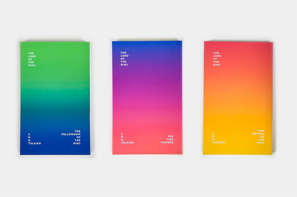
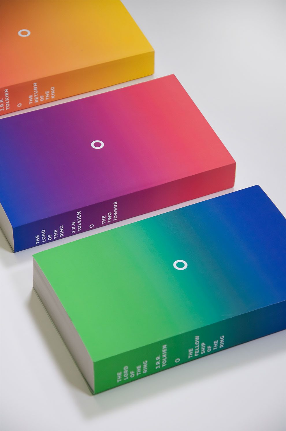
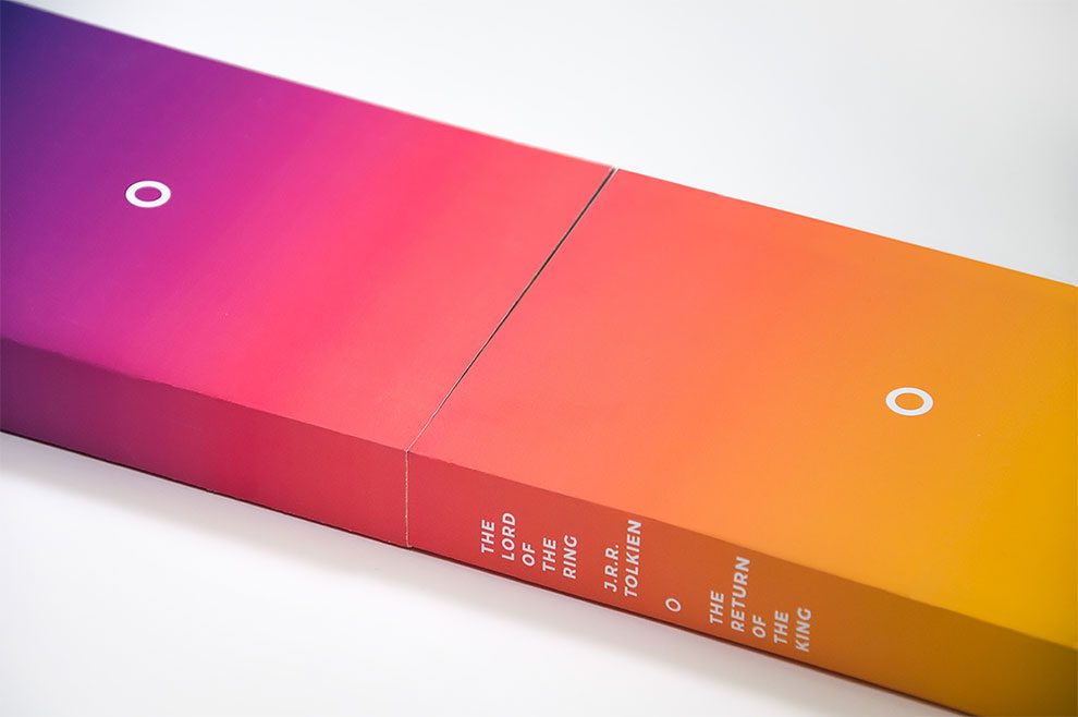
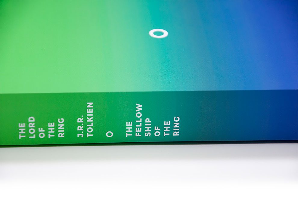
Canadian graphic designer Matthieu Jeanson has given the classic Lord of the Rings trilogy a twist by creating unconventional new covers for the beloved books. Instead of the usual motifs or illustrations of epic scenes from the story, he has opted for a minimalist design that does not even include the title or author’s name—instead, all you would see is a single circle representing the ring in the middle of the covers, against a background of brilliant color gradients.
More info: Behance (h/t: designtaxi)

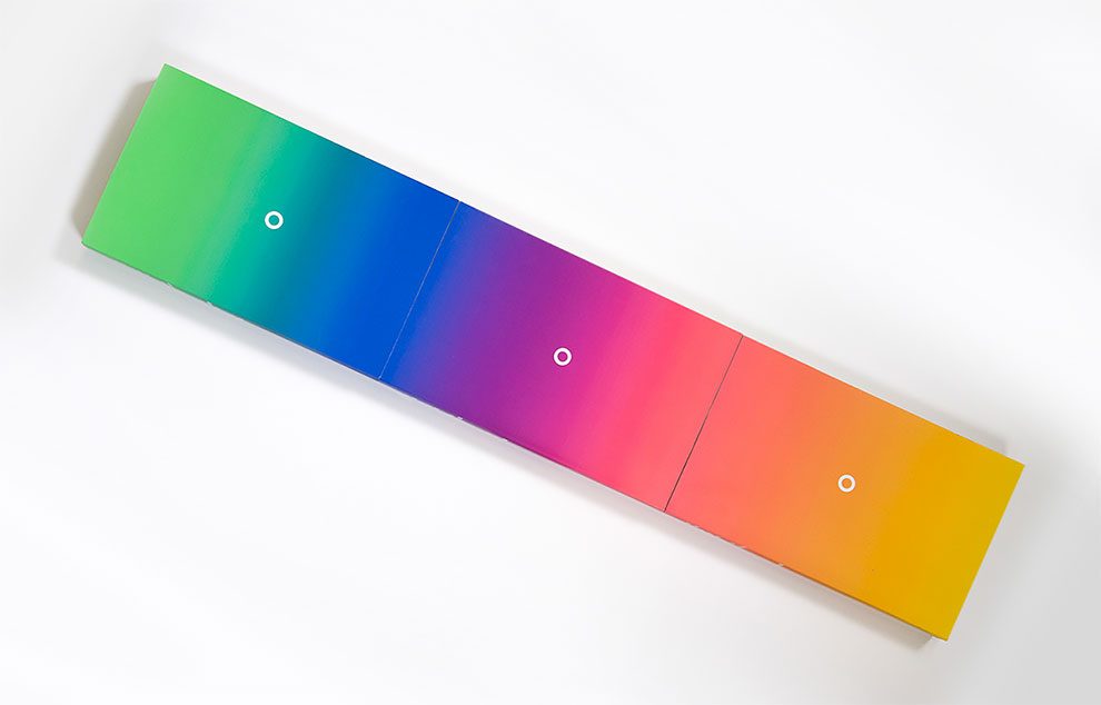
“The exercise was to choose three books from the same author and design an original cover. I chose the Lord of the Rings trilogy by J.R.R. Tolkien, because I like the story and to propose a completely different visual of the traditional covers of the editions of these books, which are, in general, heroic fantasy illustrations, very detailed and dense. Here, the covers are only illustrated by the minimalist representation of the ring and a gradient of two colors on each book. These gradients complement each other in the order of the volumes and show the continuity of the story. Moreover, the colors chosen relate to the places where the characters evolve at the beginning and at the end of the books, the first being the green of the Shire and the last the yellow of the Mountains of Shadows flames. Thus, the arrangement of colors is a reinterpretation of the map, present in each book,” he wrote.
