Clever KFC Ads Perfectly Replaced Fire With Spicy Fried Chicken – Design You Trust — Design Daily Since 2007

Clever KFC Ads Perfectly Replaced Fire With Spicy Fried Chicken

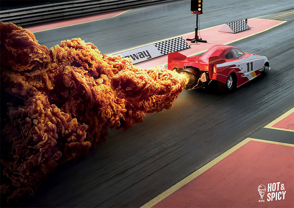
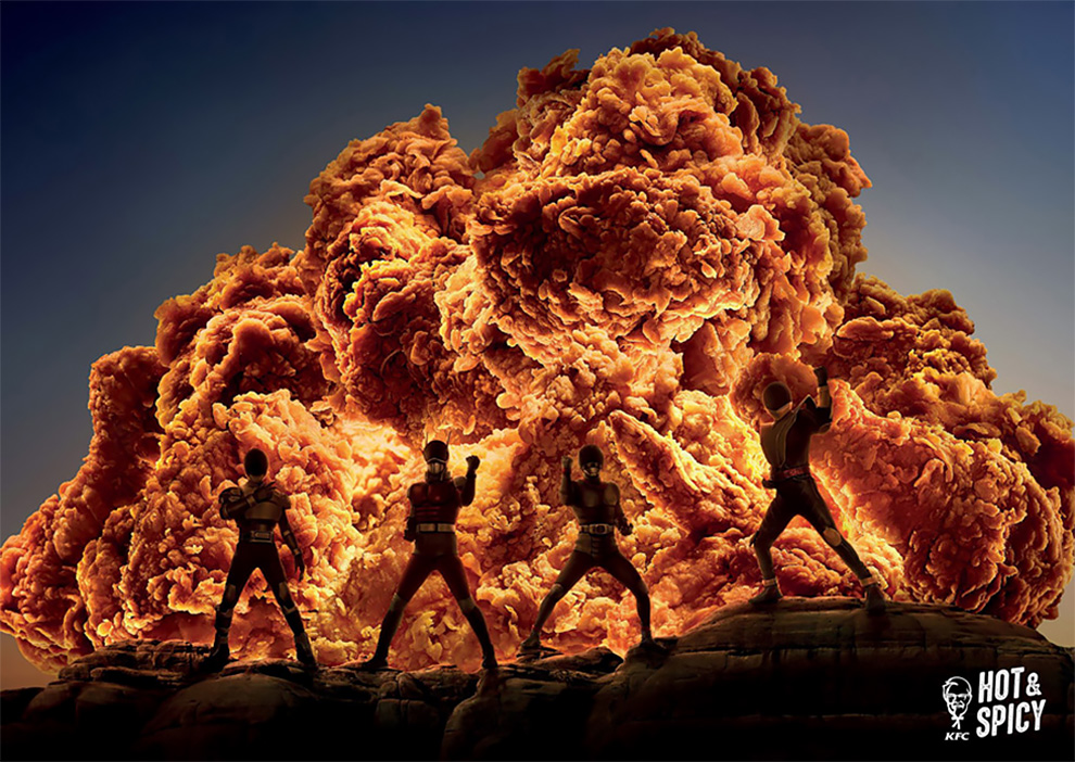
The best print ads often make you look twice. A perfect example? This campaign for KFC Hot and Spicy out of Hong Kong.

In a clever and well executed set of ads, Ogilvy Hong Kong replaces fire in photography—shots of the Space Shuttle, a rocket-powered race car and a group of Power Ranger stand-ins—with blown-up (in more ways than one) images of spicy fried chicken.

There’s not much to the concept, spotlighted by Campaign Brief Asia, but in this case that’s a good thing. Once you get the concept, you get the concept and can just sit back and appreciate the craft.

h/t: adweek

If you want more awesome content, subscribe to 'Design You Trust Facebook page. You won't be disappointed.

More Inspiring Stories

Photographer Documents Stunning Wild Foxes Enjoying The Snow
John Salminen’s Watercolor Paintings Of Urban Landscapes
Unusual Maps People Shared On This Group That Might Change Your Perspective On Things
"The Darkness That Comes Before": The Mind Blowing Sci-Fi Art Of Brad Wright
Artist Illustrates Made-Up Characters On Zoom Calls
Hilarious Comics With Unexpected Endings By War And Peas
Indian Artist Kevin Adams Creates Breathtaking Digital Artworks
This Artist Created 5 Maps That Highlight How The World Is Connected
Artist Creates Modern Landscapes In His Unique Abstract Style
Stunning 3D Art Piece in Medellin
Illustrator Repaints Disney Princesses In Her Unique Style
The Apocalypse: The Colorful Medieval Illustrations About The End of The Days, 1330
Australian Artist Illustrates Her Obsession With Plants
"Watcher On The Lane": Absolutely Breathtaking Digital Sci-Fi Masterpieces Of Col Price
Artist Pays Homage To Classic Video Games With Awesome Oil Paintings
Artist Paul Blow Smartly Illustrated Money Slang Terms From Around The World
Artist Started A Visual Diary Of Her Quarantine Lockdown
"This Is Not The End Of The World": A Pessimistic Ad Campaign
The Nightmare That Was 'His & Her' Fashion
This Posterlad Project Is All About Designing Posters. Obviously.
"Awards for Good Boys" : Hilarious Illustrations by Shelby Lorman
Traveller’s Joy – The Key To The Countryside – Beautiful Shell Adverts From The Mid-1950s
When Renaissance Artists Were Really Bad At Drawing Babies
"No Better Way to Express Yourself"