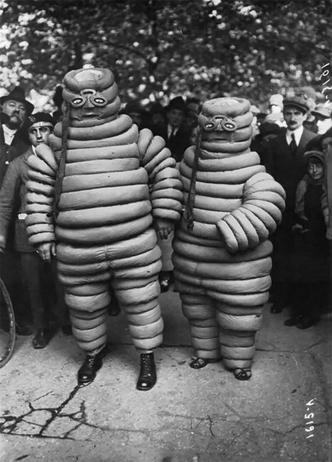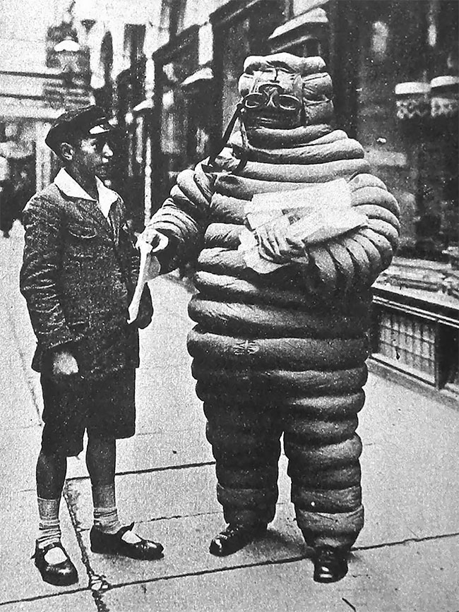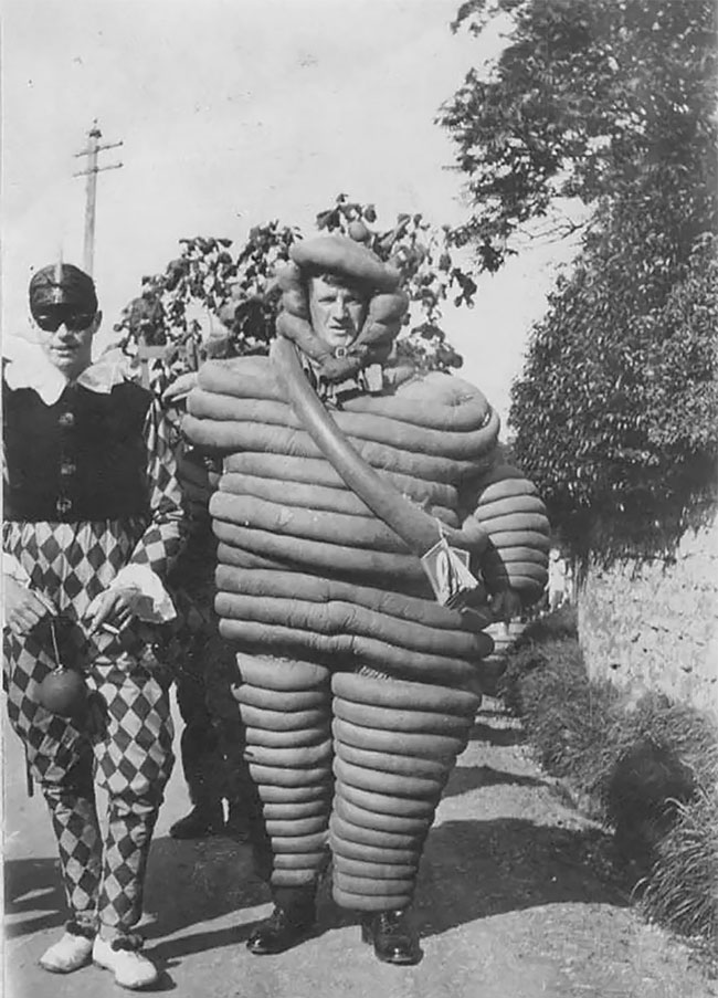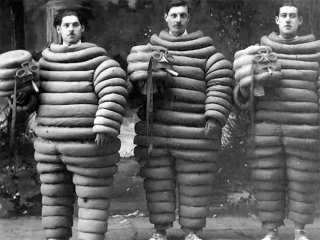
The Michelin Man, an iconic figure in marketing and advertising, originated in 1894 when the Michelin brothers founded their tire company. The concept came to life when they saw a stack of tires resembling a man without arms. A collaboration with French cartoonist O’Galop led to the creation of a figure made from tires, which became Michelin’s symbol.
h/t: rarehistoricalphotos
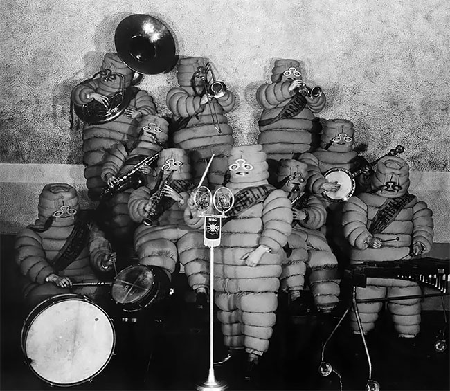
Group of Michelin Men, Berlin, 1928.
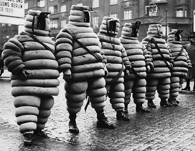
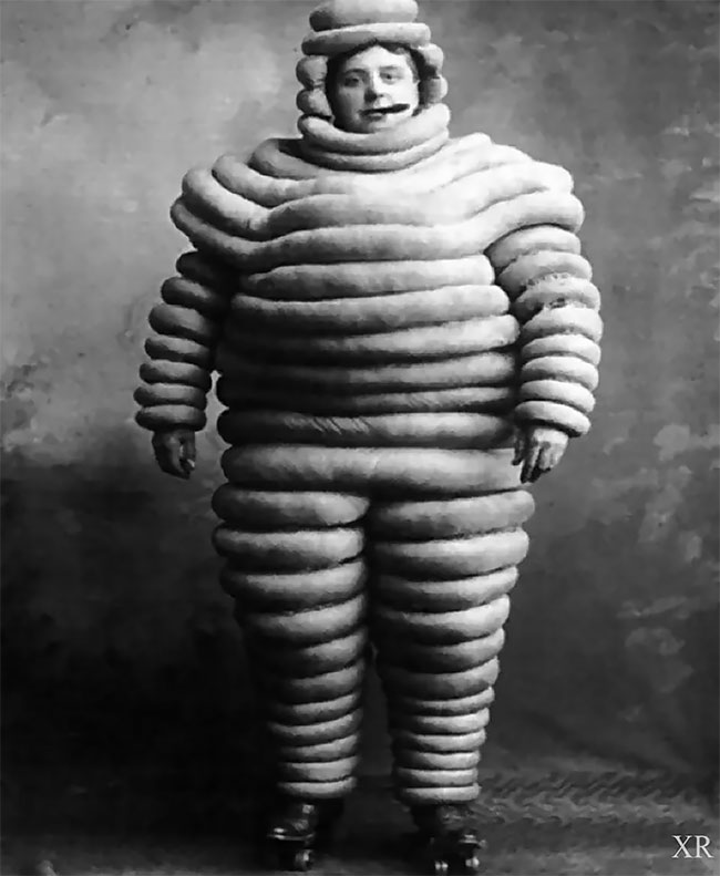
Through the years, the Michelin Man evolved from a graphic representation to a three-dimensional character. Vintage photographs reveal the origin and transformation of this iconic symbol. The Michelin company briefly changed the color of the character to black but later reverted due to printing and aesthetic concerns, not racial issues as commonly believed.
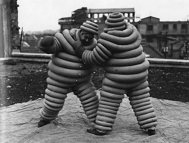
This horse-drawn advertising carriage is from 1911. The two Michelin men, made of tires, look like they materialized out of a nightmare.
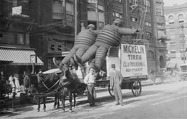
The Michelin Man’s shape and accessories also underwent changes over time, reflecting advancements and trends. Despite these adaptations, the character maintains its enduring appeal. In the future, as technology progresses, the Michelin Man will continue to evolve while staying true to its essence, captivating audiences through various mediums and leaving a lasting impact on popular culture.
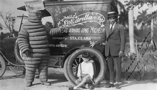
An advertising vehicle from 1926. Because tires were whitish-gray in the early 1900s, Bibendum was white.
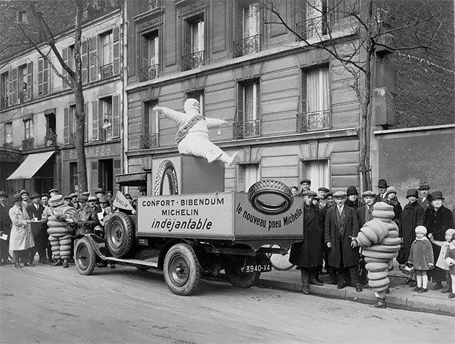
In this photograph, the Michelin Man stands next to an advertising vehicle used in Santa Clara in 1926.
