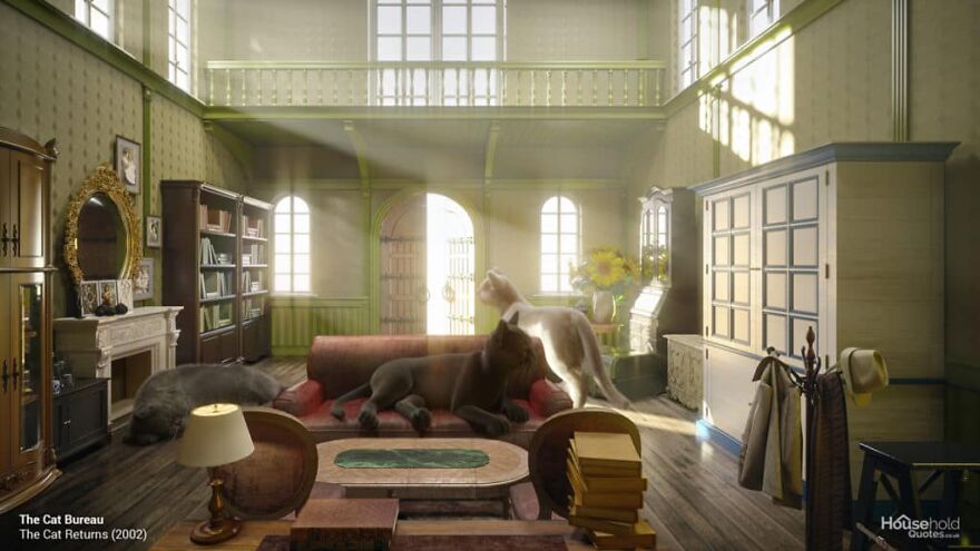
These Designers Show How Studio Ghibli Interiors Would Look Like In Real Life
If you have ever watched a Studio Ghibli movie, you know that the environment these movies create is absolutely magical, unique, and amazing. Even the creepiest places in the movies feel warm and cozy, familiar, even. Many people have probably wished that their own spaces would look similar to that.
Well, these designers took it upon themselves to recreate some of the more famous interiors in these movies. They took 5 rooms and made them realistic, showing us how they might look if they were actually real. Perhaps these edits will inspire you to do some of your own remodeling and making your home as cozy as these places!
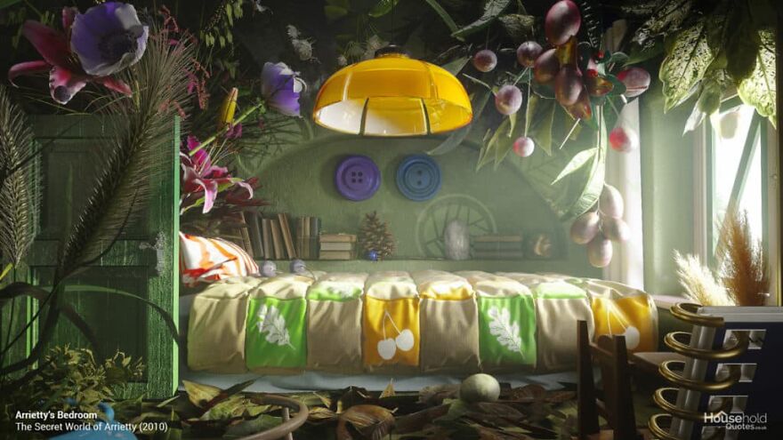
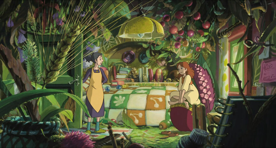
Arrietty’s Bedroom (The Secret World of Arrietty, 2010)
HouseholdQuotes
“It doesn’t come cuter than tiny characters using human-sized things. The Secret World of Arrietty is based on the ‘tiny people’ classic, Mary Norton’s Borrowers, and Ghibli’s animation captures the magic of the book in a way no live-action adaptation could manage.
Arriety’s bedroom may look messy, but she sees it as her ‘own little garden.’ This room is the perfect inspiration for a personal space like your bedroom or study, particularly if you have an eye for found/vintage objects and oversized houseplants.”
More: HouseholdQuotes h/t: boredpanda
James Barnes (Creative Lead, NeoMam Studios) tells us what inspires them to do this: “In terms of what inspired these recreations and why Ghibli, Hayao Miyazaki’s commitment to hand-drawn animations lends the movies an unparalleled level of detail. While most studios these days lean heavily on CGI and technology that expedites the process, he believes that traditional techniques are best.” They also told us more about the process of creating these edits: “Our designer, Oleksii Komarov, has an interior design background of about 10 years. With Ghibli interiors, it is similar to the translation process from one language to another. Software used to make this happen—3ds Max, Substance Painter, Corona Renderer, Adobe Photoshop.”
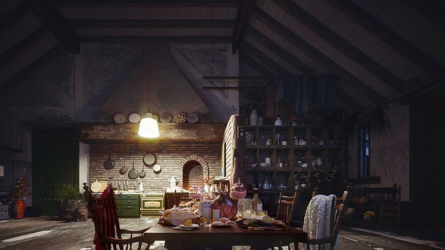
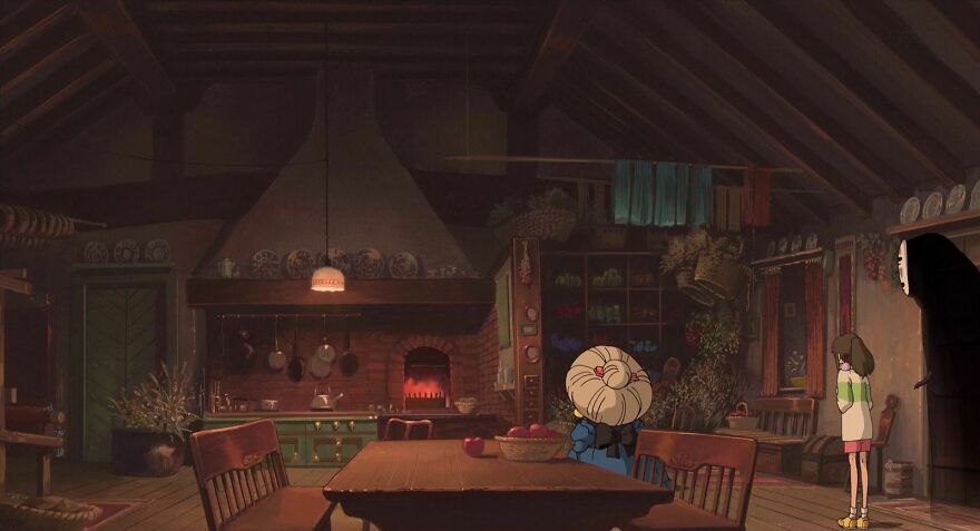
Zeniba’s Kitchen (Spirited Away, 2001)
HouseholdQuotes
“The kitchen is a great place to break bread and make friends, and that’s just what happens when scary witch Zeniba invites Sen and her guests for tea. In the comfort of her homely kitchen, Zeniba reveals herself to be more of a welcoming ‘Granny’ than a frightening foe.
What makes Zeniba’s kitchen so comforting? Texture, lighting, and personality. Exposed brickwork and floorboards lend a tactile, rustic feel. Rows of shelves lined with mismatching crockery have a graphic charm and express Zeniba’s individuality. The low-hanging pendant lamp gives the room an intimate feel, and the open fire reflects the warmth of Zeniba’s hea
Jonny Addy (Production Team Lead, NeoMam Studios) tells us more about the team behind the project: “We had 10 people involved in this project at various stages. However, the main team members were our visual researcher Molly, art director Povilas, and designer Oleksii Komarov. Molly’s task involved scouring the Ghibli back catalog and compiling an exhaustive list of suitable interiors. This list was discussed and shortlisted by the wider team before so that Povilas and Oleksii Komarov could produce the visuals.”
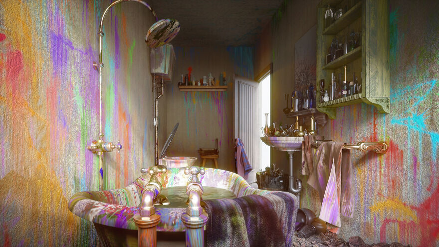
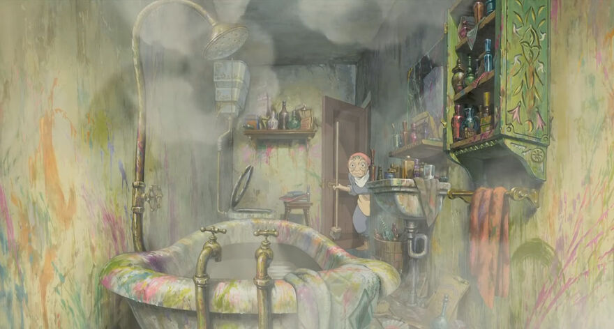
Howl’s Bathroom (Howl’s Moving Castle, 2004)
HouseholdQuotes
“In Hayao Miyazaki’s favorite Ghibli movie, a jealous witch turns a young milliner called Sophie into an old woman. Attempting to shake her curse, Sophie finds work as a cleaner at a wizard’s fantastical castle. Howl’s castle is one of cinema’s absolute high points for imaginary architecture and interior design.
Like old Sophie, the wizard Howl is not quite what he seems. His bathroom is both his private space and his ‘picture of Dorian Gray.’ Vintage copper pipes and taps reflect the movie’s steampunk mechanics, but the explosive hair-dye stains reveal Howl’s carefully maintained look is a charade. Actually, there’s something quite magical about the wild and glowing paint job in such a classic bathroom.”
James Barnes (Creative Lead, NeoMam Studios) tells us why he thinks Studio Ghibli’s interiors are so cozy: “Because, as shown above, it takes a month per minute of animation and every frame is drawn. Ghibli interiors are a labor of love over many months. That attention to detail, from the mismatched plates in Zeniba’s kitchen to the intricate carvings on Howl’s toiletry cabinet, makes the rooms feel lived in. It’s that realism alongside the fantasy that makes them feel cozy.”
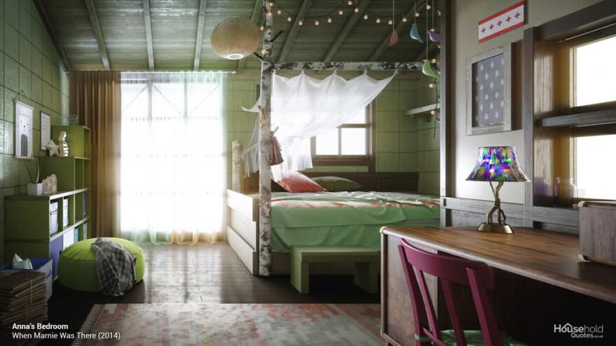
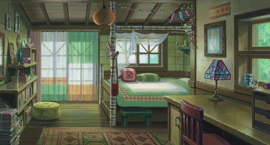
Anna’s Bedroom (When Marnie Was There, 2014)
HouseholdQuotes
“Young Anna is sent to stay with relatives after an asthma attack. She stays in their daughter’s room and meets a mysterious girl in a nearby mansion. This combination of bedrooms, anime, and schoolgirl nostalgia can’t help but recall ChilledCow’s iconic lofi study girl. In fact, ChilledCow first used a loop of Shizuku from Ghibli’s 1995 anime Whisper of the Heart, and today’s lofi girl is based on her.
There is a simple, generic pleasure in the unused room where Anna stays. The paper lamp has the feel of Isamu Noguchi’s famous Akari light sculptures. Paired with the bed canopy and sheer curtains, it creates a light, breezy feel, perfectly complemented by the calming green and wood tones.”
Jonny Addy (Production Team Lead, NeoMam Studios) advises on how to make your own home look like a Studio Ghibli movie scene: “Although Ghibli is a Japanese studio, much of the decor featured in their films is in a traditional Western interior design style. The ornate detailing of 18th and 19th-century European design can be seen in the chairs of Zeniba’s kitchen, the brass fittings in Howl’s bathroom, and the mirror and mantel in the Cat Bureau. Traditional Western interior design is a style that combines comfort and elegance and floods a space with detail.
The best way to emulate this style is to begin to introduce antique pieces into your home, whether it’s an art deco glass lamp shade like Arriety has in her bedroom or a mirror-fronted armoire such as is found in the Cat Bureau. The pieces you choose don’t necessarily all have to be from the same era; instead, focus on pieces you feel bring a comforting warmth to your home.
And, of course, no Ghibli room would be complete without a sizable collection of books and bottles. Ghibli films have such great depth due to the amount of ‘visual clutter’ that is found in their rooms. Whether it’s the books piled up in the Cat Bureau or the bottles spilling over every surface in Howl’s bathroom, a healthy amount of trinkets and treasures can bring a pleasing depth and homeliness to a room.”
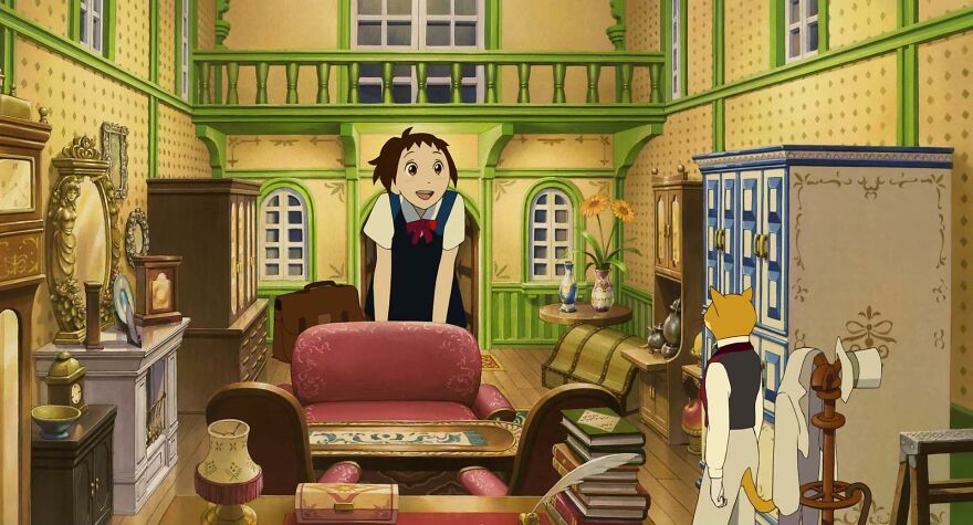
The Cat Bureau (The Cat Returns, 2002)
HouseholdQuotes
“Threatened with an arranged marriage to a cat (even threats are kawaii in Ghibli movies), our human heroine Haru visits the Cat Bureau for advice. Here she meets the very proper Baron Humbert von Gikkingen, whose regal character the office reflects.
However, the bureau is – as you might expect in cat society – more of a (miniature) lounge than a workspace. Piles of cloth-bound books and neoclassical flourishes maintain a sense of order. A bureau-style writing desk always adds character – particularly when placed next to an enormous flower. And the room’s sense of symmetry adds a feel of hyper-real splendor that would make Wes Anderson jealous.”
