Italian Graphic Designer Emanuele Abrate Perfectly Fixes The ‘World’s Worst Logos’
A brand logo can make it or break it in the big game. Just look at the most iconic ones—from Apple to Nike, there’s something genius, yet so simple about them. But that’s an exception rather than a rule.
The Italian graphic designer Emanuele Abrate knows very well how bad some logos can be. From unclear messages and typography gone wrong to designs that are just too afar to be saved altogether, these are some of the problems Emanuele is targeting in his new project. And “The worst logos ever, redesigned” does exactly what it says. Emanuele has picked 9, in his opinion, of the worst logo faux pas that could be saved from a distasteful limbo. He interpreted them in his own ways and the results are in down below.
More: Emanuele Abrate, Behance, Instagram, Facebook h/t: boredpanda
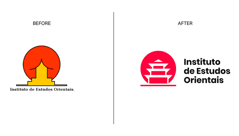
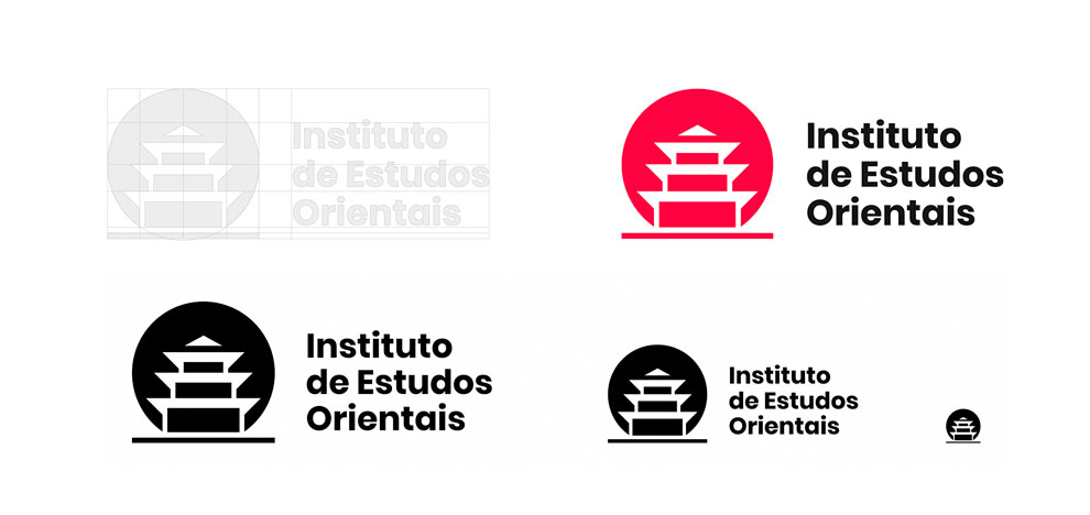
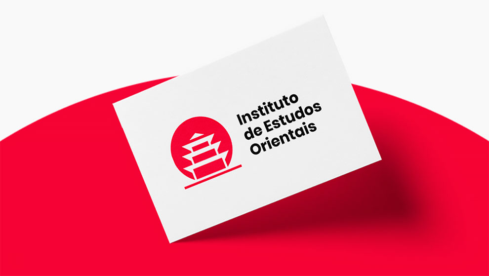
Instituto de Estudos Orientais
This is probably the most famous example of a logo with an ambiguous message. The shapes of the pictogram are simple and essential, but maybe too much? I wanted to keep the concept unchanged, working on the negative space and enhancing the figure of the pagoda. The outline has been eliminated to give the logo a fresher and more modern look. The typography has been aligned with the pictogram to assume greater importance and has been converted into a sans serif to better match the symbol.
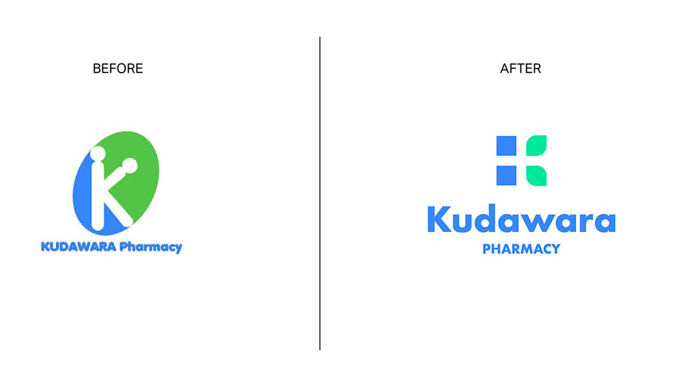
Kudawara Pharmacy
The problems of this logo are many: poor use of typography, disproportionate elements and last but not least a use of shapes that creates an ambiguous message. I wanted to delete everything, keeping only the use of the K as lettermark and a similar color palette. I used simple shapes to build the letter K and give a sense of trust linked to nature. In the negative space you can also see a cross (a distinctive element in the pharmaceutical field).

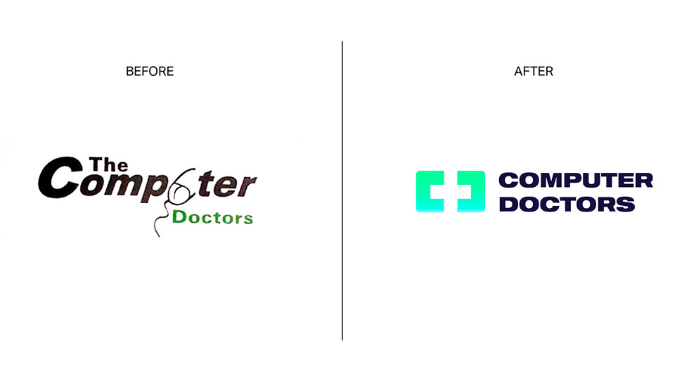
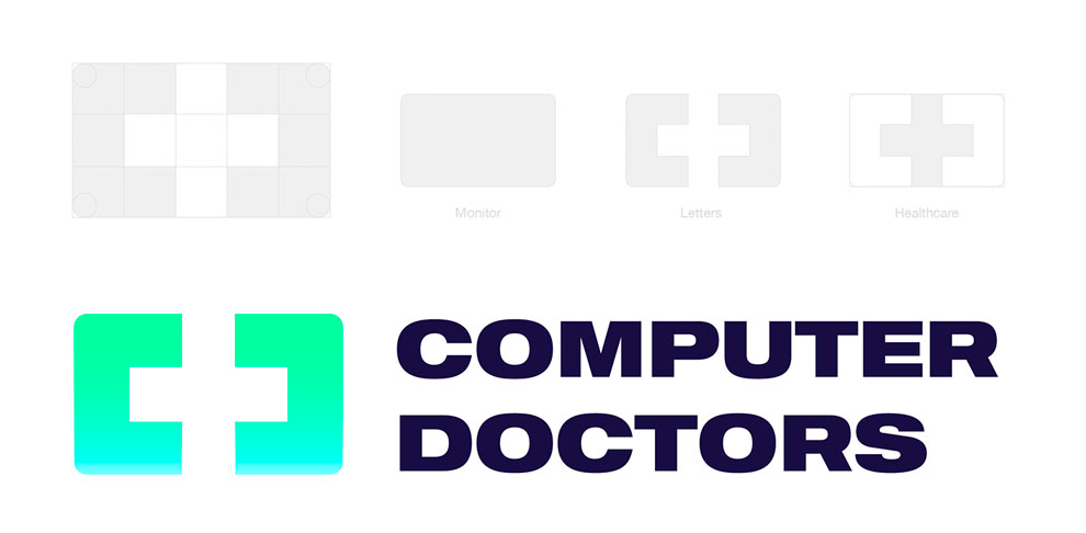
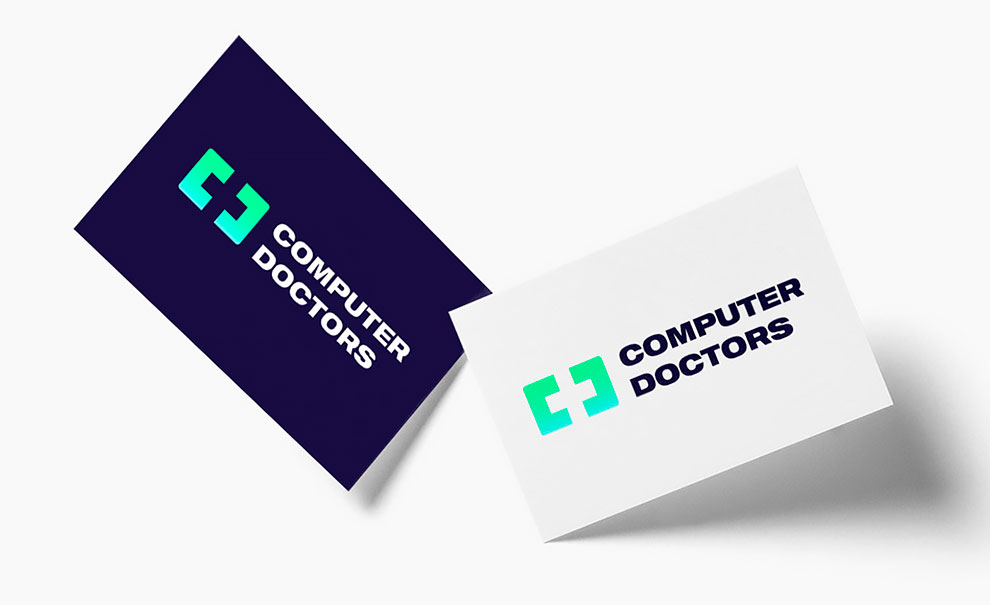
Computer Doctors
Nothing could be saved of this design, so, I wanted to work on a completely new concept that would combine the world of technology and the world of healthcare.The idea behind the new logo was to start from the shape of a monitor to insert a cross in the negative space and at the same time enhance the initial letters C and D.
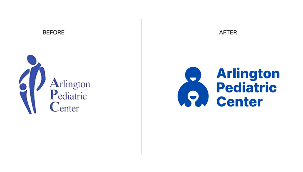
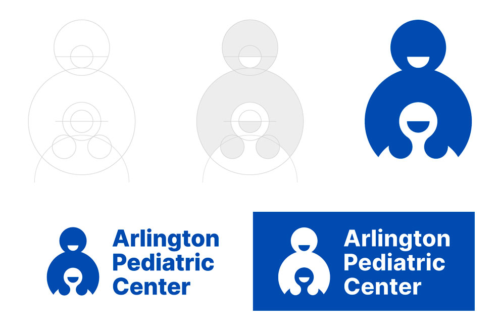
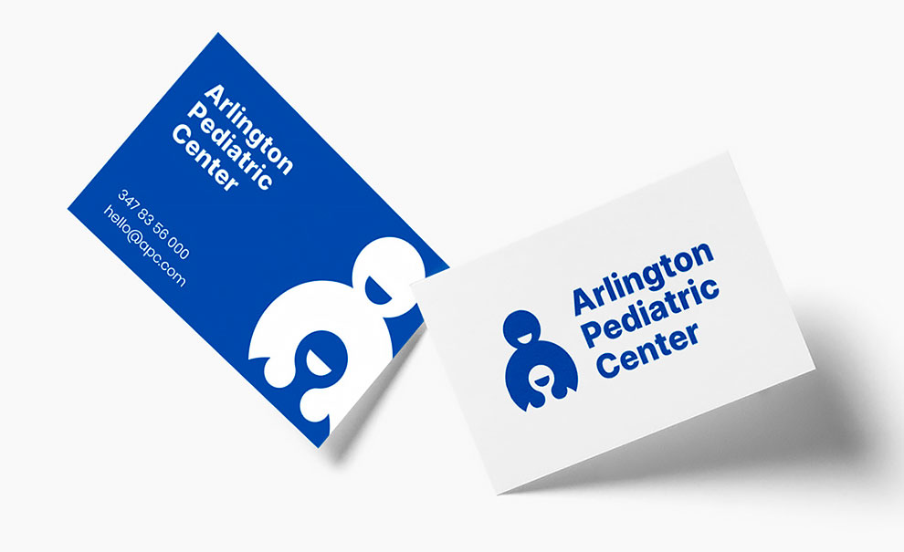
Arlington Pediatric Center
The new logo starts from the same concept, but reinterpreting it in such a way as to remove any misunderstandings and give a sense of greater confidence. The simple and circular shapes make the pictogram more friendly and warm, as well as the smiles of the two characters. The typography has been replaced by a more modern but still institutional sans serif.
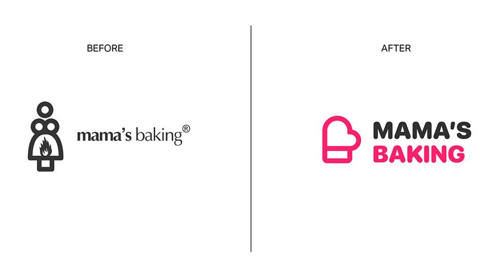
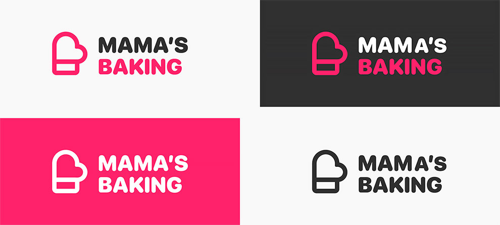
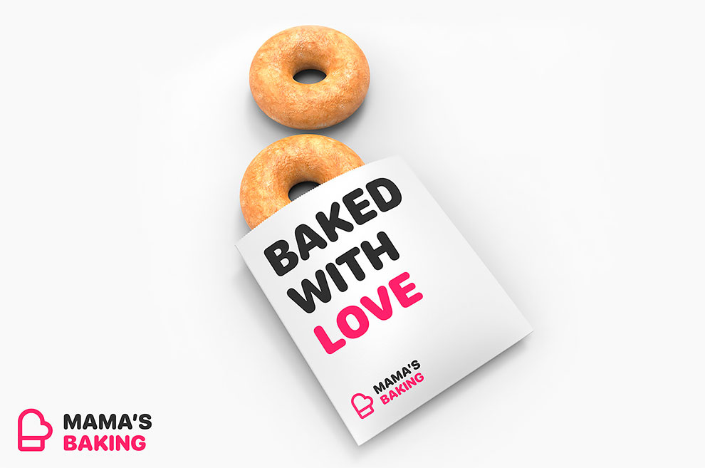
Mama’s Baking
For this logo I wanted to develop a completely new concept, letting myself be inspired by the figure of the mother who cooks with passion: I can imagine her removing the steaming pan from the oven. So I decided to start from the figure of the oven mitt as an iconic symbol: an oven mitt that joins the figure of the heart to convey the sense of love and passion. The chubby typography, suggests the figure of the African-American “big mamas”.
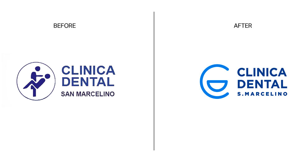
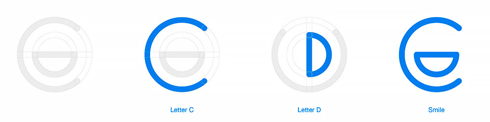
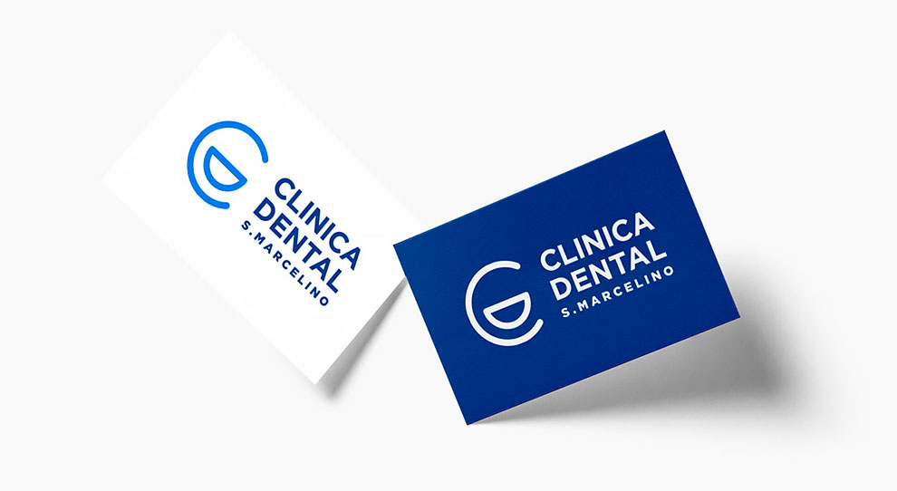
Clinica Dental San Marcelino
A dentist or a seducer? The logo of this dental practice is quite ambiguous, so I decided to come up with a new, simpler and less descriptive solution. The letters C and D are arranged to form a smiling face. The clean, rounded lines and the blue colour are intended to convey a sense of confidence and cleanliness.
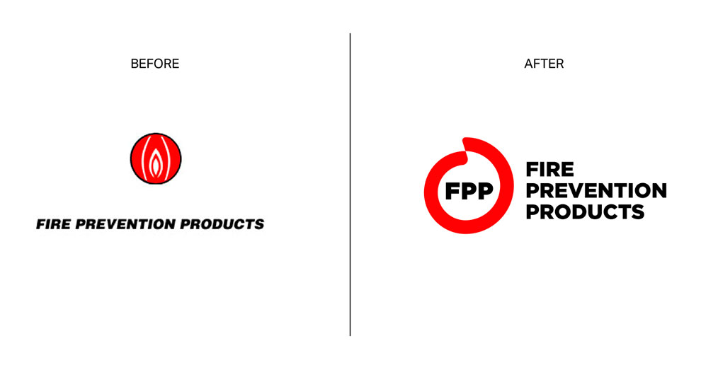
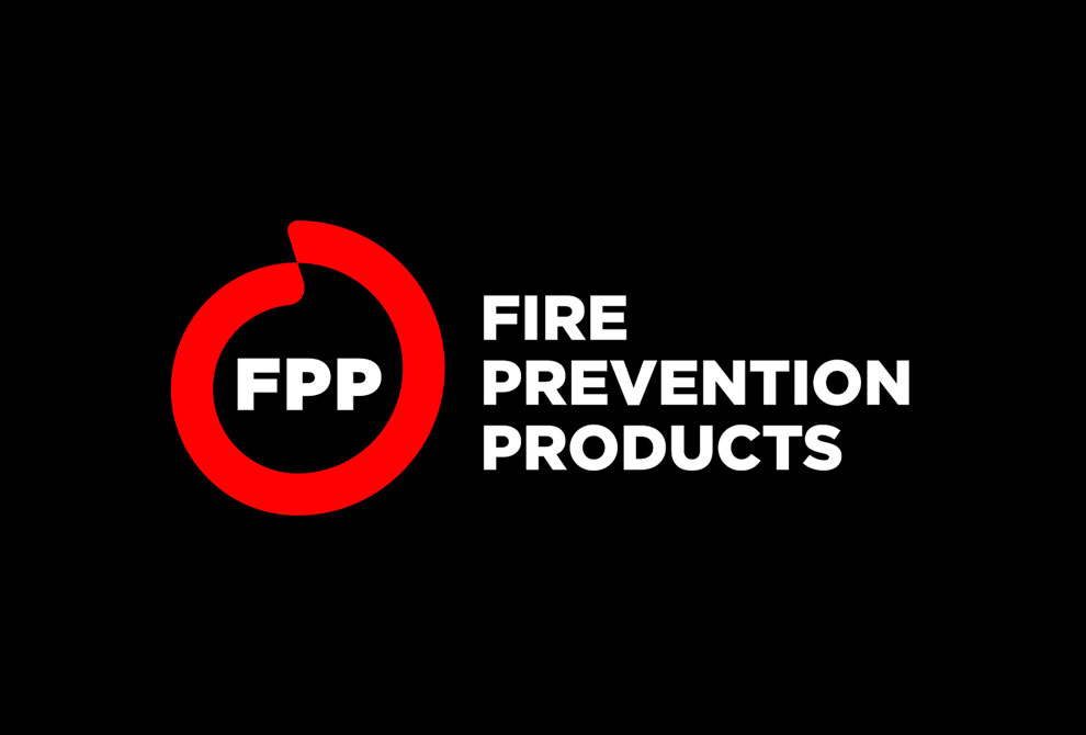
Fire Prevention Products
This logo suggests that something “down there” is on fire, uh là là! Not quite the sense of protection one should expect. That’s why I decided to develop a new concept starting from circular shapes that enclose the figure of a flame in the negative space. The name has been shortened with the acronym “FPP” enclosed in the form for a greater recognition even without the full text.
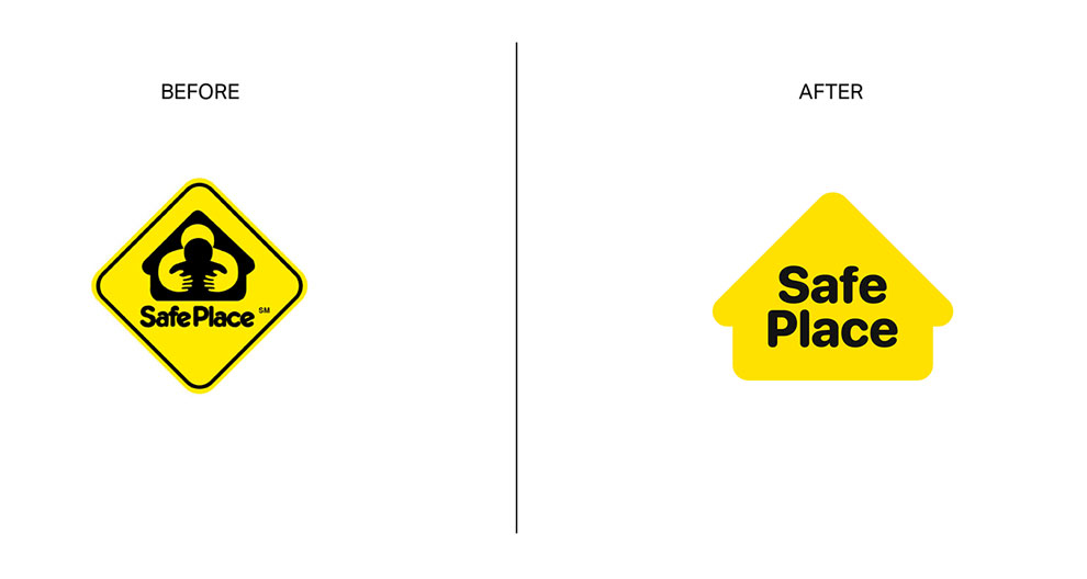
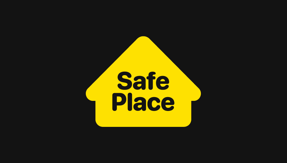
Safe Place
There is really too much in this logo: shapes inside one shape inside another shape. Also, the main figure instead of conveying confidence appears a little disturbing. Ok, let’s do some tidying up, let’s take away everything that is superfluous: the house is the only really evocative element of this logo and so, let’s enhance it!
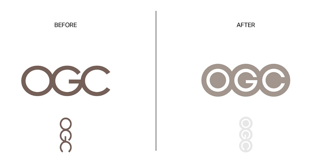
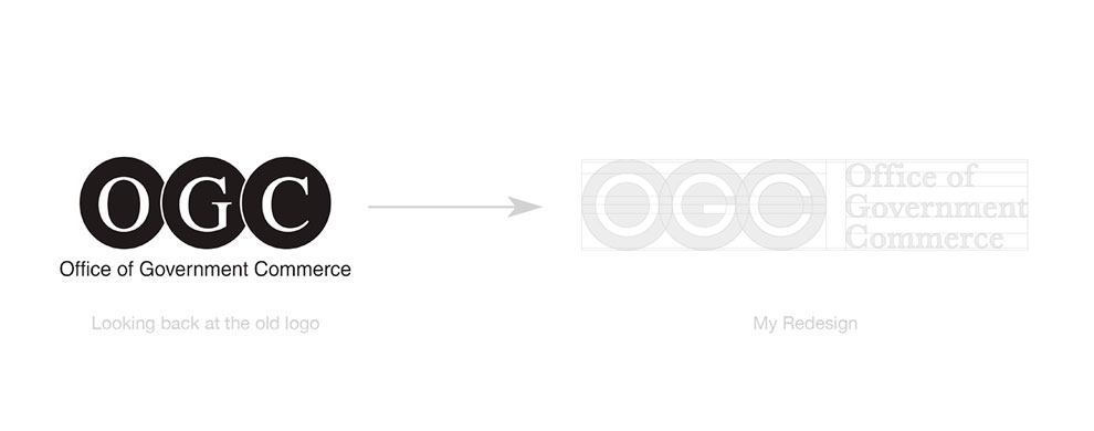
OGC (Office of Government Commerce)
OGC is a logo that apparently has nothing wrong with it: it is an acronym with three sans serif circular letters very close to each other, but by rotating the logo you can see a rather embarrassing figure (definitely not a good move for a government agency). For this reason, I decided to look back at the previous logo to make a restyling that would enhance the letters better, eliminating the outline for a more modern and current look, removing the problem of the ambiguous message.